동적 현금 흐름 분석·관리 프레젠테이션 템플릿
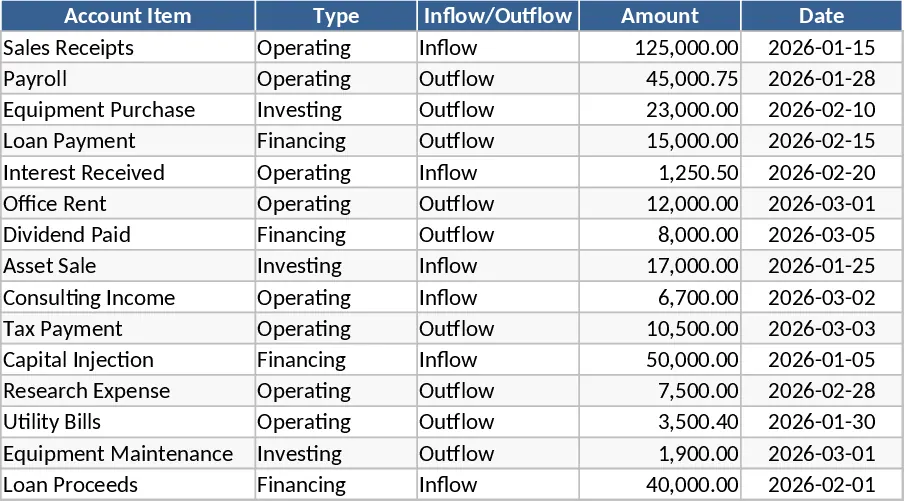
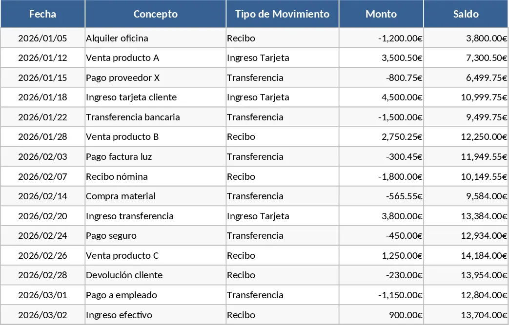
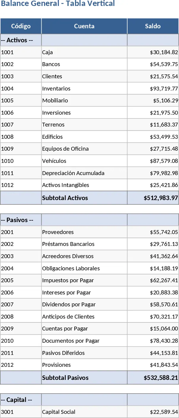
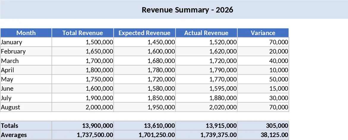
The Cash Flow Presentation and Dynamic Excel Reporting Tool is a comprehensive solution designed to bridge the gap between raw financial data and executive-level insights. The template is built around a robust data architecture that includes dedicated sheets for account itemization, transaction logging, and a high-impact visual dashboard. Within the data sheets, you will find key fields for transaction dates, account descriptions, inflow/outflow categories, and status markers. The dashboard utilizes advanced Excel features like PivotTables and Slicers, which allow for a highly interactive experience where users can drill down into specific financial periods or account types without ever touching a formula.
In the fast-paced world of corporate finance, the ability to quickly pivot your data and present it clearly to management is invaluable. This template solves the common struggle of manual report generation, which is often prone to errors and time-consuming formatting. By using a standardized input method, the tool ensures data integrity while providing the flexibility to change the look and feel of the report through Excel’s native design tools. This makes it an essential asset for finance managers, treasury officers, and small business owners who need to maintain a pulse on their liquidity and communicate financial health to stakeholders effectively.
Beyond simple tracking, this tool serves as a strategic management aid. It helps you monitor net cash positions, identify seasonal trends in spending, and verify that all account items are accounted for in the final presentation. The inclusion of dynamic charts means that your management team can see the big picture at a glance, while the underlying tables provide the necessary detail for deeper audits. This dual-layer approach ensures that you are always prepared for both high-level summaries and detailed inquiries during financial reviews.
How to use: First, populate the account items sheet with your historical and current transaction data, ensuring that each entry is categorized correctly for the PivotTable to recognize. Second, navigate to the dashboard sheet and use the Refresh All command under the Data tab to synchronize the charts and tables with your new entries. Third, interact with the slicers to filter the report by specific months, quarters, or account categories to tailor the view for your specific presentation needs. Finally, adjust the table styles and chart colors to align with your professional presentation standards.
Using this template helps streamline your monthly reporting cycle, significantly reducing the effort required to prepare for management meetings. You can expect a more organized workflow and a more professional output that enhances the credibility of your financial reporting.