Multi-Level Forklift Fleet KPI Dashboard and Performance Reporting Template
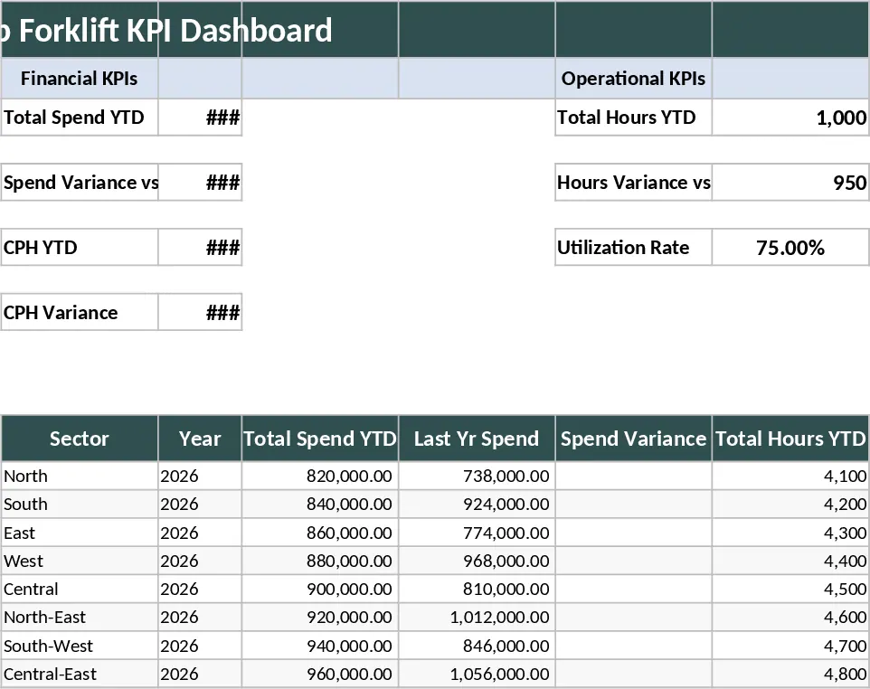
This comprehensive Forklift Fleet KPI Dashboard is designed to transform fragmented maintenance and operational data into a cohesive visual narrative for every level of your organization. Whether you are a Plant Manager focusing on daily facility uptime or a VP overseeing global sector performance, this tool provides the specific granularity you need to make informed decisions. The template is structured with dedicated data ingestion tabs to handle multiple source files, a robust calculation engine, and four distinct reporting layers: Facility, Regional, Sector, and Corporate. Key metrics are presented through professional, high-impact visuals, covering financial health, operational efficiency, and safety compliance. By centralizing your data, you can finally see the full picture of your fleet's performance without toggling between dozens of spreadsheets.
Managing a diverse fleet often leads to data silos where costs and risks are hidden. This dashboard solves that by centralizing disparate logs into a single source of truth. It allows you to identify aging assets that are no longer cost-effective through the Economic Life Index and pinpoint facilities with high avoidable damage costs. By comparing Year-To-Date performance against previous years, you can quickly spot trends in spend and usage, ensuring that your fleet strategy aligns with broader corporate goals. The multi-level reporting structure ensures that General Managers see regional trends while Plant Managers can drill down into specific unit performance, making it an essential tool for logistics hubs, manufacturing plants, and large-scale distribution centers. It helps you track everything from Total Spend YTD and Variance of Total Spend to more technical metrics like Cost Per Hour (CPH) and Utilization Rates.
The template features intuitive dropdowns for level selection and dynamic charts that update automatically as new data is added. You can track the fleet age profile to plan for capital expenditures and monitor impact severity to improve workplace safety. By visualizing the variance in Cost Per Hour, the tool helps you justify fleet replacements or maintenance contract renegotiations based on hard data rather than intuition. The inclusion of Pre-Shift Checklist Compliance and Impact Frequency metrics ensures that safety remains a top priority alongside financial performance. This professional layout is designed to be board-ready, allowing you to present complex fleet data in a way that is easy for stakeholders to digest and act upon.
How to use: First, consolidate your fleet data from various sources into the provided data input tabs, ensuring key fields like hours, costs, and impact logs are filled. Second, use the configuration sheet to define your organizational hierarchy, mapping specific facilities to their respective regions and sectors. Third, navigate to the dashboard of your choice—Facility, Regional, or Corporate—and use the slicers or dropdown menus to filter for specific timeframes or locations. The visuals will automatically recalculate to show YTD variances, utilization rates, and fleet health profiles.
Expected benefits: This tool significantly reduces the time spent on manual report consolidation and provides a professional, visually appealing presentation of fleet health that enhances cross-departmental communication and operational transparency.