Anti‑Dopamine Recovery Dashboard Template
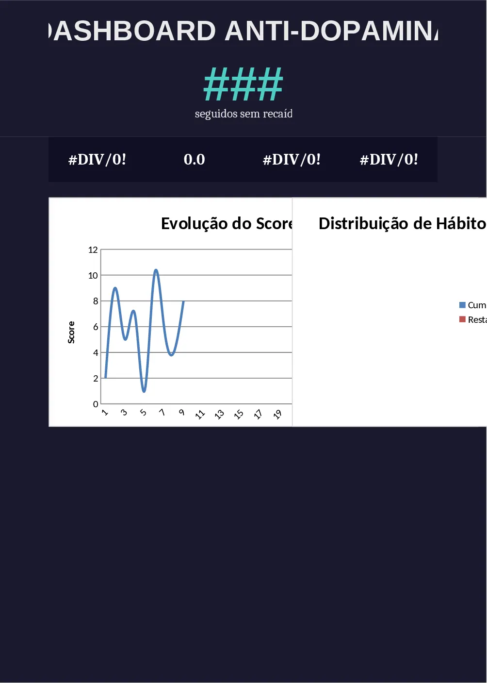
The Anti‑Dopamine Dashboard is a four‑sheet Excel workbook designed for young adults who want to break digital‑addiction cycles and build healthier routines. The first sheet, Dashboard Principal, is a dark‑mode interface that follows the colour palette you specified: deep navy background, accent orange for alerts, teal for success, and soft white text. At the top you’ll see a large title and a central score (0‑100) that changes colour based on performance thresholds. Below the score, a subtitle automatically counts the number of consecutive days without a relapse. Four metric cards display your average energy (1‑5), total focus hours, productivity percentage, and weekly score, each paired with a minimalist icon. A line chart visualises the last 30 days of progress, while a pie chart breaks down the proportion of habits you’ve completed. An alert box at the bottom changes from green to yellow to red, providing an instant visual cue of your current status.
This template solves the common problem of fragmented habit‑tracking by consolidating all key indicators into one glanceable view. It helps you recognise patterns, celebrate small wins, and spot early signs of relapse before they become setbacks. By translating raw daily entries into colour‑coded scores and charts, you gain a clear picture of how your energy, focus and productivity evolve over time. The dashboard is especially useful for anyone in recovery from digital overuse, coaches guiding young adults, or self‑help enthusiasts who prefer a data‑driven approach to personal transformation.
How to use
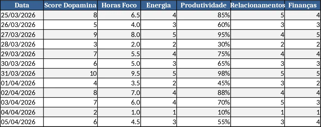
- Open the hidden "Data Entry" sheet (or the sheet you create for daily logs) and record each habit you performed, the hours you focused, and a self‑rated energy level for the day.
- The workbook automatically aggregates these entries; you do not need to edit any formulas. Refresh the dashboard by pressing Ctrl + Alt + F9 if calculations do not update instantly.
- Watch the central score and the four metric cards update in real time. The line and pie charts will redraw to reflect the latest 30‑day window.
- If the alert box turns yellow or red, review the underlying data to identify which habit slipped and adjust your plan accordingly.
Expected benefits: you’ll spend far less time compiling spreadsheets, get instant visual feedback on your progress, and reduce the mental load of remembering which habits need attention, allowing you to focus on building lasting change.