Fuel Price Trend Analysis 2016‑2025 Template
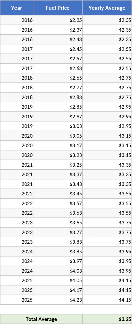
This Excel template is built around two main sheets: a Data sheet and a Dashboard sheet. The Data sheet holds a clean, color‑coded table with four columns – Year, Fuel Price, Yearly Average, and Total Average. The Year column is pre‑filled with the range 2016‑2025, while the Fuel Price column is ready for you to input monthly or annual price figures. The Yearly Average column automatically calculates the mean price for each year using a simple AVERAGE formula, and the Total Average cell at the bottom shows the overall average across all years. All cells are formatted with conditional colors to highlight high and low values at a glance.
The Dashboard sheet pulls the calculated data and presents it in two ready‑to‑use charts. A line chart plots the yearly fuel price trajectory, making it easy to spot upward or downward trends over the decade. Beside it, a pie chart breaks down the contribution of each year to the total average, giving a quick visual of which periods dominate the overall cost picture. Both charts update instantly as you modify the underlying data, ensuring your analysis stays current without manual re‑drawing.
This template is ideal for analysts, finance professionals, procurement officers, or anyone who needs to monitor fuel cost fluctuations for budgeting, forecasting, or policy‑making purposes. By consolidating raw price entries, automatic calculations, and visual summaries in one file, it eliminates the repetitive work of building tables and charts from scratch. It also helps you quickly answer questions like “What was the average fuel price in 2020?” or “How have prices changed year‑over‑year?” without digging through raw datasets.
What you can track and manage with this tool includes yearly price trends, average cost per year, overall average price, and visual representations that support presentations or reports. The built‑in formatting draws attention to outliers, while the charts provide a professional look for stakeholder meetings. Because the formulas are locked in, you avoid calculation errors and maintain consistency across multiple analyses.
How to use
- Open the Data sheet and enter the actual fuel price values for each year in the Fuel Price column (you can paste a list or type manually).
- The Yearly Average column will fill automatically; verify the Total Average at the bottom.
- Switch to the Dashboard sheet – the line and pie charts will refresh instantly to reflect your inputs.
- If you need to extend the timeline, simply add new rows in the Data sheet; the table and charts will expand automatically.
Expected benefits: you’ll save considerable time on data entry, calculation, and chart creation, letting you focus on interpreting the trends rather than building the report.