Ice Cream Price Impact on Supply, Demand & Equilibrium Template
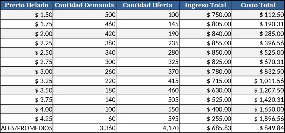
This Excel template is built for students, teachers, and anyone studying basic micro‑economics. It contains three worksheets: Input, Calculations, and Results. In the Input sheet you enter the current price of ice‑cream, the estimated price elasticity of demand, the elasticity of supply, and any external factors (seasonality, promotional discounts) via simple dropdowns or numeric fields. The Calculations sheet automatically applies the standard linear supply‑and‑demand formulas to compute the new quantity supplied, quantity demanded, and the resulting equilibrium price and quantity after a price increase. The Results sheet presents a clean table of the original and new equilibrium values and a dynamic chart that overlays the original and shifted supply and demand curves, highlighting the new intersection point.
The template solves the common classroom problem of visualizing how a price hike moves the market. Instead of sketching curves by hand, users instantly see the quantitative impact of a price change, how the supply curve may shift (if producers respond) and how the demand curve reacts based on elasticity inputs. This makes abstract concepts concrete, helps learners test “what‑if” scenarios, and prepares them for more advanced economic modeling.
Ideal for economics students, high‑school teachers preparing lesson plans, or business analysts who need a quick illustration of price‑impact dynamics. Whether you are explaining the law of demand, preparing a case study on seasonal ice‑cream sales, or simply curious about market behavior, the template gives you a ready‑made analytical framework.
How to use
- Open the Input sheet and fill in the current ice‑cream price, the expected percentage increase, and the elasticity values for demand and supply. Choose any relevant scenario from the dropdown (e.g., "Summer peak", "New competitor").
- Switch to the Calculations sheet – the formulas run automatically, updating the projected quantities and equilibrium.
- Go to the Results sheet to view the updated table and the chart. The chart will show the original and new supply‑demand lines with the new equilibrium highlighted.
- Export the chart or copy the table for reports, presentations, or homework assignments.
Expected benefits: By automating the calculations and visualizations, the template saves you the time spent on manual graphing and reduces errors, letting you focus on interpreting results and discussing economic implications.
Similar Templates Recommendation
Secondary School Results and Ranking Template
Track up to 200 secondary students' marks, auto‑calculate grades, averages, divisions and rankings in a clear, formatted sheet.

Couple Budget and Cash Flow Tracker Template
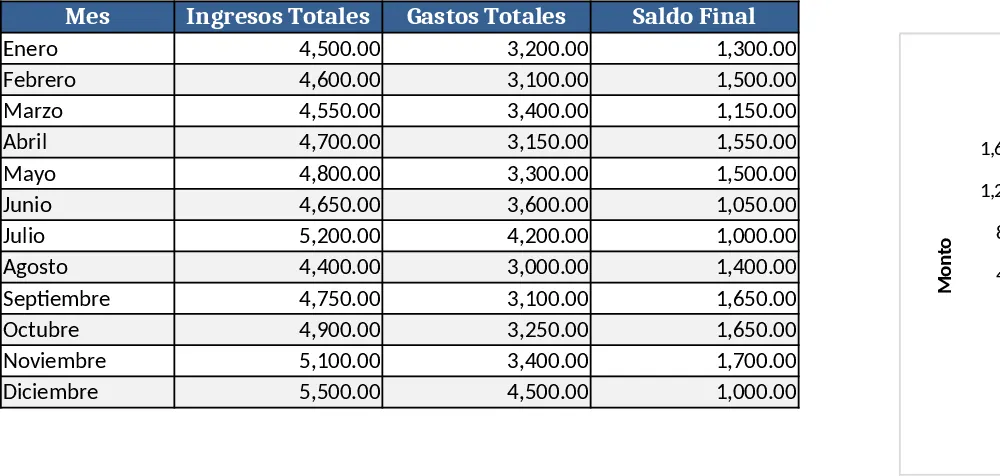
Track monthly income, expenses, and cash flow for a working couple, visualize budgets and savings goals in one spreadsheet.
Date Range and Internal Log Template
Create an Excel file with two columns for dates and internal notes, with colored rows for different date ranges.