Weekly Snap & CAM Sales Tracker Template
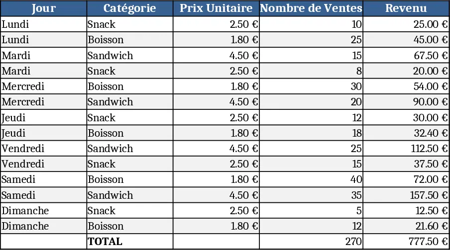
This Excel template provides a clear, week‑long view of your sales activity across multiple product categories such as various Snap exchange durations and CAM time slots. The workbook is split into three sheets: Data Entry, Pricing, and Summary Dashboard. In the Data Entry sheet you record each day's sales count for every category in a simple table; the Pricing sheet holds the unit price for each category, which you can adjust at any time. The Summary Dashboard pulls these inputs together, automatically calculating daily revenue per category, total units sold, and overall weekly earnings, displayed in both tabular and chart formats for quick visual insight.
The template solves the common headache of manually aggregating daily sales numbers and calculating revenue across many price‑varying items. By centralising data entry and linking it to a live summary, you eliminate repetitive calculations, reduce errors, and gain instant visibility into which categories are driving income. This is especially valuable for small business owners, sales managers, or freelancers who need to monitor performance across time‑based service offerings (e.g., Snap exchanges of 5‑30 minutes and CAM sessions of 2‑15 minutes) without spending hours on spreadsheets.
Anyone who sells time‑based services or products with distinct price points will find this tool useful—whether you run a boutique digital‑media shop, a consulting practice, or a small retail operation. The template tracks the number of transactions per day, applies the correct price per category, and produces a concise revenue snapshot for the entire week. It also highlights top‑performing categories, helping you allocate marketing effort or adjust pricing strategies based on real data.
How to use
- Open the Pricing sheet and enter the current unit price for each category (e.g., "echange snap 5 mins" = $X). Save any changes.
- Switch to the Data Entry sheet and fill in the sales count for each day (Monday‑Sunday) under the appropriate category columns.
- The Summary Dashboard updates automatically – you’ll see daily revenue per category, total units sold, and a weekly total revenue chart.
- Optionally, filter or sort the summary table to focus on specific days or categories.
Expected benefits: faster weekly reporting, fewer manual calculations, and clearer insight into which services generate the most income, freeing up time for strategic planning.