How to Add a Benchmark Line in Excel Graphs (Step-by-Step Guide)

We've all been there - staring at a spreadsheet trying to figure out if we're hitting targets. A benchmark line cuts through the noise, showing exactly where your data stands against goals. Let me show you how to create these visual game-changers in Excel (and share a secret weapon for doing it in seconds).

Why Benchmark Lines Are Your Secret Weapon

Think of benchmark lines as finish lines for your data. They help you:

  • Spot underperforming months at a glance
  • Celebrate when you crush targets
  • Make reports instantly understandable for your team

RowSpeak (our AI-powered spreadsheet tool) automates this entire process, but if you're working in traditional Excel, here's how to do it manually.

Step 1: Set Up Your Data Like a Pro

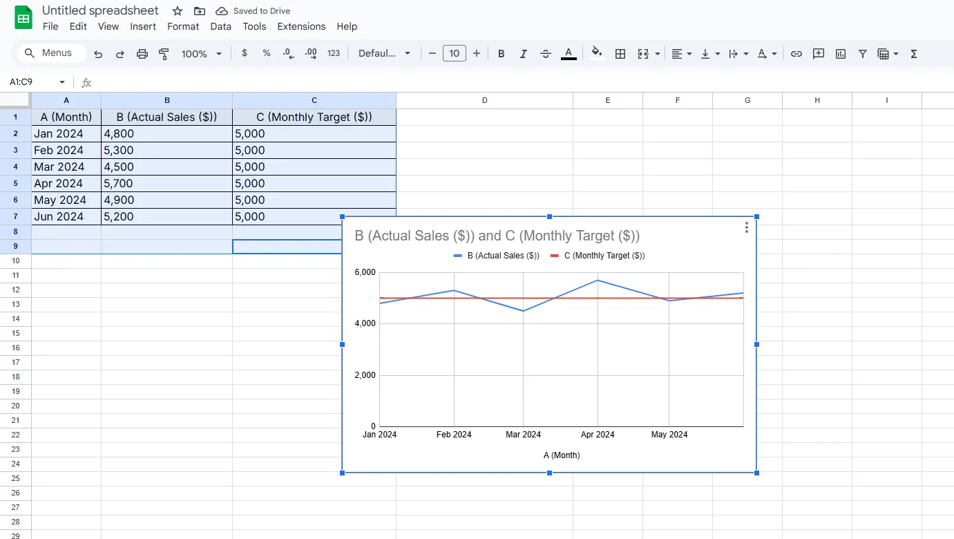
Your spreadsheet needs three columns:

  1. Time periods (Column A)
  2. Actual performance (Column B)
  3. Benchmark values (Column C)

Pro tip: In RowSpeak, you'd just say "Add a 10,000 monthly sales target line" and it handles the setup automatically.

Step 2: Create Your Base Chart

  1. Highlight all three columns
  2. Go to Insert > Line Chart
  3. Choose any clean line style

1

Watch how Excel plots both your actual data and benchmark as separate lines.

Step 3: Make That Benchmark Pop

Right-click your benchmark line to:

  • Change it to red (classic "alert" color)
  • Make it dashed (helps distinguish from actual data)
  • Thicken the line (2.25pt works great)

In RowSpeak, you'd just type "Make target line red and dashed" - no manual formatting needed.

Level Up: Advanced Benchmark Tricks

  1. Dynamic Benchmarks: Link your benchmark to a cell so it updates automatically when goals change
  2. Multiple Benchmarks: Add lines for minimum, target, and stretch goals
  3. Conditional Formatting: Make data points change color when they beat the benchmark

Fun fact: RowSpeak users create these advanced visuals 3x faster using natural language commands like "Show me performance against quarterly targets."

When to Use AI Instead of Manual Excel

While you can absolutely build these manually, consider switching to RowSpeak when you:

  • Need to update reports weekly/monthly
  • Share dashboards with non-technical teams
  • Want to ask questions like "Which products beat benchmarks last quarter?"

The bottom line? Benchmark lines transform numbers into actionable insights. Whether you build them manually or use AI-powered tools like RowSpeak, they're a must-have for data-driven teams.

Pro Tip: Try RowSpeak's free plan to see how AI can automate your benchmark reporting. Just upload your data and say "Show performance against our targets" - you'll get a polished, interactive dashboard in seconds.

Remember: Great data visualization isn't about fancy charts - it's about making insights obvious. Benchmark lines do exactly that.
Turn Your Next Spreadsheet Into a Report You Can Share

Start with the Excel or CSV file you already have. RowSpeak helps you find what matters and create clear, reviewable reports and dashboards for your team.

Try It with Your File

Recommended Posts

How to Add a Target Line in Excel Charts (Step-by-Step Guide)
Excel Operation

How to Add a Target Line in Excel Charts (Step-by-Step Guide)

Target lines transform basic Excel charts into powerful performance dashboards. Here's how to add them in minutes.

Gianna
How to Add a Vertical Line in Excel Graphs: A Step-by-Step Guide
Excel Operation

How to Add a Vertical Line in Excel Graphs: A Step-by-Step Guide

Vertical lines in Excel graphs can transform your data storytelling. Whether you're marking a product launch or a financial milestone, this guide shows you multiple ways to add them with ease.

Gianna
How to Add Text in Excel: A Step-by-Step Guide
Excel Operation

How to Add Text in Excel: A Step-by-Step Guide

Text isn't just for Word docs - it's crucial for clear Excel spreadsheets too. Discover how to add, format, and automate text in Excel like a spreadsheet pro.

Gianna
How to Add an Average Line in Excel (Step-by-Step Guide)
Excel Operation

How to Add an Average Line in Excel (Step-by-Step Guide)

Want to make your Excel charts more insightful? Adding an average line helps you visualize data trends at a glance. Here's how to do it in just a few clicks.

Gianna
How to Add an Asterisk in Excel Graphs: A Step-by-Step Guide
Excel Operation

How to Add an Asterisk in Excel Graphs: A Step-by-Step Guide

Want to make your Excel graphs stand out? This guide shows you exactly how to add asterisks to highlight important data points - no design skills needed!

Gianna
How to Add Tick Marks to Excel Graphs Like a Pro (Step-by-Step Guide)
Excel Operation

How to Add Tick Marks to Excel Graphs Like a Pro (Step-by-Step Guide)

Tick marks transform basic Excel charts into professional data visualizations. Discover how to add and customize them in minutes - no design skills needed!

Gianna
How to Add a Linear Trendline in Excel (Step-by-Step Guide)
Excel Operation

How to Add a Linear Trendline in Excel (Step-by-Step Guide)

Trendlines transform raw numbers into actionable insights. This simple guide shows you exactly how to add and customize linear trendlines in Excel - plus how RowSpeak's AI can automate this process for you.

Gianna
How to Add a Slope Equation in Excel (Step-by-Step Guide)
Excel Operation

How to Add a Slope Equation in Excel (Step-by-Step Guide)

Slope equations help uncover trends in your data—but manual calculations can be tedious. Here's how Excel (and RowSpeak) make it effortless.

Gianna