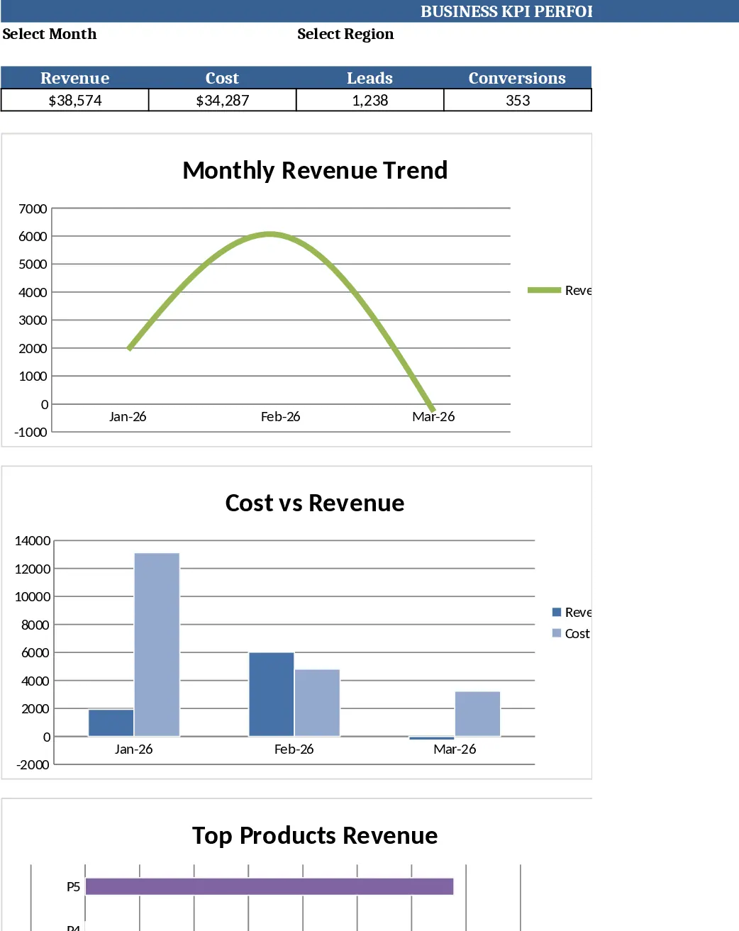
Monthly Business KPI Dashboard Excel with Charts Template
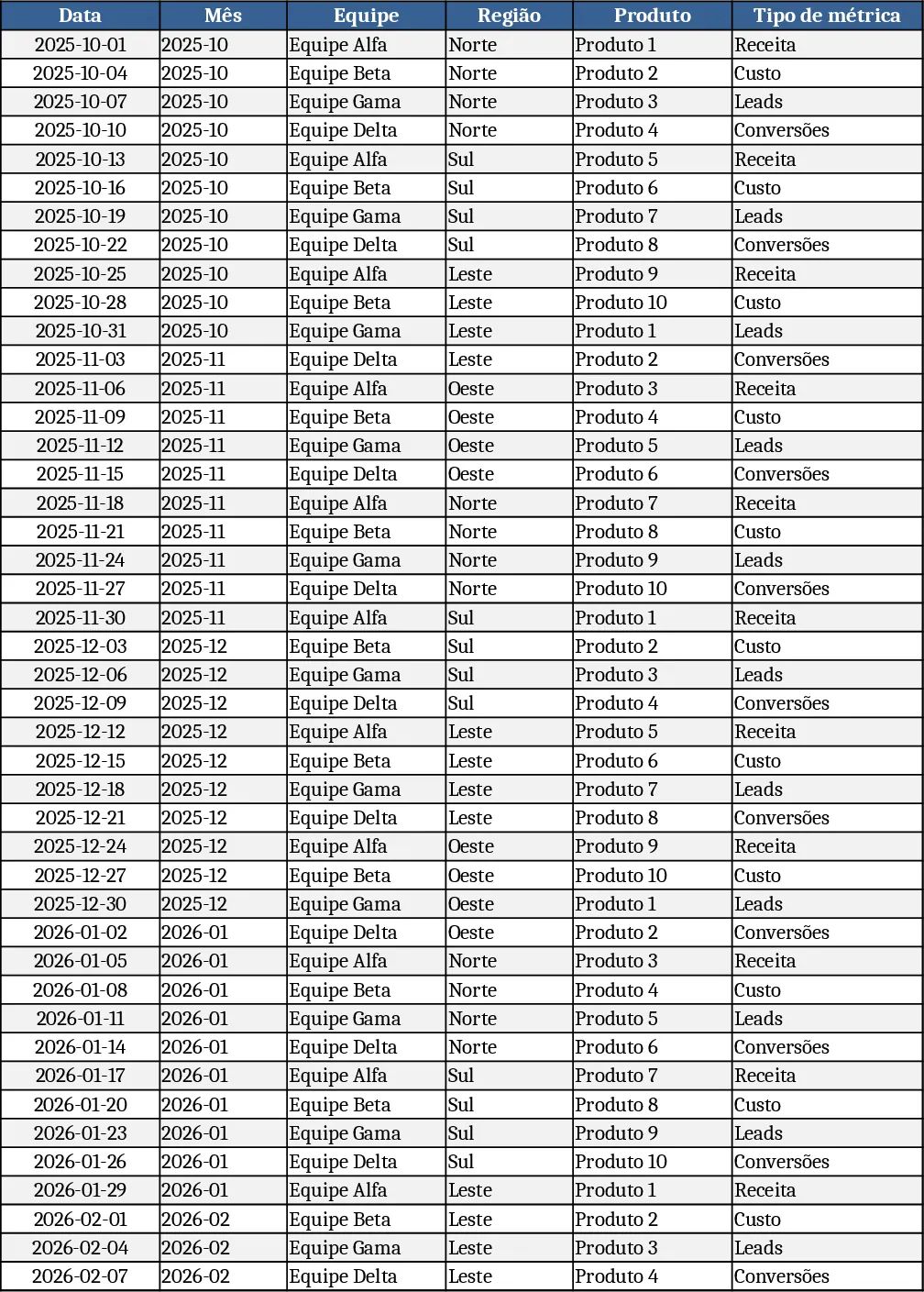
The Advanced Business KPI Dashboard template is organized into four clear worksheets: Raw_Data, KPI_Definitions, Pivot_Summary, and Dashboard. In the Raw_Data sheet you’ll find 60 rows of sample records covering six months, with columns for Date, Month, Team, Region, Product, Metric Type (Revenue/Cost/Leads/Conversions) and Value. KPI_Definitions lists each key performance indicator, the exact formula (e.g., Conversion Rate = Conversions ÷ Leads) and any explanatory notes. Pivot_Summary contains ready‑to‑use pivot tables that aggregate the raw numbers by Month, Region, Product and Team, and includes slicer‑friendly fields for quick segmentation. The Dashboard sheet pulls data from the pivots to display line charts for revenue trends, bar charts for regional revenue, a combo chart comparing cost versus revenue, a dual‑axis chart for leads and conversion rate, and a top‑10 product revenue bar chart.
This template solves the common pain of manually consolidating disparate sales and marketing data into a single, up‑to‑date visual report. By centralizing raw inputs and automating calculations, it eliminates repetitive copy‑pasting, reduces errors, and gives decision‑makers instant insight into how different dimensions of the business are performing. It’s especially valuable for business analysts, finance teams, and sales managers who need to monitor monthly results, spot trends, and present findings to leadership without building a dashboard from scratch each month.
The file helps you track overall revenue, cost structures, lead generation, conversion efficiency, and product performance across multiple regions and teams. Because the dashboard is linked directly to the Raw_Data sheet, any new entry automatically refreshes all calculations, pivot tables and charts, ensuring you always work with the latest information.
How to use
- Open the workbook and enter your own data in the Raw_Data tab, following the existing column layout. Add or delete rows as needed; the table will expand automatically.
- Review or edit the KPI formulas in KPI_Definitions if you have custom metrics or different calculation rules.
- Refresh the pivots on the Pivot_Summary sheet (Data → Refresh All) to update the aggregated tables.
- Switch to the Dashboard sheet to see the refreshed charts and KPI cards; you can use the slicers to filter by month, region, product or team.
Expected benefits: a fully automated monthly KPI report that saves hours of manual data wrangling and gives you a professional, instantly‑readable visual summary of business health.
Similar Templates Recommendation
Monthly Business KPI Dashboard with Trend Analysis Template
Track monthly revenue, cost, leads and conversion rates with a dynamic KPI dashboard that updates automatically from raw data.
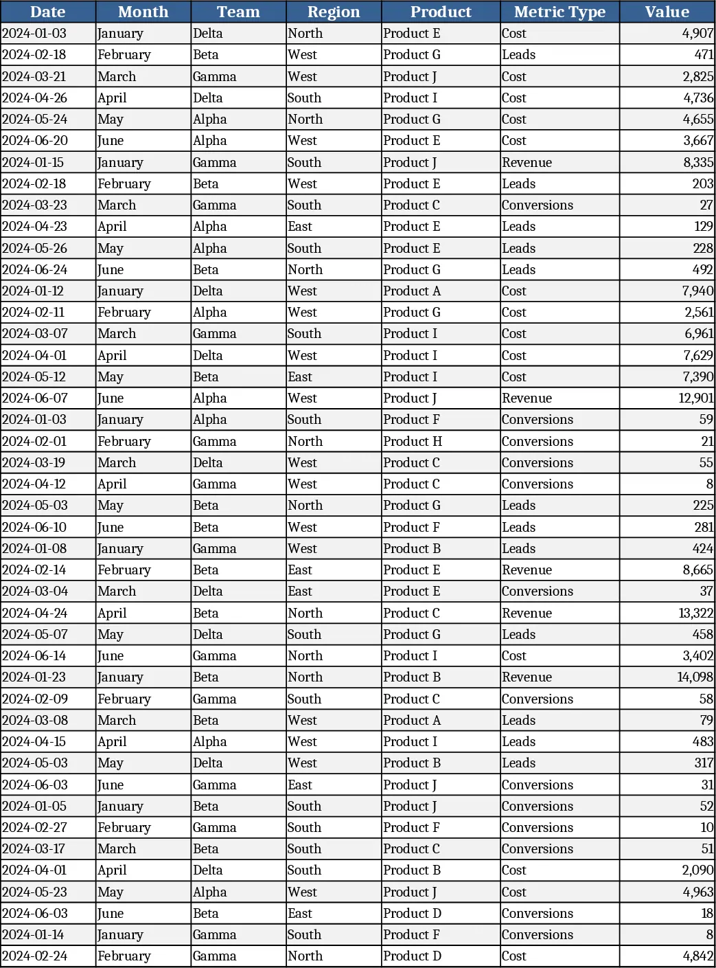
Monthly Business KPI Dashboard with Automation Template
Track monthly revenue, cost, leads and conversion rates with a dynamic KPI dashboard that updates automatically from raw data.
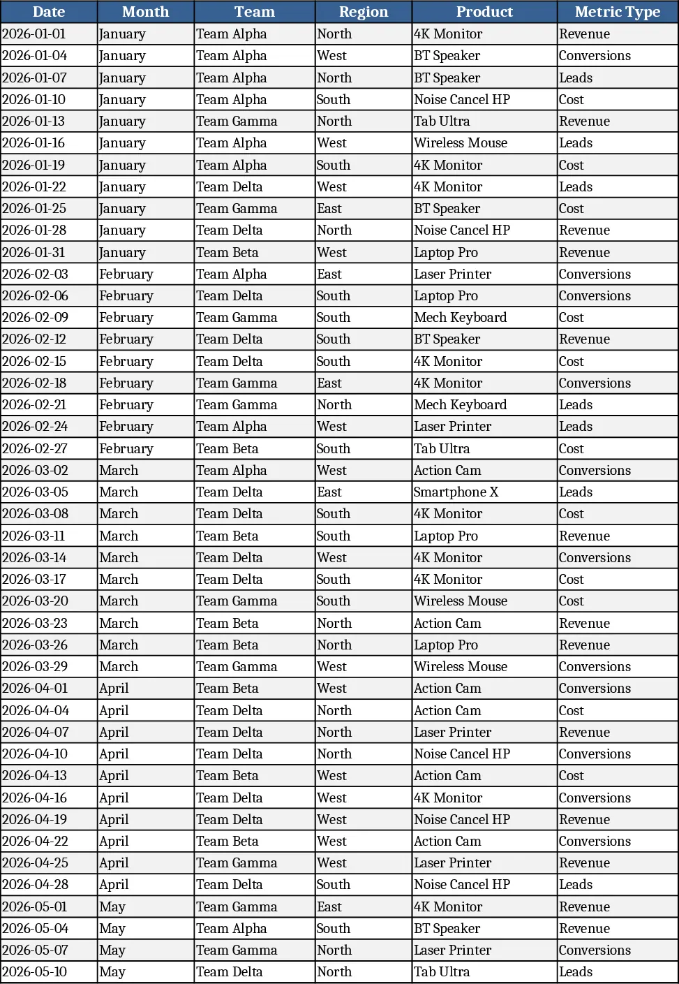
Advanced Monthly Business KPI Dashboard with Weekly Trends Template
Track monthly revenue, costs, leads and conversion rates across teams, regions and products with dynamic charts and pivot summaries.