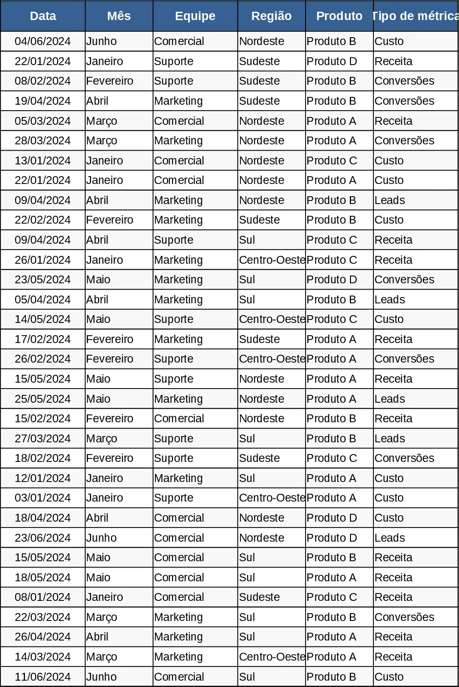
Monthly Business KPI Dashboard with Trend Analysis Template
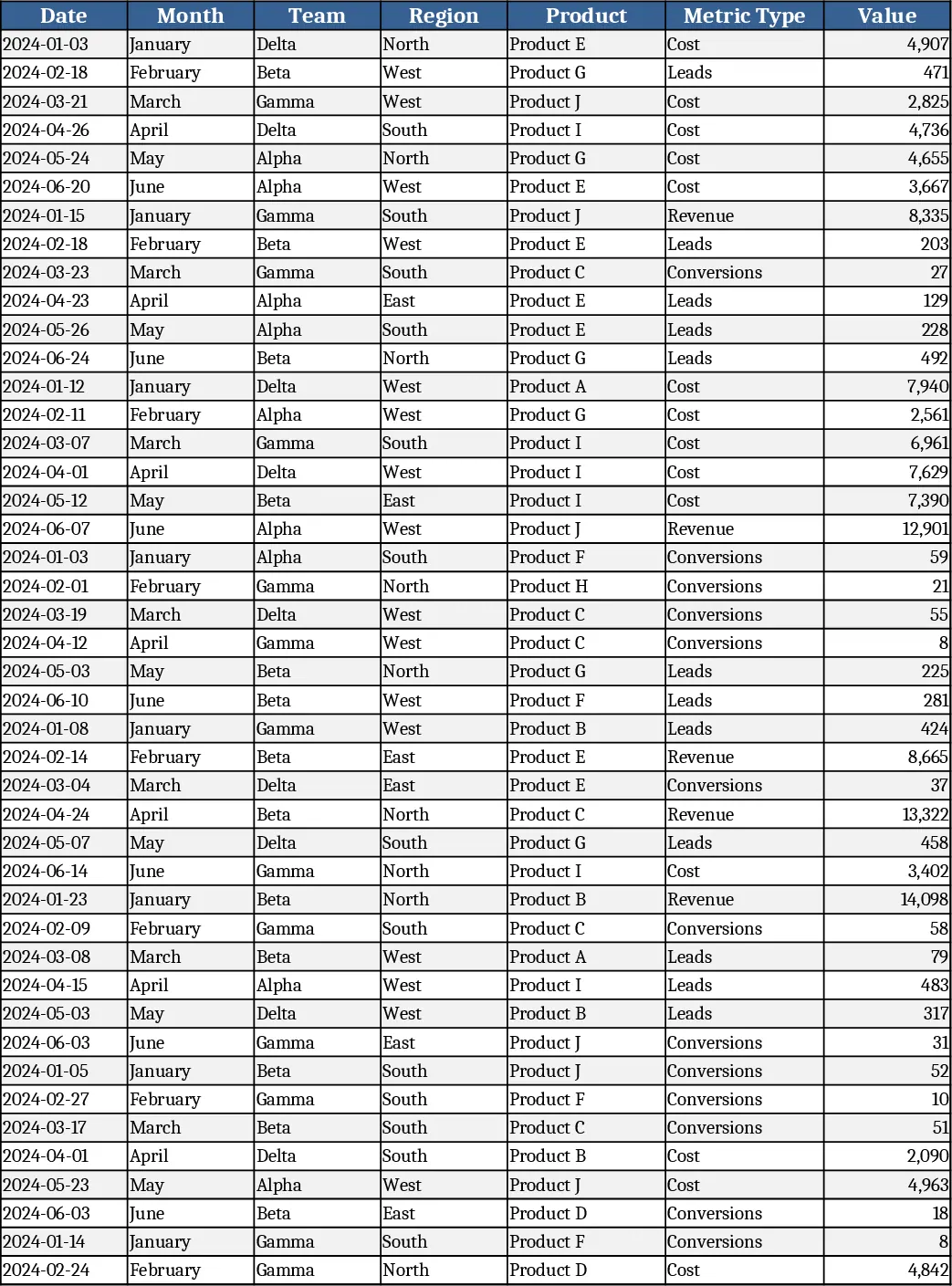
The Monthly Business KPI Dashboard template is built on four interconnected sheets that turn raw transaction data into clear, actionable visuals. Raw_Data holds the source records with fields for Date, Month, Team, Region, Product, Metric Type and Value. KPI_Definitions lists each key performance indicator, the exact formula (e.g., Conversion Rate = Conversions ÷ Leads) and any logic notes, so you can adjust calculations without breaking the model. Pivot_Summary contains pre‑configured pivot tables that aggregate values by Month, Region, Product and Team, and includes slicer‑ready fields for instant filtering. Finally, the Dashboard sheet pulls the pivot results into a set of charts – a line chart for revenue trend, a bar chart for revenue by region, a combo chart comparing cost versus revenue, a dual‑axis trend for leads and conversion rate, and a top‑10 product bar chart.
This template solves the common pain of manually consolidating monthly performance data across multiple dimensions. By feeding new rows into Raw_Data, all pivot tables and charts refresh automatically, eliminating repetitive copy‑paste and formula errors. It gives finance analysts, sales managers, and operations leaders a single source of truth for tracking growth, spotting cost overruns, and measuring conversion efficiency, all without needing advanced Excel skills.
Anyone who needs to monitor business health on a month‑by‑month basis will benefit – from CFOs reviewing profitability, to regional managers comparing sales performance, to product owners assessing which items drive the most revenue. The dashboard makes it easy to answer questions like “Which region delivered the highest revenue this month?” or “How is our conversion rate trending compared to leads generated?”
How to use
- Open the workbook and add your own records to the Raw_Data sheet; keep the column order and data types unchanged.
- If you have custom KPIs, edit the KPI_Definitions sheet – enter the name, formula and any notes; the pivot and dashboard will pick up the changes.
- Use the slicers on the Pivot_Summary sheet (Month, Region, Product) to filter the view; the Dashboard charts will reflect the selected slice instantly.
- Review the visual summary on the Dashboard sheet; export charts or copy them into presentations as needed.
Expected benefits: faster monthly reporting, reduced manual calculations, and a clearer visual picture of business performance, freeing up time for strategic analysis.
Similar Templates Recommendation
Advanced Monthly Business KPI Dashboard with Weekly Trends Template
Track monthly revenue, costs, leads and conversion rates across teams, regions and products with dynamic charts and pivot summaries.
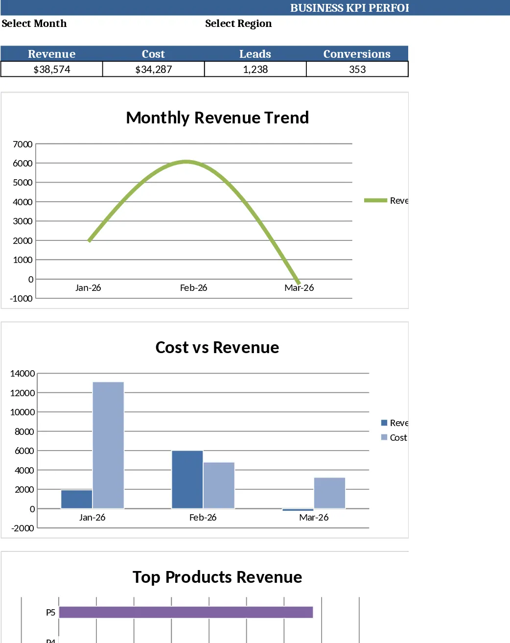
Monthly Business KPI Dashboard with Automation Template
Track monthly revenue, cost, leads and conversion rates with a dynamic KPI dashboard that updates automatically from raw data.
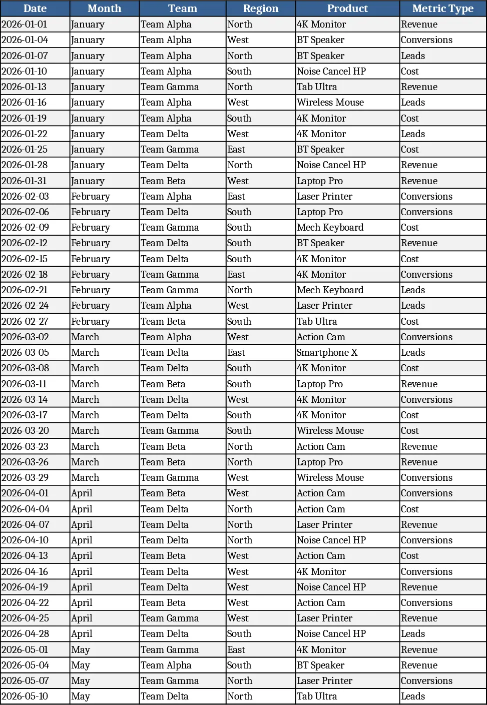
Monthly Business KPI Dashboard with Charts and Performance Metrics Template
Advanced Excel KPI dashboard with raw data, definitions, pivot summary, and visual panel for monthly business performance.