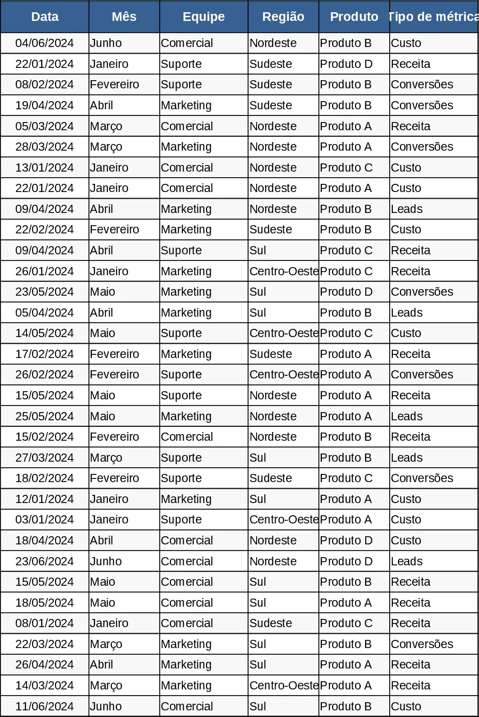
Monthly Business KPI Dashboard with Automation Template
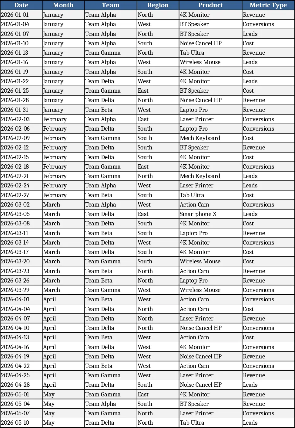
The Monthly Business KPI Dashboard template is built on four interconnected sheets that turn raw transaction data into clear, actionable visual insights. Raw_Data is the engine, holding rows for Date, Month, Team, Region, Product, Metric Type and Value. You can paste or import up to thousands of records, and the sheet includes a simple data‑validation dropdown for Metric Type to keep entries consistent. KPI_Definitions lists each key performance indicator with its exact formula – for example, Conversion Rate = Conversions ÷ Leads – so anyone can see the logic behind the numbers. Pivot_Summary contains ready‑to‑use pivot tables that aggregate values by Month, Region, Product and Team, and slicer‑friendly fields let you filter the view instantly. Finally, the Dashboard sheet pulls the pivot results into a set of charts: a line chart for revenue trends, a bar chart for revenue by region, a combo chart comparing cost versus revenue, a dual‑axis trend for leads and conversion rate, and a top‑10 product bar chart. All charts are linked to the slicers, so a single click updates the entire visual set.
This template solves the common headache of manually consolidating monthly performance data across multiple dimensions. Instead of copying formulas across dozens of sheets, you enter raw numbers once and let the pivots and formulas do the heavy lifting. The dashboard gives you a single‑page snapshot of business health, making it easy to spot trends, regional strengths, product winners and cost pressures. It is especially useful for finance analysts, sales managers, and operations leaders who need to report on a regular cadence without spending hours on data wrangling.
Anyone who monitors monthly business performance will benefit – from small‑business owners tracking product profitability to corporate teams preparing executive scorecards. The template works in any standard Excel environment and requires no external add‑ins. By centralising raw data, KPI logic, and visual output, it reduces the risk of inconsistent calculations and ensures that every stakeholder sees the same numbers.
How to use
- Open the Raw_Data sheet and paste your monthly records, using the dropdown to select Revenue, Cost, Leads or Conversions for each row. The sample data of 60 rows across six months is already in place to show you the expected layout.
- Review the KPI_Definitions sheet to understand each metric; you can add new KPIs by entering a name and a formula that references the pivot fields.
- Go to Pivot_Summary and refresh the pivots (Data → Refresh All). Use the slicers at the top to filter by month, region or product and watch the summary tables adjust.
- Switch to the Dashboard sheet; the charts will automatically reflect the filtered data. Export the dashboard as a PDF or embed it in a PowerPoint deck for presentations.
Expected benefits: faster monthly reporting, fewer manual calculations, consistent KPI definitions, and a visual snapshot that helps decision‑makers act quickly.
Similar Templates Recommendation
Monthly Business KPI Dashboard with Trend Analysis Template
Track monthly revenue, cost, leads and conversion rates with a dynamic KPI dashboard that updates automatically from raw data.
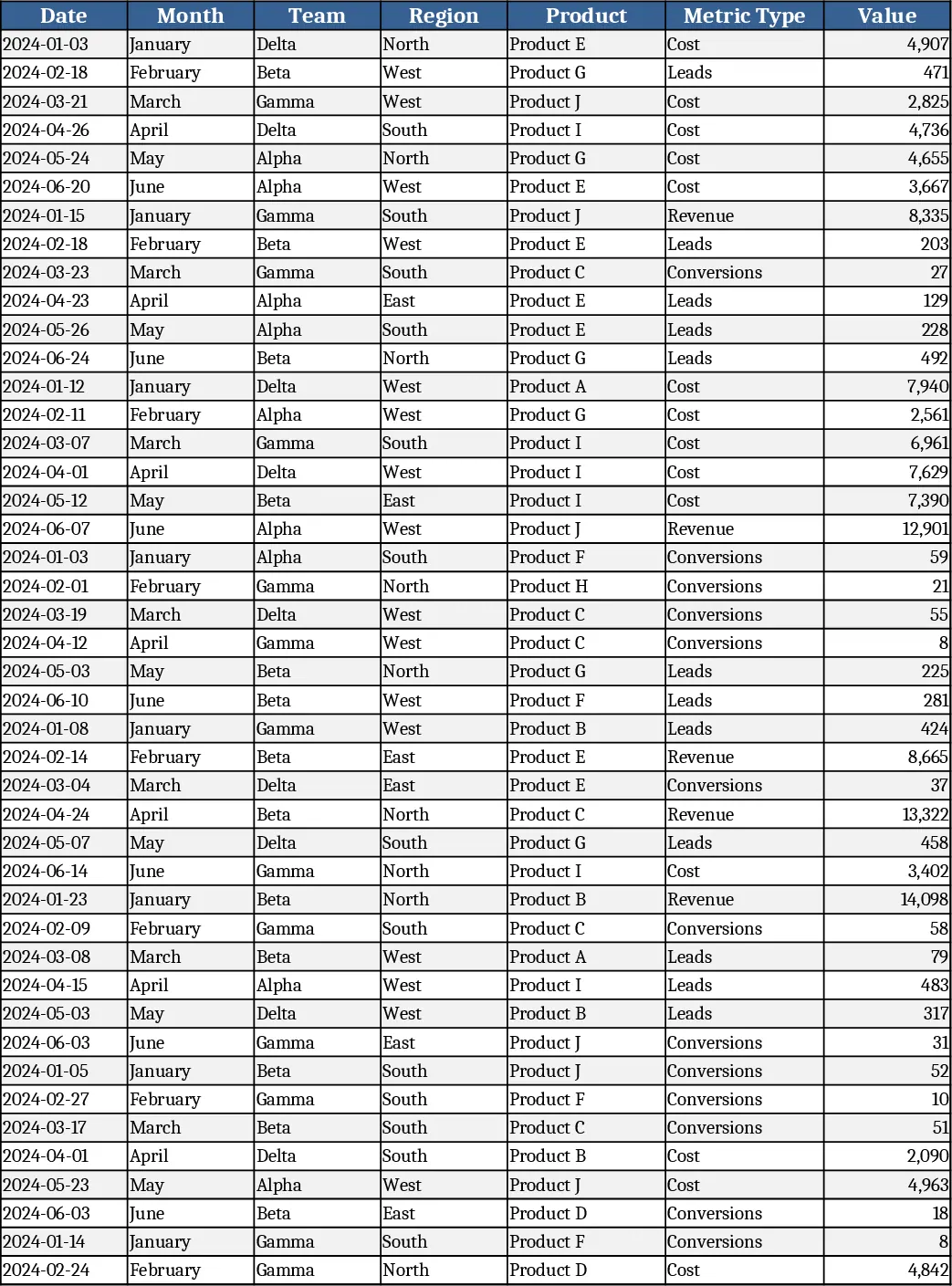
Advanced Monthly Business KPI Dashboard with Weekly Trends Template
Track monthly revenue, costs, leads and conversion rates across teams, regions and products with dynamic charts and pivot summaries.
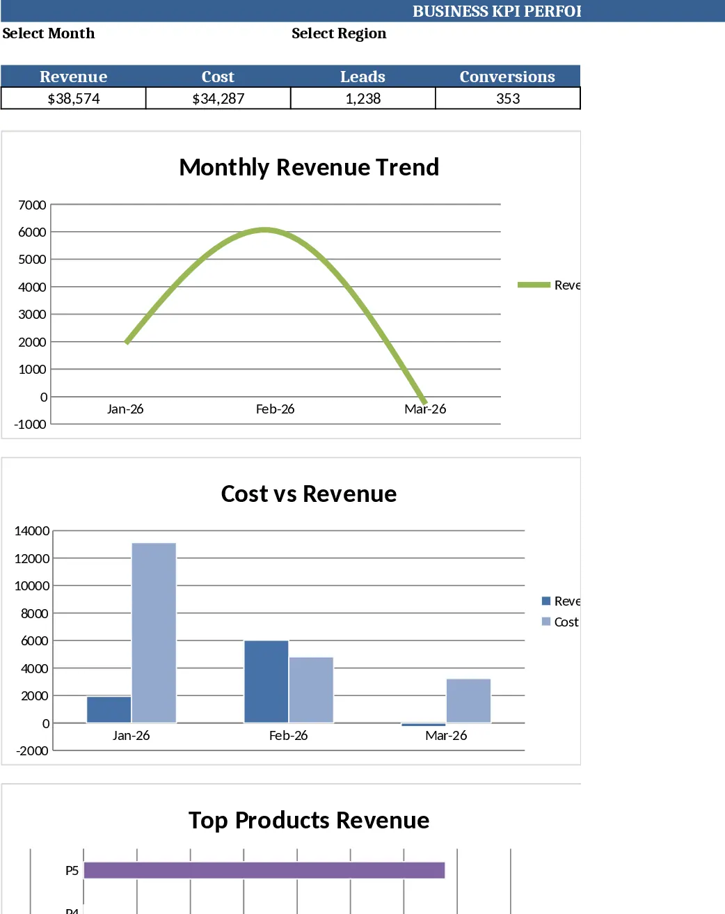
Monthly Business KPI Dashboard with Charts and Performance Metrics Template
Advanced Excel KPI dashboard with raw data, definitions, pivot summary, and visual panel for monthly business performance.