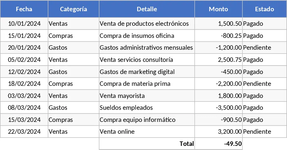
Formula-Enabled Data Table Template
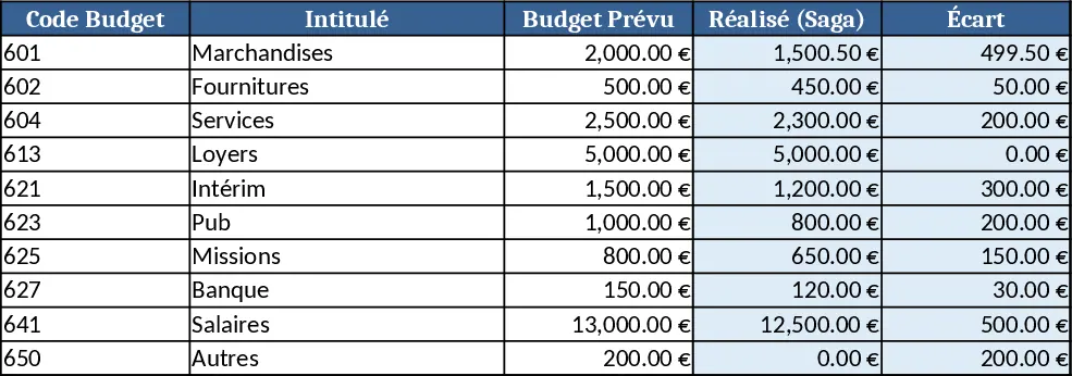
This Excel template is organized into three simple sheets: Data Input, Calculations, and Summary Dashboard. In the Data Input sheet you paste or type raw numbers, dates, and categories into clearly labeled columns. The Calculations sheet contains hidden rows with pre‑written formulas that reference the input table, automatically generating totals, averages, growth rates, and other common KPIs. The Summary Dashboard pulls those results into clean tables and charts, giving you an at‑a‑glance view of performance without any manual equation writing.
The workbook solves the everyday headache of building formulas from scratch. Whether you need to track sales trends, monitor project costs, or analyze any set of numeric data, the template handles the heavy lifting. By standardizing calculations, it reduces errors, speeds up reporting, and frees you to focus on interpreting results rather than debugging spreadsheets. It’s especially useful for analysts, small‑business owners, and team leads who need reliable numbers quickly but lack advanced Excel expertise.
Anyone who works with recurring data sets—finance officers, operations managers, HR analysts, or educators—can benefit. The template helps you keep a single source of truth, automatically updates totals when you add new rows, and provides ready‑made visual summaries that can be shared with stakeholders. It tracks raw entries, derived metrics, and trend visuals, making it easy to spot outliers, compare periods, and present findings in meetings.
How to use
- Open the workbook and go to the Data Input sheet. Fill in the required columns (Date, Category, Amount, etc.) or copy‑paste your existing table.
- Switch to the Calculations sheet; the formulas will refresh instantly, showing subtotals, averages, and any custom KPI you defined.
- Review the Summary Dashboard for updated charts and summary tables. If needed, adjust filter dropdowns to view specific periods or categories.
- Export the dashboard as PDF or copy the charts into presentations for quick reporting.
Expected benefits include a noticeable cut in time spent on manual calculations, fewer formula errors, and a consistent reporting format that can be reused month after month.
Similar Templates Recommendation
Calculation and Summary Report Template
A versatile Excel template that lets you input raw data, run calculations, and instantly generate clear summary tables and charts.
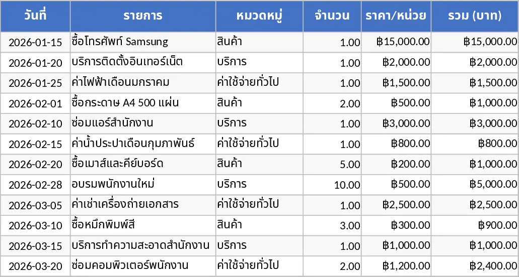
All-Purpose Excel Template
A versatile Excel template that lets you organize data, run calculations, and generate clear, visual reports in one workbook.
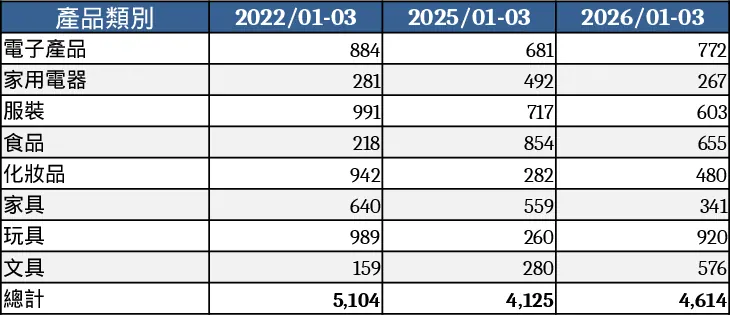
General Purpose Excel with Category Breakdown Template
A versatile Excel template that lets you organize data, track key metrics, and generate clear reports for any business need.