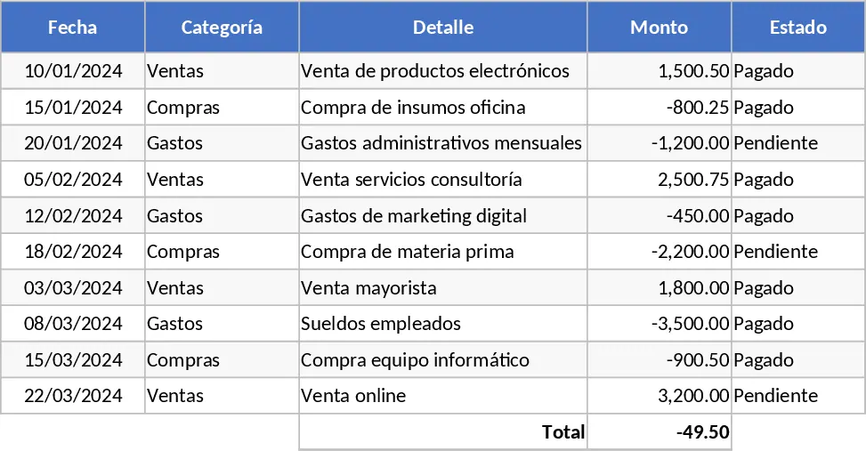
Hello Message Log with Charts Template
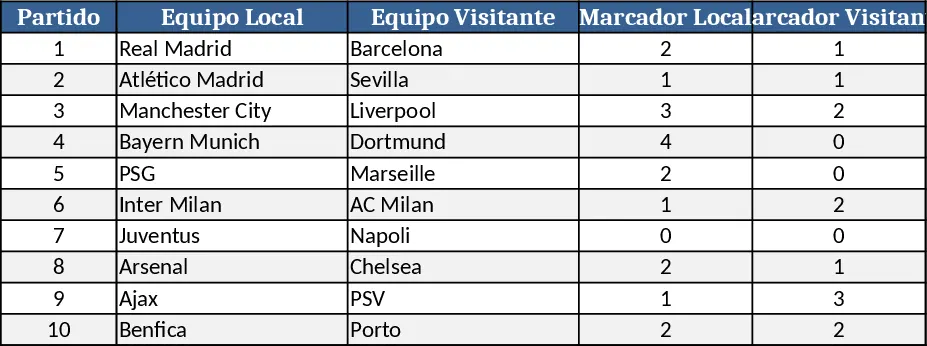
This template provides a ready‑made workbook designed to capture every piece of information related to hOLA in a structured, easy‑to‑use format. The file contains three main sheets: Data Entry, Lookup & Settings, and Dashboard. In the Data Entry sheet you’ll find a table with columns for Date, Category, Description, Quantity, Cost, Status, and Comments. Dropdown lists on Category and Status pull their options from the Lookup sheet, ensuring consistent terminology across the file. The Lookup sheet also holds any custom codes, conversion rates, or reference tables you might need, and you can edit these lists at any time. The Dashboard sheet automatically aggregates the raw entries into key metrics – total quantity, total cost, average cost per unit, and a simple trend chart that visualizes weekly or monthly activity. All calculations are built with dynamic ranges, so adding new rows instantly updates the summary without any extra steps.
The template is ideal for anyone who needs to keep a systematic record of hOLA‑related activities, whether that’s a small team tracking project milestones, a department monitoring resource usage, or an individual maintaining a personal log. By centralising data entry and automatically generating summaries, the workbook eliminates the need for manual tallying, reduces errors from inconsistent naming, and gives you instant insight into performance trends. This helps you spot bottlenecks, allocate resources more efficiently, and make data‑driven decisions without leaving Excel.
Who benefits most? Project coordinators, operations staff, finance analysts, or any stakeholder who regularly records hOLA events and wants a quick visual overview. The template works well in weekly status meetings, monthly reviews, or ad‑hoc audits, providing a single source of truth that can be shared with colleagues or exported for further analysis.
How to use:
- Open the workbook and go to the Data Entry sheet. Fill in each row with the relevant details – select the appropriate Category and Status from the dropdowns, and enter numbers for Quantity and Cost.
- If you need new categories or status options, edit the lists on the Lookup sheet; the dropdowns will update automatically.
- Switch to the Dashboard sheet to see real‑time totals, averages, and a simple line chart that reflects the data you just entered.
- Save the file and, if needed, export the Dashboard as a PDF or copy the chart into presentations.
Expected benefits include a noticeable reduction in time spent compiling reports, fewer data‑entry mistakes, and faster access to actionable insights, allowing you to focus on decision‑making rather than spreadsheet maintenance.
Similar Templates Recommendation
Personal Data Organizer Template
A versatile Excel sheet to organize and view any data you have, with customizable tables, dropdowns, and summary charts.

General Purpose Excel with Data Validation Template
A versatile, customizable Excel template that you can adapt to track data, manage projects, or analyze metrics across any business need.
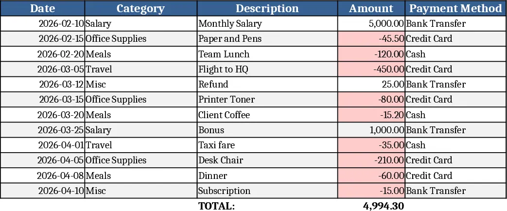
General Purpose Excel with Category Breakdown Template
A versatile Excel template that lets you organize data, track key metrics, and generate clear reports for any business need.