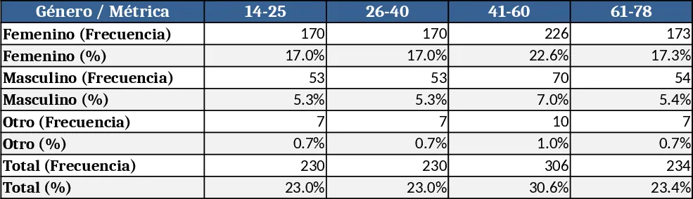
Bar Chart Dashboard Template
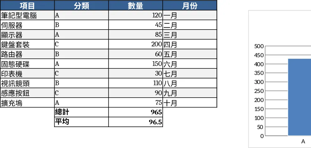
This template gives you a ready‑made framework for building bar charts in Excel. It consists of three sheets: a Data Input sheet where you list categories and values (or multiple series), a Chart Settings sheet with dropdowns for chart orientation, color scheme, axis titles and sorting options, and a Bar Chart sheet that displays a dynamic chart linked to the inputs. As soon as you add or edit numbers, the chart refreshes automatically, letting you see trends and comparisons instantly.
The template is perfect for anyone who needs to turn raw numbers into clear visual stories—sales managers tracking quarterly performance, finance teams comparing expense categories, teachers showing test score distributions, or project leads monitoring task completion rates. By automating the chart‑building process, it eliminates the repetitive steps of selecting data ranges, formatting axes, and styling bars, so you can focus on interpreting results rather than fiddling with graphics.
How to use
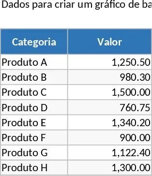
- Open the Data Input sheet and enter your categories in column A and the corresponding values in column B (add extra columns for additional series if needed).
- Switch to the Chart Settings sheet and pick your preferred orientation (vertical or horizontal), choose a color palette, and set axis titles using the provided dropdowns and text boxes.
- Go to the Bar Chart sheet—your chart updates instantly to reflect the data and settings you just entered.
- Copy the chart to PowerPoint, Word, or another workbook, or keep it in the template for ongoing reporting.
Expected benefits: you’ll spend far less time formatting charts, reduce the chance of manual errors, and produce professional‑looking visuals that make your reports more persuasive.
Similar Templates Recommendation
Blue Bar Chart Template
Visualize your data trends and comparisons using a professional blue-themed bar chart designed for clear reporting and analysis.
Simple Bar Chart Template
Visualize and compare data categories easily with this clean bar chart template designed for quick reporting and clear data presentation.
Occupation Distribution Horizontal Bar Chart Template
Visualize respondent occupation distribution with a ready‑made horizontal bar chart showing percentages for each category.