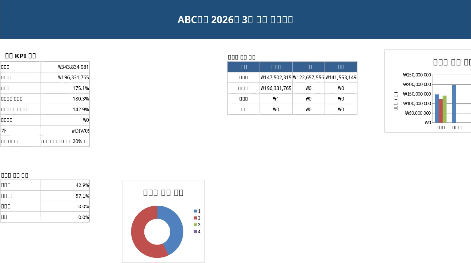
Sales Goal Tracker & Weekly/Monthly Dashboard Template
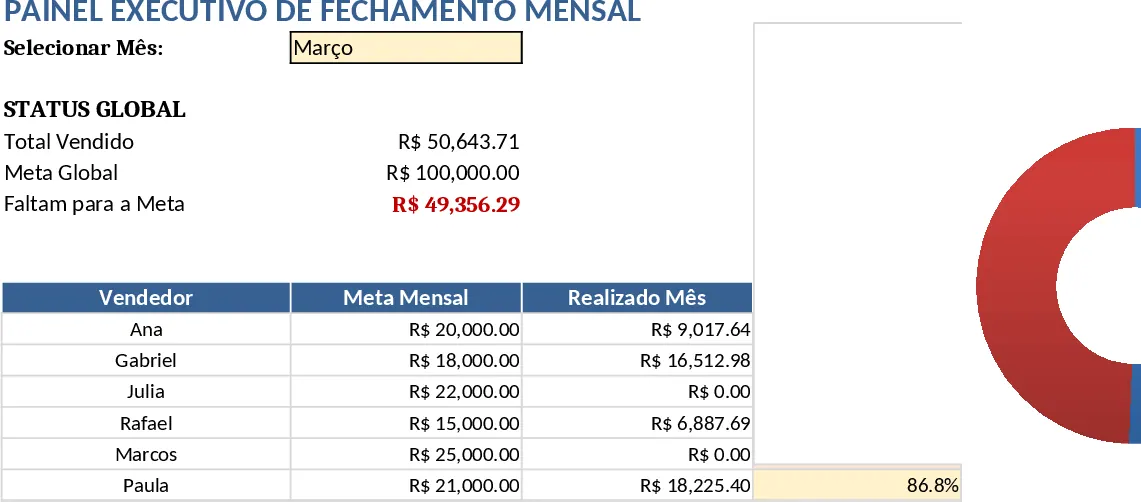
The template is organized into four clear tabs that work together as a single data engine. ⚙️ Configurações holds all master lists – salespeople, individual monthly targets, team goals, weeks, months and loss reasons – and drives every dropdown in the workbook, guaranteeing consistent naming and eliminating manual entry errors. 📝 Lançamentos is the central data table where each row records one salesperson’s results for a specific week, including sold value, quantity, average ticket, referrals, reactivations, pipeline balance and lost value. Formulas automatically calculate the average ticket and pull the appropriate targets from Configurações. 📊 Painel da Semana reads the weekly slice of the Lançamentos sheet based on the week and month you select in the top filter cell. It shows a summary card with total sales, weekly target, achievement percentage (color‑coded), a bar chart ranking sellers, and key indicators such as referrals and ticket size. 🏆 Painel do Mês aggregates the same data at the month level, displaying a gauge or doughnut chart of total sales versus the team’s monthly goal, a highlighted shortfall amount, and a detailed table that lists each seller’s target, actual sales, achievement % and a status badge. Conditional formatting flags anyone who has fallen below 80 % for three consecutive months, turning the name cell red for quick risk identification.
This workbook solves the most common pain points for sales managers: inconsistent data entry, duplicated calculations, and time‑consuming manual reporting. By feeding every visual element from a single, validated source, the weekly and monthly dashboards always reconcile – the monthly total is simply the sum of the weekly figures. The visual layout replaces dense numeric sheets with intuitive charts, gauges and color alerts, making weekly tactical meetings and monthly performance reviews fast and focused. Adding a new salesperson is as easy as typing the name in Configurações; the new name instantly appears in all dropdowns, charts and summary tables without any formula adjustments. The solution is ideal for sales leaders, regional managers, and business owners who need a reliable, scalable way to monitor quotas, spot under‑performance early, and keep the team aligned on targets.
How to use:
- Open the Configurações tab and enter every salesperson’s name, their monthly sales target and any global team targets; the sheet will auto‑calculate weekly targets. 2. Each Monday, go to Lançamentos and add a new row for every seller, selecting the month, week and name from the dropdowns, then fill in the sold amount, quantity and other metrics – the sheet will compute ticket average and pull the correct targets automatically. 3. Switch to Painel da Semana, choose the week and month you want to review in the filter cell, and instantly see a color‑coded achievement card, ranking chart and key indicators for that period. 4. For a broader view, go to Painel do Mês, pick the month, and review the gauge, shortfall message and individual performance table, including any risk alerts.
By centralizing data entry and automating calculations, the template reduces the time spent on manual consolidation, cuts errors, and gives you a clear visual pulse on sales performance every week and month.
Similar Templates Recommendation
Business Dashboard Template
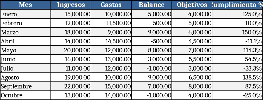
A customizable analytics dashboard template that lets you consolidate key metrics, visualize trends, and monitor performance at a glance.
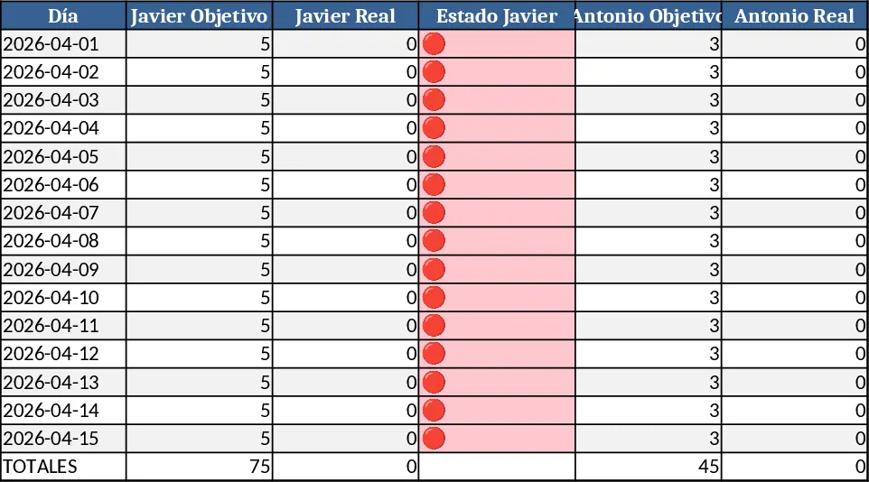
Commercial Points Tracking & Ranking Template
Track daily sales points for each rep, see real‑time traffic‑light status, and get team totals and rankings in one Excel sheet.
Professional Sales Closing Dashboard Template
A ready‑to‑use Excel dashboard that lets you input monthly sales data and instantly see KPI summaries, trend charts and detailed tables for executive reporting.