Professional Sales Closing Dashboard Template
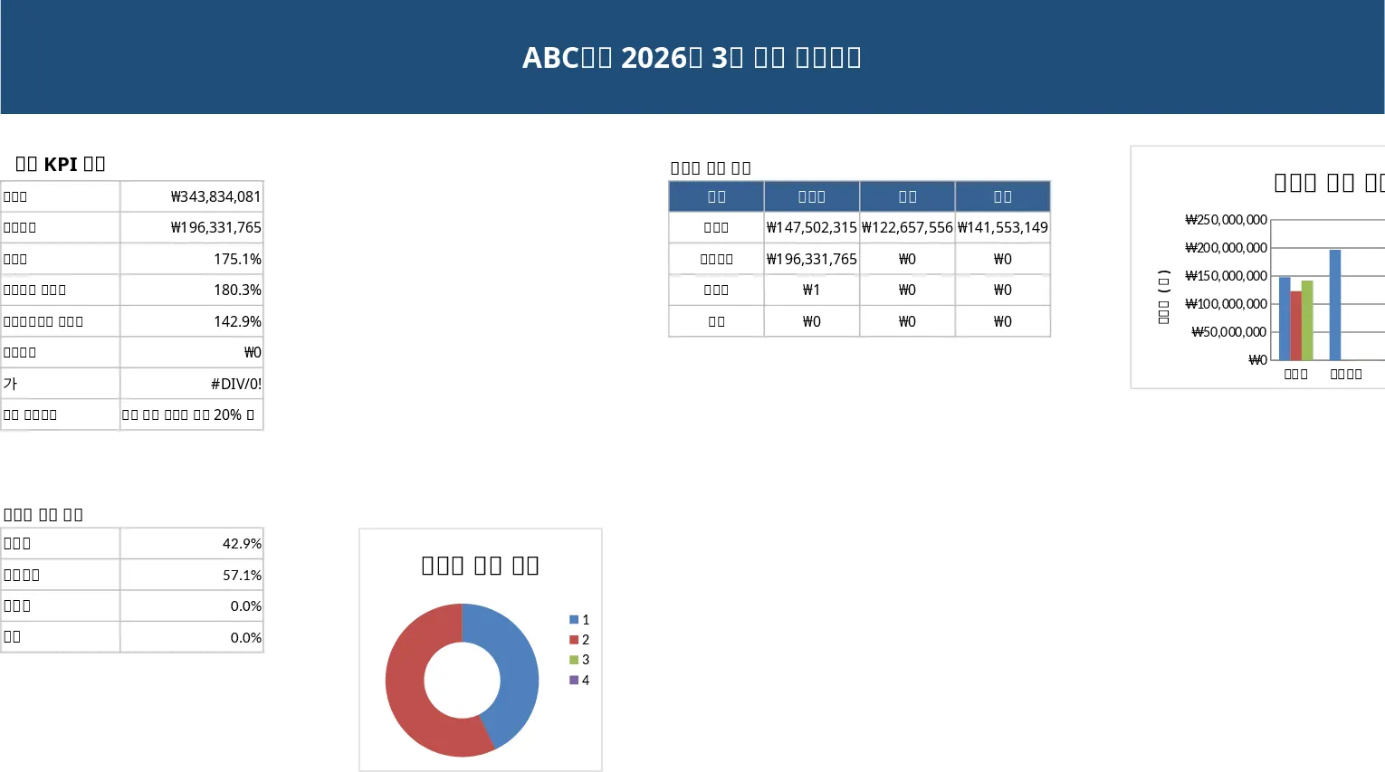
The Sales Closing Dashboard template is organized into four worksheets: a clean, executive‑style Dashboard, a Raw Data sheet, a Calculations sheet, and an optional Codebook sheet. The Dashboard sheet features a bold blue title bar, a KPI summary table with total sales, target, achievement rate, month‑over‑month and year‑over‑year changes, order count and average order value. Below the KPI block you’ll find a donut chart that visualizes sales share by channel or product category, and two vertical bar charts that compare channel performance and month‑to‑month or year‑to‑year trends. At the bottom, two side‑by‑side tables provide detailed breakdowns – one for channel‑level sales and another for product‑group sales, each showing targets, actuals, variances and percentages.
This template solves the common pain of manually aggregating sales numbers for monthly close. By linking all calculations to the Raw Data sheet, any change to the source rows automatically updates the KPI values and charts, eliminating repetitive copy‑paste and reducing errors. It’s especially useful for sales analysts, finance partners, and managers who need to prepare polished, data‑driven reports for senior leadership on a recurring basis.
Who benefits? Sales operations teams, regional managers, and finance analysts who need a fast, repeatable way to present monthly performance. The template tracks total revenue, target achievement, growth rates, order volume, average order value, and detailed channel and product breakdowns – all essential metrics for evaluating sales health and making informed decisions.
How to use
- Open the file and go to the Raw Data sheet. Replace the sample rows with your actual sales transactions, keeping the column headings (Date, Month, Channel, Customer, Product, Category, Quantity, Sales Amount, Target, Prior Month, Prior Year, Remarks).
- If you want to filter by a specific month, use the dropdown in the Dashboard sheet’s header to select the month; the KPI table, charts and detail tables will refresh automatically.
- Review the KPI summary at the top of the Dashboard – totals, percentages and variances are calculated with SUMIFS, COUNTIFS and simple arithmetic formulas.
- Export or print the Dashboard (A4 landscape) for your executive meeting; the layout is already optimized for a professional look.
Expected benefits: Saves hours of manual consolidation each month, improves data accuracy, and delivers a polished, ready‑to‑present sales report with just a few clicks.
Similar Templates Recommendation
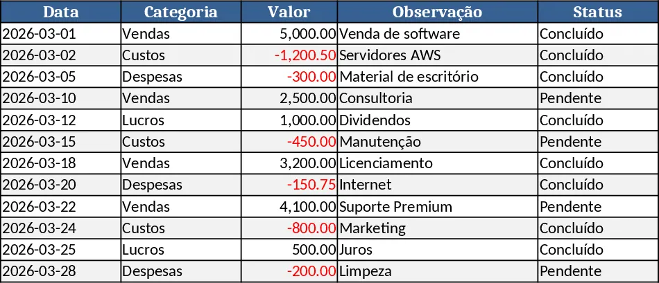
Monthly Sales Report Template
A ready‑to‑use Excel template that lets you quickly compile, analyze, and visualize monthly sales data in a professional report.
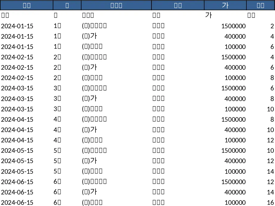
Data Extraction Chart Template
Create dynamic extraction charts in Excel to visualize data pulls, track trends, and generate instant visual reports.
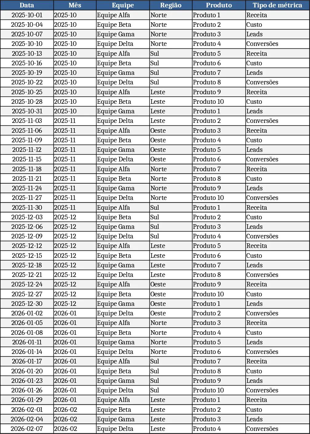
Monthly Business KPI Dashboard Excel with Charts Template
Track monthly business performance with an interactive KPI dashboard that visualizes revenue, costs, leads, conversions and top products.