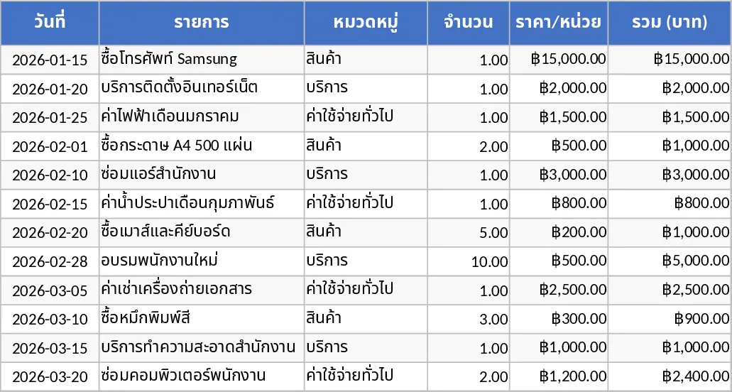
Data Extraction Chart Template
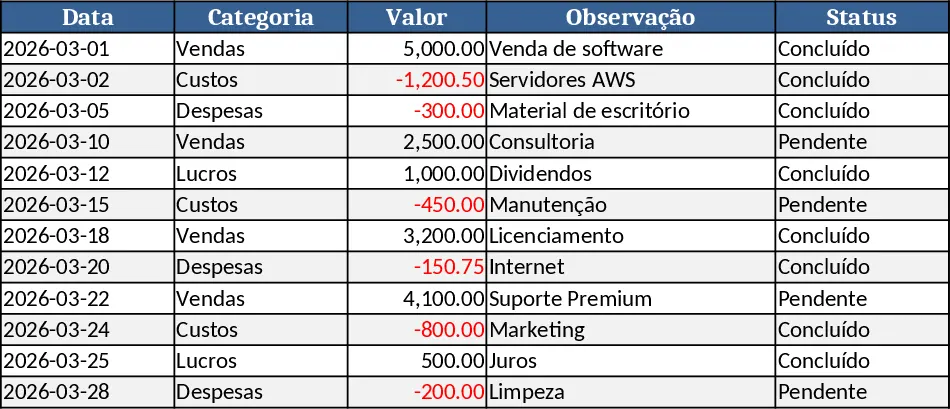
This Excel template lets you turn raw data into a live extraction chart with just a few clicks. It is organized into three sheets: Data Input, where you paste or import your source table; Extraction Settings, where you define the range, filters, and aggregation rules using simple dropdowns and date pickers; and Chart Dashboard, which automatically builds a chart based on the settings and displays a summary table of key figures.
The template solves the common pain of manually creating charts every time new data arrives. By linking the chart to the extraction logic, any change in the source data instantly updates the visual, so you always have an up‑to‑date view of trends, totals, or ratios. This saves the repetitive steps of selecting ranges, applying formulas, and formatting charts, letting you focus on interpreting results instead of building them.
It is ideal for business analysts, sales managers, operations supervisors, or anyone who needs a quick visual snapshot of extracted metrics. Whether you are monitoring monthly sales performance, tracking inventory levels, or reviewing project milestones, the template adapts to any numeric dataset and presents the information in a clear, shareable chart.
The template helps you track extraction parameters, manage filter criteria, and produce a polished visual report that can be copied into presentations or dashboards. Because the chart is driven by formulas and named ranges, you avoid errors that often arise from manual chart adjustments.
How to use
- Paste your raw data into the Data Input sheet, ensuring column headers match the template’s expected fields.
- In the Extraction Settings sheet, select the columns to analyze, set any date or category filters, and choose the chart type (line, bar, pie) from the dropdown.
- Switch to the Chart Dashboard sheet – the chart updates automatically, and a summary table shows the calculated totals and percentages.
- Refresh the workbook whenever new data is added; the chart and summary will reflect the latest figures.
Expected benefits include a noticeable reduction in the time spent building and updating charts, more consistent reporting, and clearer visual communication of key metrics.
Similar Templates Recommendation
Professional Sales Closing Dashboard Template
A ready‑to‑use Excel dashboard that lets you input monthly sales data and instantly see KPI summaries, trend charts and detailed tables for executive reporting.
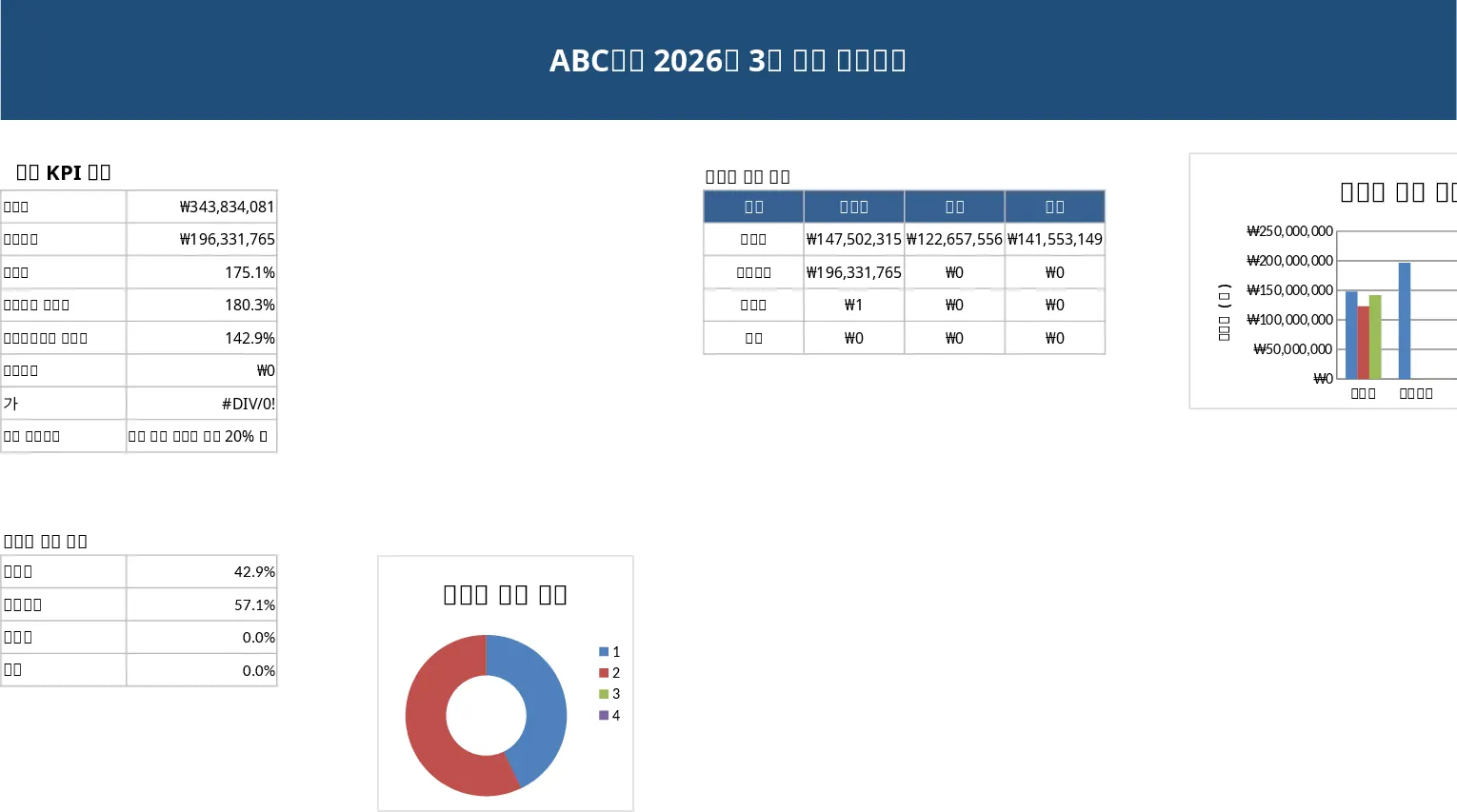
General Purpose Excel with Category Breakdown Template
A versatile Excel template that lets you organize data, track key metrics, and generate clear reports for any business need.
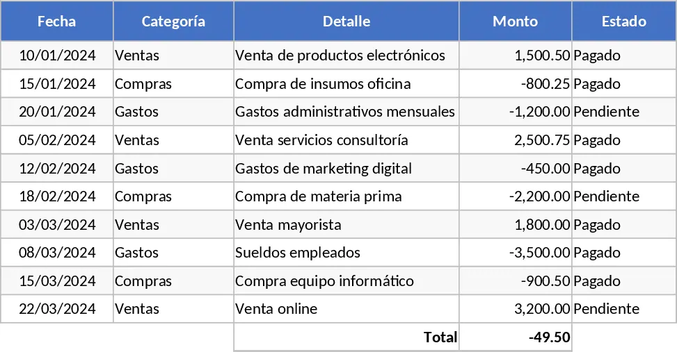
Calculation and Summary Report Template
A versatile Excel template that lets you input raw data, run calculations, and instantly generate clear summary tables and charts.