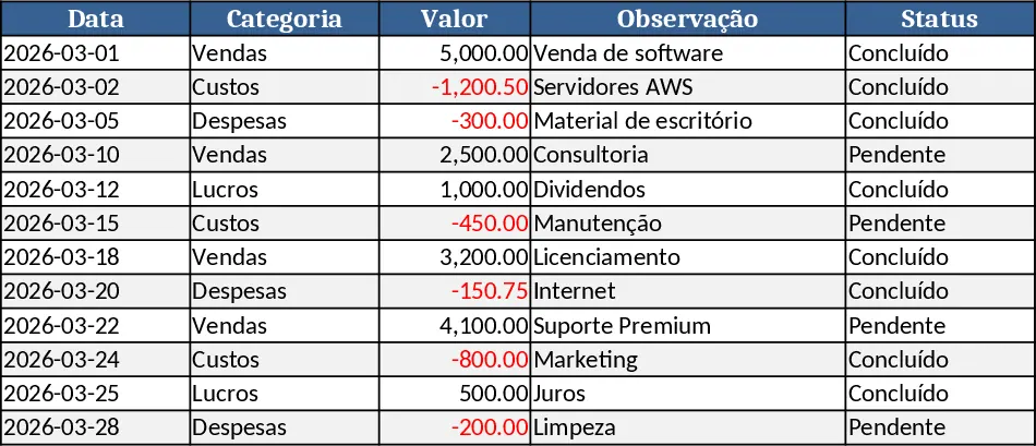
Business Dashboard Template
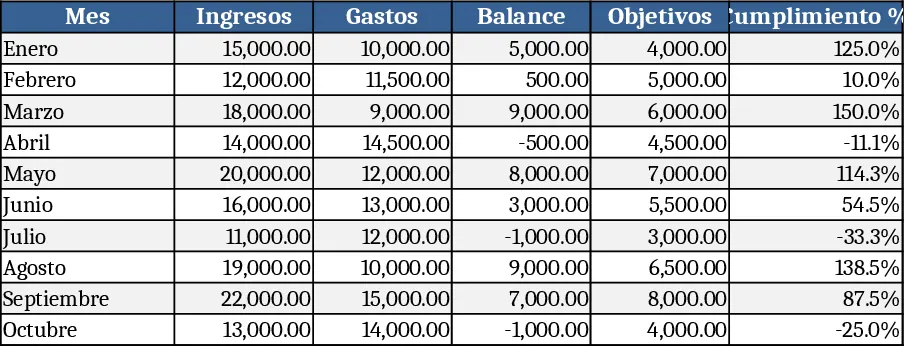
The Dashboard template is built on three interconnected sheets – Data Input, KPI Settings, and Dashboard. In the Data Input sheet you paste or type raw records such as dates, categories, amounts, or counts. The KPI Settings sheet lets you define which metrics you want to watch, choose aggregation methods, and set up dropdowns for time periods, regions, or product lines. The Dashboard sheet pulls everything together with dynamic charts, scorecards, and summary tables that update automatically when the source data changes. Built‑in slicers and dropdown menus let you switch views without editing formulas.
This template solves the common headache of assembling weekly or monthly reports from scattered spreadsheets. Instead of copying‑pasting numbers into PowerPoint or writing separate charts, you have a single place where data is entered once and visualized instantly. It reduces manual errors, speeds up the reporting cycle, and gives you a clear visual story of how key performance indicators are trending over time. Whether you need to track sales revenue, operating expenses, project milestones, or employee turnover, the dashboard adapts to any set of numbers you feed it.
The primary audience includes business analysts, department managers, small‑business owners, and anyone who needs a quick, reliable view of their numbers. It works best in scenarios where you regularly collect quantitative data and want to see it summarized for meetings, executive reviews, or daily check‑ins. By centralizing data and providing ready‑made visualizations, the template helps you stay on top of performance without spending hours building charts from scratch.
With this template you can track month‑over‑month growth, compare actuals against targets, monitor budget variances, and spot emerging trends. The visual scorecards highlight whether each KPI is on track, while the line and bar charts reveal patterns that raw tables hide. Because the calculations are pre‑wired, you get instant insight into the health of your business and can make data‑driven decisions faster.
How to use
- Open the template and go to the Data Input sheet; paste your raw data into the predefined columns (Date, Category, Value, etc.).
- Switch to KPI Settings and select the metrics you want to display, set target values, and choose the time‑frame dropdowns that matter to you.
- Navigate to the Dashboard sheet; the charts and scorecards will refresh automatically, or click the Refresh button if you have macros enabled.
- Use the slicers at the top of the dashboard to filter by month, region, or any other dimension you defined.
Expected benefits: you’ll spend far less time assembling reports, enjoy consistent visual output, and gain quicker insight into the numbers that drive your business.
Similar Templates Recommendation
Project Dashboard Template
A ready‑to‑use analytics dashboard template that lets you import data, view key performance indicators, and track trends with interactive charts and summary tables.
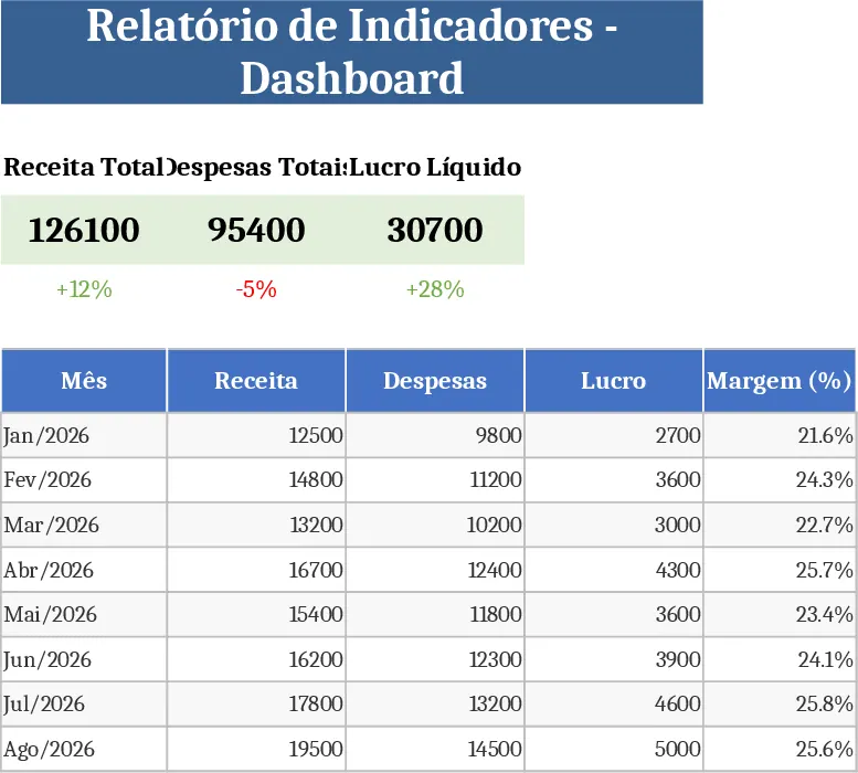
Interactive Data Dashboard with KPI Cards Template
Track metrics, visualize data trends, and gain actionable insights with this customizable multi-purpose dashboard template.
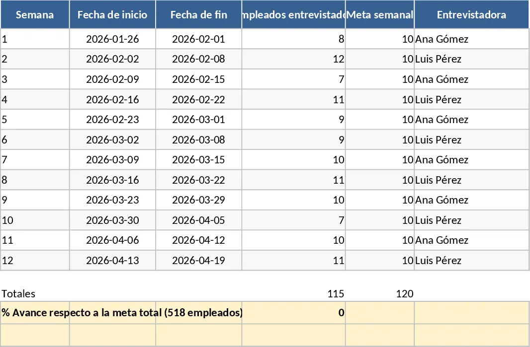
Data Extraction Chart Template
Create dynamic extraction charts in Excel to visualize data pulls, track trends, and generate instant visual reports.