Simple Pie Chart Dashboard Template
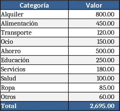
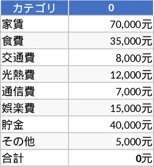
This Excel template is a ready‑to‑use pie‑chart builder that lets you turn raw numbers into clear, colourful circular graphs. The workbook contains three sheets: a Data Input sheet where you list categories and their values, a Chart Settings sheet with dropdowns for colour palettes, label options and explode settings, and a Pie Chart sheet that automatically renders the visual based on your entries. Key fields include Category Name, Value, Color Code and optional Notes. The chart updates instantly as you edit the data, and a small summary table shows each slice’s percentage and cumulative total.
The template solves the common hassle of manually creating and formatting pie charts for presentations, status reports or dashboards. Instead of fiddling with Excel’s chart wizard each time, you get a consistent look, accurate percentages and a professional layout with a single click. It saves time, reduces formatting errors, and ensures that every stakeholder sees the same visual language, making it easier to spot dominant categories, compare periods, or highlight outliers.
Ideal for analysts, marketers, project managers or anyone who needs to illustrate how a whole is divided among parts—whether you’re tracking market share, expense categories, survey responses, or product mix. Use it in quarterly business reviews, budget meetings, sales performance summaries, or classroom projects where visual impact matters.
The template helps you track category contributions, calculate real‑time percentages, and produce a polished chart that can be copied into PowerPoint, Word or PDFs. By automating the calculation of totals and percentages, it eliminates manual errors and lets you focus on interpreting the data rather than formatting it.
How to use
- Open the Data Input sheet and fill in each row with a category name and its numeric value; optionally assign a colour code.
- Switch to the Chart Settings sheet to choose a colour theme, decide whether to display data labels, and set any slices to “explode” for emphasis.
- Go to the Pie Chart sheet; the chart refreshes automatically, and the adjacent summary table shows percentages and totals.
- Copy the chart to your report or presentation, or export the workbook as PDF for distribution.
Expected benefits include faster report preparation, consistent visual branding, and clearer communication of how individual items contribute to the overall picture, all without the need for advanced chart‑building skills.