Applied Values & Profitability Dashboard Template
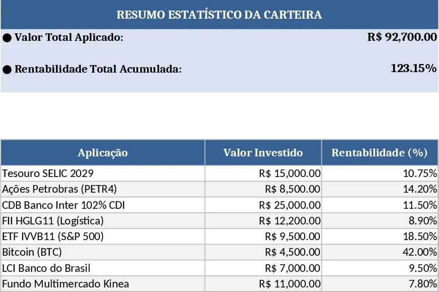
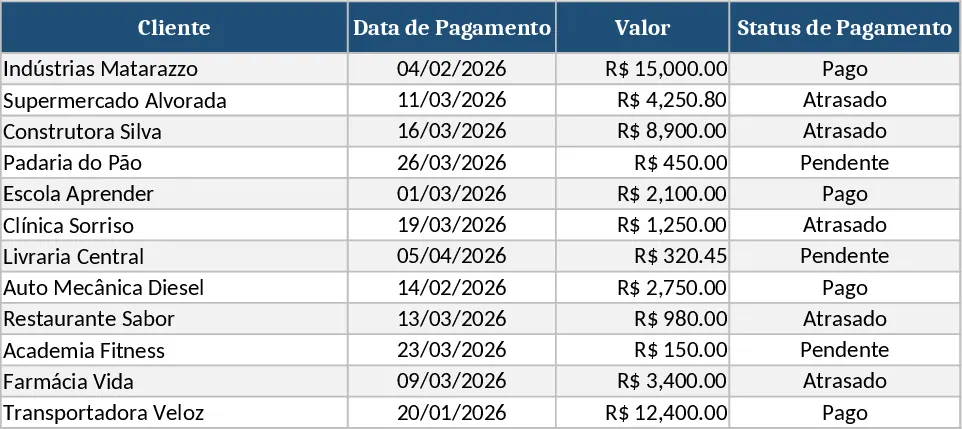
This Excel template turns a simple data table of investments into a clean, bullet‑style dashboard. The workbook is split into three sheets: Data Input, where you paste or type each transaction with fields such as Date, Asset, Amount Invested, and Return; Calculations, which automatically aggregates the total invested capital, computes cumulative return, and derives key ratios like ROI and annualized yield; and Dashboard, where dynamic bullet charts display the total applied value and total profitability at a glance, plus optional slicers to filter by asset class or period.
The template is perfect for financial analysts, portfolio managers, or anyone who needs to monitor the performance of multiple investments without digging through raw numbers. It solves the common problem of manually summarising large datasets and creating ad‑hoc charts, saving you time and reducing errors. By visualising the totals in bullet form, you get an immediate sense of whether targets are being met and can quickly spot trends or outliers.
How to use:
- Open the Data Input sheet and fill in each row with your investment details; the template includes dropdowns for Asset categories to keep data consistent.
- The Calculations sheet updates automatically – no formulas to edit – and shows the aggregated totals.
- Switch to the Dashboard sheet; the bullet charts refresh in real time, reflecting the latest numbers.
- (Optional) Use the slicers at the top of the dashboard to view performance for specific assets or date ranges.
Expected benefits: you’ll spend far less time preparing reports, get instant visual insight into total capital and returns, and improve decision‑making with reliable, up‑to‑date figures.