
Data Visualization - Page 3
Learn how AI tools simplify data visualization for beginners. Discover how to create stunning charts and graphs effortlessly with tools like RowSpeak. Page 3 of 6, showing results 73-108 of 189.
 Excel Automation
Tired of Manual Formatting? Style Your Excel Reports Instantly with AI
Tired of manually formatting every Excel report? Applying cell styles and conditional formatting rules is tedious and inconsistent. Discover how an Excel AI like RowSpeak can instantly create professional, data-driven formatting from a simple text command.
Ruby • Data Visualization
Stop Clicking Around: Add Error Bars to Excel Charts Instantly with AI
Tired of navigating endless menus just to add error bars to your Excel charts? See how RowSpeak, an Excel AI agent, lets you create charts with custom error bars using simple text commands, turning a tedious task into a quick conversation.
Ruby • Excel Charts & Visualization
Stop Clicking: Create Excel Scatter Plots Instantly with AI
Tired of clicking through menus to create a scatter plot in Excel, especially with multiple data series? This guide shows you a much faster way. Learn how to use Excel AI to generate complex correlation charts instantly, just by asking a question.
Ruby • Excel Automation
Stop Wasting Hours on Excel Formatting: Create Presentation-Ready Reports with AI
Tired of spending hours manually formatting Excel reports to make them look professional? You're not alone. Discover how an Excel AI agent like RowSpeak can instantly transform your raw data into polished, presentation-ready charts and tables, saving you time and eliminating tedious work.
Ruby • Data Visualization
Forget Manual Bins: Create Instant Histograms in Excel with AI
Tired of wrestling with the Data Analysis ToolPak or the FREQUENCY function just to visualize data distribution? Discover a smarter way. This guide shows you how an Excel AI can create perfect histograms instantly, saving you time and eliminating manual setup.
Ruby •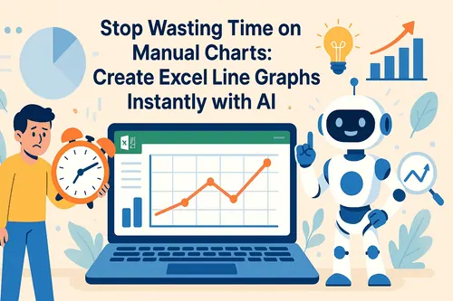 Data Visualization
Stop Wasting Time on Manual Charts: Create Excel Line Graphs Instantly with AI
Tired of endlessly clicking through Excel menus to create a simple line graph? Discover how to visualize trends instantly. This guide contrasts the slow, manual method with a new AI-powered approach using RowSpeak, turning your raw data into insightful charts with just a few words.
Ruby • AI Dashboard
Stop Building Excel Dashboards Manually: Let AI Do It For You
Tired of spending hours wrestling with pivot tables, slicers, and chart formatting to build a sales dashboard? Discover a new way. This guide shows you how to ditch the manual grind and use Excel AI to create dynamic, interactive dashboards with simple text prompts.
Ruby •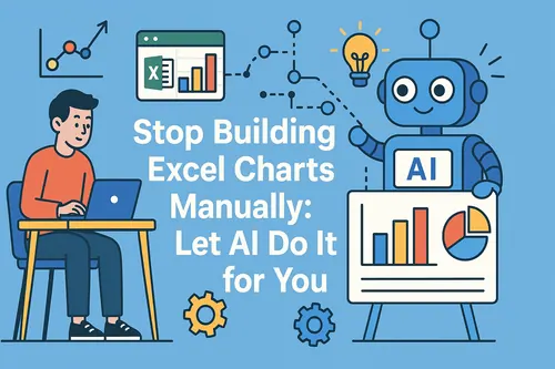 Data Visualization
Stop Building Excel Charts Manually: Let AI Do It for You
Tired of fiddling with Excel's chart wizard or hunting for the perfect template? Discover a new way to visualize your business data. This guide shows you how to ditch manual charting and use Excel AI to generate any chart you need, just by asking.
Ruby •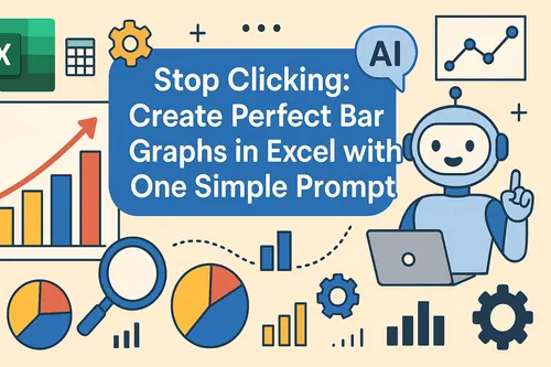 Data Visualization
Stop Clicking: Create Perfect Bar Graphs in Excel with One Simple Prompt
Tired of endlessly clicking through Excel menus to create a simple bar graph? This guide shows you the old, slow way and a new, faster method using Excel AI. See how RowSpeak can turn your sales data into a perfect bar chart in seconds, just by asking.
Ruby •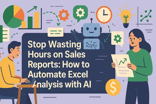 Excel Automation
Stop Wasting Hours on Sales Reports: How to Automate Excel Analysis with AI
Tired of spending hours cleaning raw sales data and wrestling with MID, SUMIFS, and COUNTIFS formulas? Discover how an Excel AI agent like RowSpeak can automate the entire process, from data extraction to creating summary charts, just by using plain English commands.
Ruby • AI Dashboard
The Ultimate Guide to Excel Dashboard Tools: Find Your Perfect Fit
This article explains the 8 core dashboard types used in modern business, who they are for, and their key KPIs. Learn the simple method to choose the right one, ensuring your data tells a clear and actionable story.
Gogo • AI Dashboard
RowSpeak Tutorial: From Excel to Dashboard with AI (The Complete Guide)
This comprehensive RowSpeak tutorial guides you from uploading your Excel file to sharing a finished AI-powered dashboard. Learn the 6-step process, key features, and how to edit every element. Master data visualization with no technical skills required.
Gogo • AI Dashboard
8 Types of Dashboards: How to Choose the Right One for Your Business
This article explains the 8 core dashboard types used in modern business, who they are for, and their key KPIs. Learn the simple method to choose the right one, ensuring your data tells a clear and actionable story.
Gogo • AI Dashboard
Why Your Next Dashboard Should Be AI-Powered: From Days to 10 Seconds
Why switch to AI dashboards? This post compares the old, slow process with the new AI-powered way that turns Excel into insights in seconds, detailing key advantages and a simple workflow.
Gogo • Data Visualization
Create Stunning Sankey Diagrams: A Guide for Excel, Python, and R
Sankey diagrams are powerful for visualizing flows, but creating them can be complex. This guide walks you through the process in Python and R, and compares the traditional add-in method in Excel with a new, AI-powered approach that simplifies everything.
Ruby • AI Dashboard
The Ultimate Guide to the Top 10 Dashboard Tools of 2025
This guide reviews 10 leading dashboard tools for 2025, including RowSpeak, Power BI, and Tableau. It provides clear pros, cons, and ideal use cases for each, helping you move beyond feature lists to find the tool that best matches your team's specific data goals and skills.
Gogo • AI Dashboard
What Is a Dashboard? Definition, Uses & Step-by-Step Guide
This guide covers the definition of a dashboard, its key uses in business, and why it's critical for real-time decisions. It also provides a step-by-step tutorial on how to build a professional dashboard quickly using RowSpeak.
Gogo • Excel Tips
Effortless PivotTable Conditional Formatting: A Modern Guide
Elevate your PivotTable reports. This guide compares two manual methods for applying conditional formatting in Excel with a new, AI-driven solution that lets you get instant visual insights using simple English commands. Spend less time clicking and more time analyzing.
Ruby • Data Visualization
Create Stunning Pie Charts in Excel: The Manual vs. AI Method
Tired of clicking through endless Excel menus to create a simple pie chart? This guide shows you the traditional method step-by-step and introduces a revolutionary AI-powered way to generate and customize charts instantly with a single command. See which method is right for you.
Ruby • Data Visualization
Creating Insightful Combo Charts in Excel The Classic vs. AI Approach
Unlock the power of combo charts to visualize diverse datasets in a single, insightful graphic. This guide walks you through creating them, comparing the classic manual process with a revolutionary AI-powered method that generates perfect charts from a simple command.
Ruby • Data Visualization
2 Fast Ways to Make a Gantt Chart in Excel (Including an AI Method)
Struggling with complex project timelines? This guide walks you through creating a Gantt chart in Excel. Discover the traditional step-by-step method and see how an AI assistant can build a professional chart for you in seconds, saving you time and effort.
Ruby • Data Visualization
Create Bar Graphs in Excel The Classic Method vs. The Instant AI Approach
Tired of clicking through endless menus to create a simple bar graph in Excel? This guide shows you the traditional method and introduces a revolutionary AI-powered way to generate charts instantly with just a plain English command. Compare both and speed up your reporting.
Tony • Data Visualization
Create Stunning Line Graphs in Excel: The Classic vs. The AI-Powered Way
Tired of clicking through endless menus to create a simple line graph in Excel? This guide shows you the traditional way and introduces a revolutionary AI method. Just ask, and your chart is ready. Discover how to turn your data into compelling visual stories in seconds, not minutes.
Ruby • Excel Tips
4 Effortless Ways to Create a Histogram in Excel (2025 Guide)
Struggling to visualize data distribution? This guide breaks down four powerful methods for creating histograms in Excel. We cover everything from the simple built-in chart to advanced formulas, and even introduce an AI-powered approach for instant results. Master histograms today!
Ruby • Data Visualization
Excel Sparklines: The Ultimate Guide to Mini Data Visualizations
Master Excel Sparklines to create compact, in-cell data visualizations. This guide covers everything from basic creation to advanced customization and compares the classic manual approach with the speed and simplicity of using an AI-powered assistant for instant trend analysis.
Ruby • Data Visualization
Beyond Manual Charts: How AI Charts Transform Gantt Chart Creation
Explore how AI Charts are transforming Gantt diagram creation. This guide shows how AI instantly generates dynamic project timelines through simple commands, replacing complex manual processes with intelligent automation.
Gogo • Data Visualization
The Future is Visual: Exploring the Top 8 AI Tools for Data Visualization
We review the Top 8 AI Tools for Data Visualization, including Tableau, Power BI & ThoughtSpot. Learn how AI automates charts and insights. RowSpeak emerges as the top choice for its seamless, intuitive interface that simplifies data storytelling.
Gogo • Data Visualization
Top 6 AI Chart Tools in 2025: That Turn Complex Data into Insights Instantly
This comprehensive guide reviews the six best AI chart tools of 2025 - RowSpeak, Julius AI, Microsoft Power BI, ChartAI, GraphMaker, and Alteryx - comparing their unique features and ideal application scenarios for different business needs.
Gogo •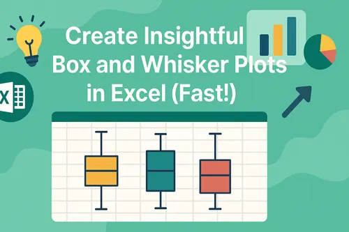 Data Visualization
Create Insightful Box and Whisker Plots in Excel (Fast!)
Tired of complex steps to create a box and whisker plot in Excel? This guide shows you three methods, including the traditional approach and a revolutionary AI-powered solution that generates perfect charts from a simple sentence. Unlock deeper data insights faster.
Ruby • Data Visualization
Stop Staring at Spreadsheets: How AI Data Visualization Turns Your Data into Instant Insights
This guide breaks down how AI data visualization transforms raw numbers into actionable insights. Explore tools like RowSpeak that analyze data through natural language, compare traditional and AI methods, and learn to create effective visualizations without technical expertise.
Gogo • Data Visualization
Research Paper Due? Create Publication-Ready Charts in 2 Minutes
The tedious process of manually formatting research charts in Excel is over. This guide reveals a simple AI method that turns experimental data into journal-ready visualizations with proper error bars and statistical markers using a single command.
Ruby • Calculation
How to Create a "Top 10 Bestsellers" Chart in Excel in 5 Seconds
Don't get bogged down in PivotTables. Learn the AI-powered method to instantly find and visualize your top 10 bestselling products from thousands of order lines. A 5-minute analysis, now done in seconds.
Gianna • Data Visualization
The 6 Best AI Chart Generators: An In-depth Review for 2025
Manual chart creation is a major efficiency bottleneck. AI chart generators offer a powerful solution, creating stunning visualizations from simple text commands. This guide reviews the 6 best tools on the market, including RowSpeak and Copilot, to help you choose the perfect one and transform your workflow.
Gianna •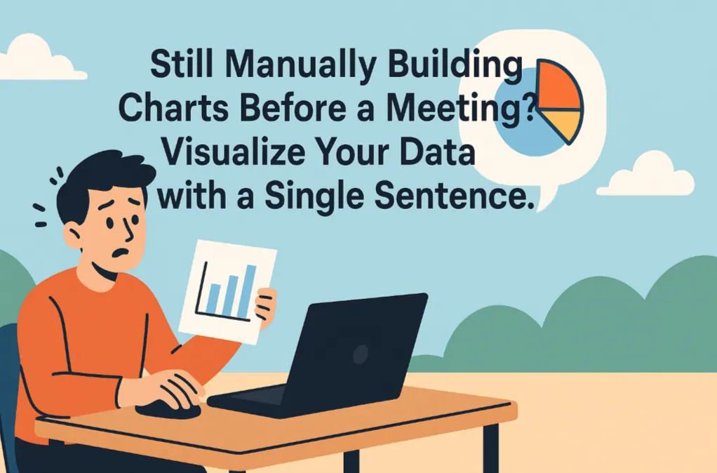 Graph Maker
Still Manually Building Charts Before a Meeting? Visualize Your Data with a Single Sentence.
Stop wasting time on manual chart creation. This guide shows how RowSpeak, an AI graph maker, replaces complex Excel steps with one command. Instantly turn raw data into insightful charts and focus on the story behind your data.
Gianna •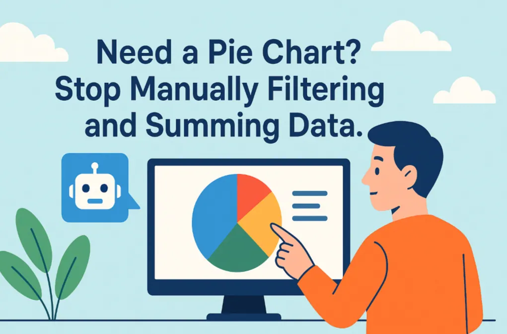 Data Visualization
Need a Pie Chart? Stop Manually Filtering and Summing Data.
Making a pie chart in Excel often means tedious filtering and pivot tables. This guide shows how RowSpeak’s AI pie graph maker simplifies this. Turn complex requests into a single sentence and get instant, presentation-ready visuals.
Gianna •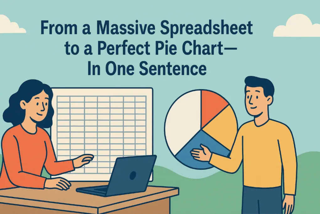 Data Visualization
From a Massive Spreadsheet to a Perfect Pie Chart—In One Sentence
Need to show a breakdown of your sales data but dread the multi-step Excel process? This guide shows you how to use a simple AI command to instantly filter massive datasets and generate a clear, accurate pie chart, freeing you up to focus on insights, not clicks.
Gianna •