
In today's world, we are surrounded by data. From sales figures and market trends to website traffic and customer feedback, numbers hold the secrets to smarter decisions and groundbreaking insights. But raw data, in its native form of endless rows and columns in a spreadsheet, can be overwhelming and difficult to interpret. This is where data visualization comes in, acting as the universal language that translates complex data into clear, compelling, and actionable stories.

What is Data Visualization and Why Does It Matter?
At its core, data visualization is the practice of converting numerical data into a visual context, such as a map or a graph. The primary goal is to make the information easier for the human brain to understand and process. Instead of poring over spreadsheets, you can see trends, identify patterns, and spot outliers at a single glance. A well-crafted chart can reveal the narrative hidden within your numbers far more effectively than a table ever could.
The importance of this practice cannot be overstated. Effective visualization helps you grasp difficult concepts and identify new patterns, which is crucial for strategic business planning. When you can "see" your data, you can make faster, more informed decisions. Furthermore, it's a powerful tool for communication, enabling you to share your findings with colleagues, stakeholders, and clients in a way that is both engaging and easy to digest.
The Challenges of Traditional Visualization
For years, creating charts and graphs has been a staple of spreadsheet software. However, the traditional process is often cumbersome and unintuitive, presenting several significant hurdles. Users typically face a steep learning curve, needing to master complex menus and formatting options. The process is manual and time-consuming: you must meticulously select the correct data ranges, guess which chart type best represents your data, and then spend considerable time adjusting colors, labels, and titles to make the output presentable. This friction discourages exploration and can feel more like a technical chore than a creative process of discovery. For many, the effort required to create even a simple chart can be a barrier to unlocking the insights held within their data.
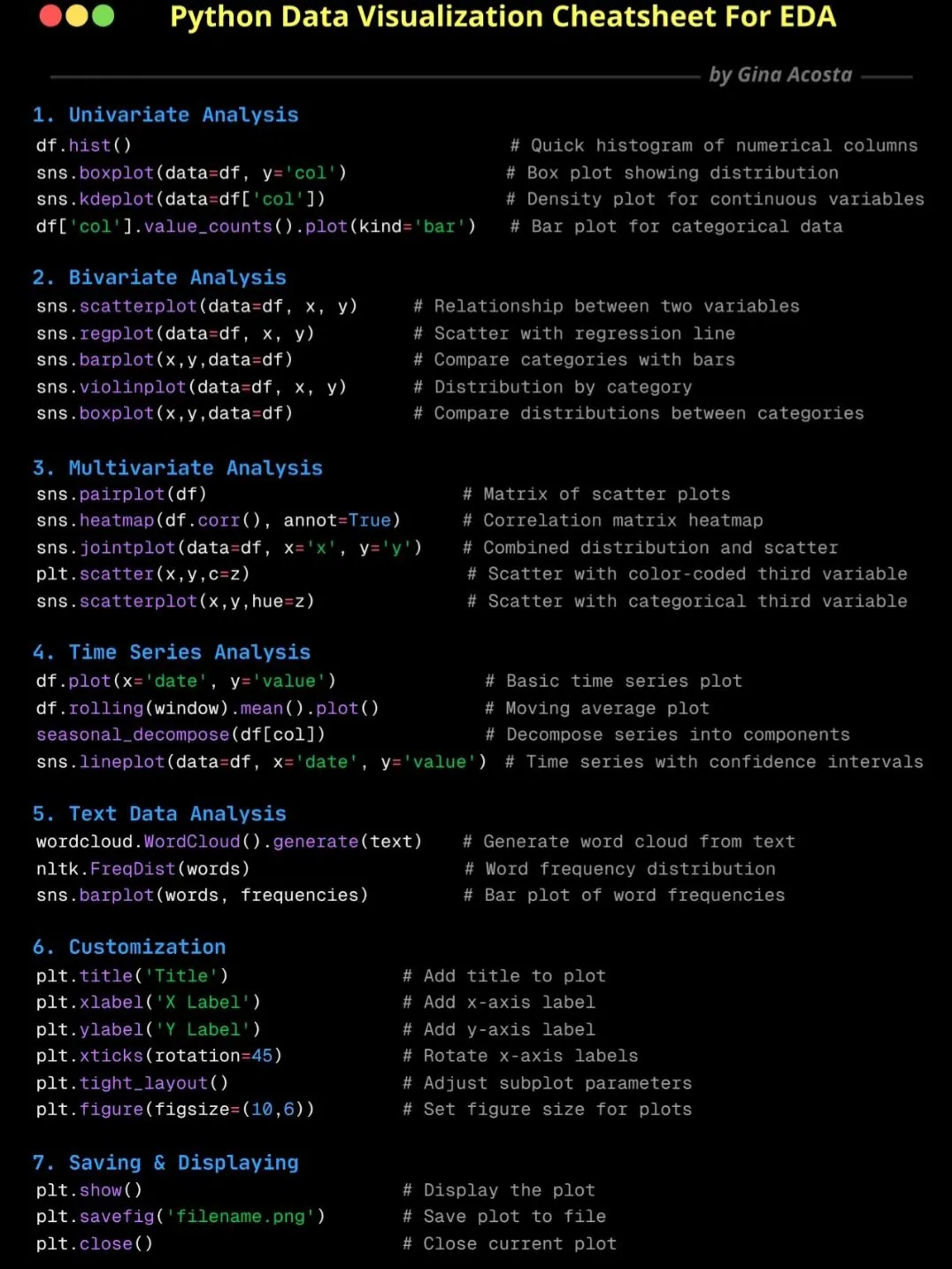
And if you want to create more complex visualizations, such as flowcharts or network diagrams, the process becomes even more daunting. You often need specialized software or advanced skills to draw shapes, connect lines, and format everything correctly. This complexity can lead to frustration and a reluctance to engage with data visualization at all.
Sometimes, you might write some python code to create the custom visualizations you need, but this requires programming knowledge and can be time-consuming.
The RowSpeak AI Way: Visualization Through Conversation
This is where RowSpeak revolutionizes the entire experience. We believe that creating a chart should be as easy as asking a question. By integrating a powerful AI engine, RowSpeak transforms data visualization from a manual task into an intelligent conversation. Instead of clicking through menus, you simply tell the AI what you want to see using natural language. The AI not only understands your request but also analyzes the underlying data to suggest the most effective chart type, automating the entire creation and formatting process. This shift empowers you to focus on what truly matters: understanding the story your data is telling.
Creating Any Chart Instantly with RowSpeak
Getting started with AI-powered visualization in RowSpeak is remarkably simple and intuitive. There's no need to select data ranges or browse chart menus. You just need to express your goal.
Let's walk through how you can create some of the most common and useful chart types with a simple command.
Crafting a Pie Chart for Proportions
Imagine you have a dataset containing sales figures broken down by different regions: North, South, East, and West. You want to quickly see which region contributes the most to your total sales. With traditional tools, you would need to select the region and sales columns, find the pie chart option, and then format the chart. With RowSpeak, you simply type a prompt like:
Show me the distribution of sales by region as a pie chart.
Instantly, the AI will analyze your data, identify the relevant columns, calculate the proportions, and generate a perfectly labeled and visually appealing pie chart. It understands context, so it knows "distribution" implies a part-to-whole relationship, for which a pie chart is ideal.
The following blogs will help you understand how to create pie charts and other data visualizations using RowSpeak:
 Data Visualization
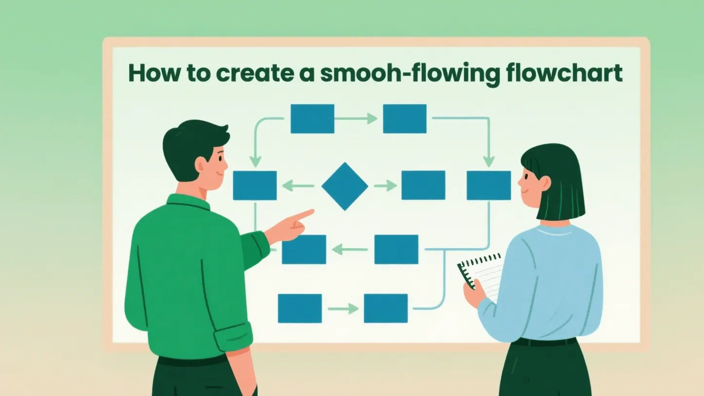
No Hand-Drawing Needed! Master Flowcharts with This One Trick!
Each time a flowchart is created, two software programs need to be switched, and the nodes and arrows have to be repeatedly adjusted. This not only wastes time but also makes the process prone to errors. With AI, data can be automatically retrieved and the flowchart can be drawn in just a few seconds. You can also become an expert in creating flowcharts.
 Data Visualization
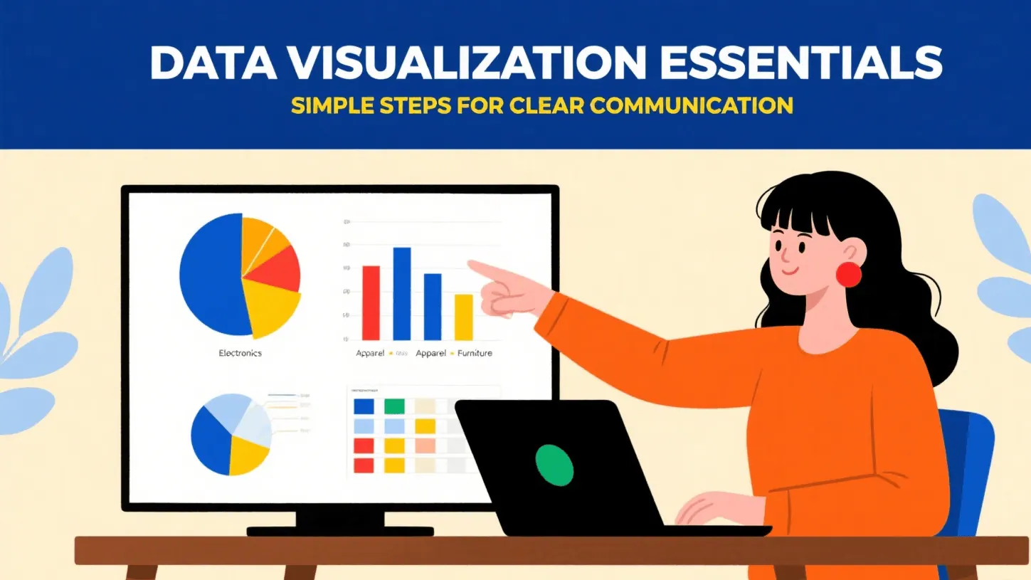
Workplace Lesson One: No Tools for Data Visualization Flowcharts = Wasted Effort!
Are you still envious of your colleagues' data visualization charts? Are you still trying to stay up late and practice making charts? If you are still racking your brains thinking about which chart to use and spending a lot of time pondering, then you will fall behind others. Putting in all your effort is not as good as using the right method. With the right AI tools, you can also become a chart expert.
 Data Visualization
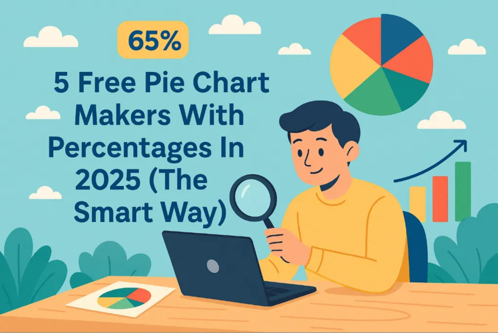
Tired of Confusing Spreadsheets? 5 Free AI Pie Chart Makers for Clear Sales Reports
Want to turn your numbers into clear, percentage-based pie charts in seconds? 📊 This guide reviews 5 free pie chart makers — including RowSpeak, Graphy, LiveChatAI, NoteGPT, and Edraw.AI — so you can choose the best tool to transform raw data into visuals that tell a story.
 Data Visualization
Create Stunning Pie Charts in Excel: The Manual vs. AI Method
Tired of clicking through endless Excel menus to create a simple pie chart? This guide shows you the traditional method step-by-step and introduces a revolutionary AI-powered way to generate and customize charts instantly with a single command. See which method is right for you.
 Data Visualization
How to Create Stunning Excel Charts with AI
are you still troubled by the analysis of massive data through charts? still spending a lot of time converting tables into pictures? let ai help you! just upload the file and have a chat, accurate and professional charts will be generated..
 Data Visualization
Which Device Loses the Most Carts? Let a Pie Chart Show You Instantly
Mobile users abandoning more carts? Desktop converting better? Find out which screen hurts your revenue most with a simple AI chart.
 Data Visualization
What’s Your Best-Selling Product? Find Out Instantly with This AI Chart Maker
Tired of guessing which product is driving most of your sales? Let an AI chart maker generate a pie chart or bar graph that shows your top-selling items—instantly and clearly.
 Data Visualization
Visualize Your E-commerce Category Sales with a Pie Chart
Stop wasting time building charts manually. Discover how Excel AI can generate clean, insightful pie charts from your data with just one simple prompt.
 Data Visualization
How to Instantly Create Pie Charts in Excel with AI Tools
Make stunning pie charts in Excel without touching a pivot table. Learn how Excel AI makes data slices easy to understand and beautiful to present.
 Data Visualization
How to Instantly Spot Repeat Buyers vs Newbies Using AI Charts
Brand stickiness or one-time hype? A simple pie chart tells you whether customers are coming back—or walking away.
 Data Visualization
From a Massive Spreadsheet to a Perfect Pie Chart—In One Sentence
Need to show a breakdown of your sales data but dread the multi-step Excel process? This guide shows you how to use a simple AI command to instantly filter massive datasets and generate a clear, accurate pie chart, freeing you up to focus on insights, not clicks.
 Data Visualization
Solving Flowchart Creation Challenges with One Secret Weapon: AI Tools
Instead of putting in ten times the useless effort, choose a good tool. Just upload your requirements and let AI read the file, and it will automatically generate the chart you want. Creating flowcharts isn't as difficult as you think.
 Data Visualization
Need a Pie Chart? Stop Manually Filtering and Summing Data.
Making a pie chart in Excel often means tedious filtering and pivot tables. This guide shows how RowSpeak’s AI pie graph maker simplifies this. Turn complex requests into a single sentence and get instant, presentation-ready visuals.
Plotting a Trend with a Line Chart
Now, let's say your spreadsheet contains monthly revenue data for the past two years. You want to visualize the performance trend over this period to identify seasonal patterns or growth trajectories. Instead of the tedious process of selecting the time and revenue columns and configuring a line graph, you just tell RowSpeak:
Create a line chart for the monthly revenue trend over the last 24 months.
The RowSpeak AI will recognize the time-series nature of your data, automatically place the months on the X-axis in chronological order, and plot the corresponding revenue on the Y-axis, presenting you with a clean, insightful line chart.
The following blogs will help you understand how to create line charts and other data visualizations using RowSpeak:
 Data Visualization
Stop Wasting Time on Manual Charts: Create Excel Line Graphs Instantly with AI
Tired of endlessly clicking through Excel menus to create a simple line graph? Discover how to visualize trends instantly. This guide contrasts the slow, manual method with a new AI-powered approach using RowSpeak, turning your raw data into insightful charts with just a few words.
 Data Visualization
Track Your Average Order Value with Excel AI Line Charts
Wondering if customers are spending more per order? Use Excel AI to track average order value (AOV) with clean, automated line charts that reveal the story behind your revenue.
 Data Visualization
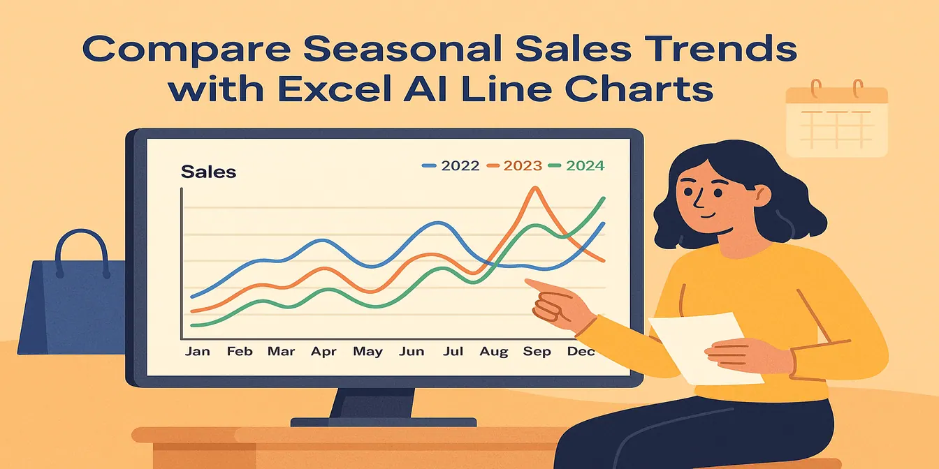
Compare Seasonal Sales Trends with Multi-Line Excel AI Charts
Track sales across multiple years and reveal your seasonality trends with just one Excel AI prompt. RowSpeak makes comparing monthly sales easy and accurate.
 Data Visualization
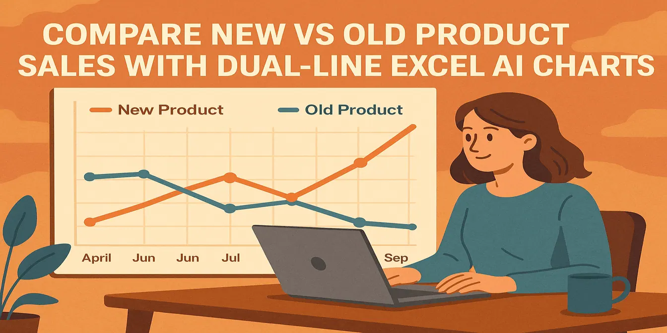
Compare New vs Old Product Sales with Dual-Line Excel AI Charts
Want to know if your new product is helping or hurting your old one? Use Excel AI dual-line charts to reveal growth, cannibalization, and revenue shifts with crystal clarity.
 Data Visualization
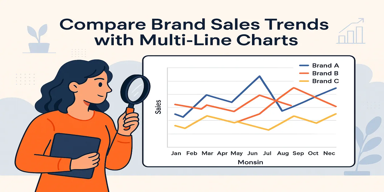
Compare Brand Sales Trends with Multi-Line Charts in Excel AI
Want to track your brand against competitors over time? Multi-line charts in Excel AI let you compare monthly sales trends instantly—no formulas, no formatting headaches.
 Data Visualization
How to Create a Line Chart Instantly Using Excel AI Tools
Forget manual formatting—learn how Excel AI can create clear, clean line charts in one simple step.
 Data Visualization
From Gut-Feel to Data-Driven: Master Your Sales Forecast in 5 Minutes
Stop relying on gut-feel for your sales targets. This guide shows you how to escape the slow, manual process of Excel forecasting and use AI to turn raw data into a dynamic forecast line graph with just a few simple commands.
 Data Visualization
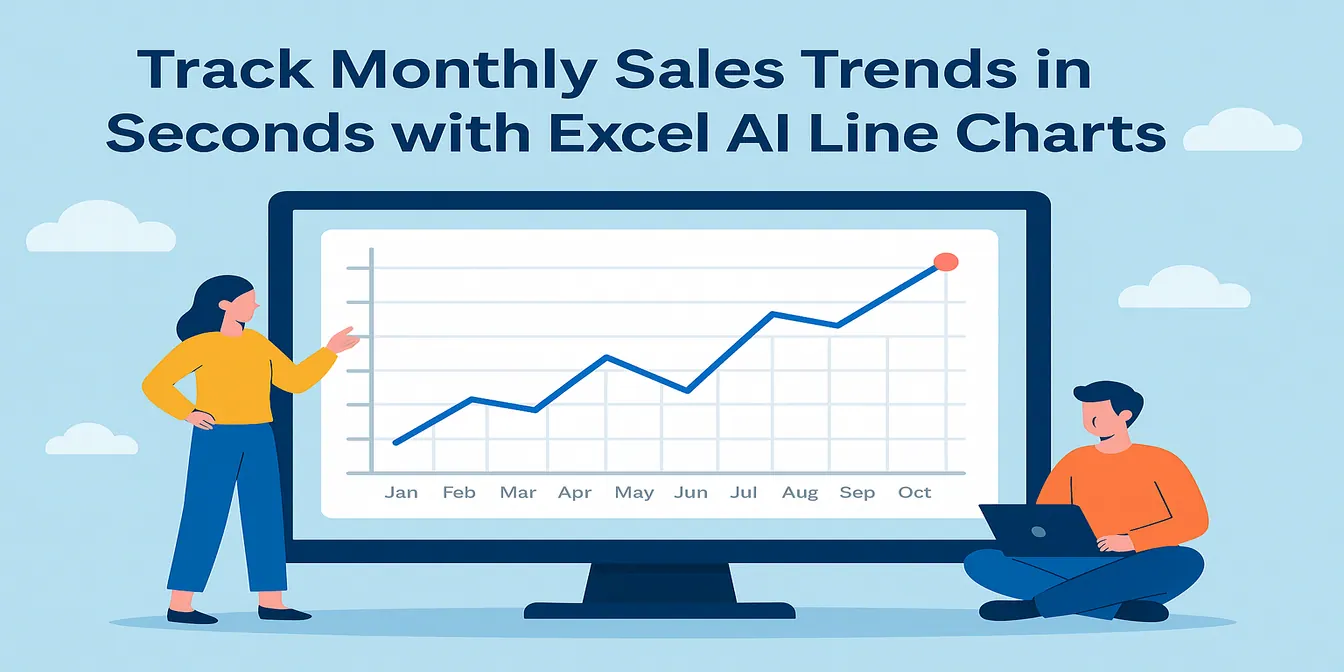
Track Monthly Sales Trends in Seconds with Excel AI Line Charts
Ditch manual work and discover how Excel AI tools like RowSpeak can create dynamic, trend-focused line charts from your raw data. Analyze monthly changes with zero stress.
 Data Visualization
Still Guessing Your Best Time to Post? Let AI Find Your Account's Unique "Golden Hour"
The "best posting time" suggested by other bloggers' operation experiences may not work for your account. This article teaches you a scientific method: using AI chart tools like Kuangyou Excel to transform your messy backend data Excel sheet into a clear "fan activity heat map" with just one click. You will visually see the traffic peaks of your account throughout the 7 days of the week and 24 hours of a day, and bid farewell to the mystery of posting.
 Data Visualization
Running Out of Content Ideas? How AI Can Help You Find the Secret to Your Next Viral Post
Every content creator knows the feeling: you're out of ideas. Instead of endlessly scrolling for inspiration, what if you could let your own data guide you? This guide explores how AI tools like RowSpeak can transform your exported data from platforms like Instagram and TikTok into powerful dashboards. Discover how to find popular topics and formats to scientifically engineer your next viral post.
Comparing Categories with a Bar Chart
Bar Charts are perfect for comparing distinct items or categories. Suppose you have data on the number of units sold for several different products. To see which product is the top performer, you can issue a simple command:
Generate a Bar Chart comparing the units sold for each product.
The AI will produce a horizontal Bar Chart that clearly ranks your products from highest to lowest sales, making direct comparison effortless.
The following blogs will help you understand how to create Bar Charts and other data visualizations using RowSpeak:
 Data Visualization
Stop Clicking: Create Perfect Bar Graphs in Excel with One Simple Prompt
Tired of endlessly clicking through Excel menus to create a simple bar graph? This guide shows you the old, slow way and a new, faster method using Excel AI. See how RowSpeak can turn your sales data into a perfect bar chart in seconds, just by asking.
 Data Visualization
Beyond Manual Charts: How AI Charts Transform Gantt Chart Creation
Explore how AI Charts are transforming Gantt diagram creation. This guide shows how AI instantly generates dynamic project timelines through simple commands, replacing complex manual processes with intelligent automation.
 Calculation
How to Create a "Top 10 Bestsellers" Chart in Excel in 5 Seconds
Don't get bogged down in PivotTables. Learn the AI-powered method to instantly find and visualize your top 10 bestselling products from thousands of order lines. A 5-minute analysis, now done in seconds.
 Data Visualization
How to Create a Sales Performance Bar Chart from Excel Data in Seconds
See how an AI-powered tool replaces the tedious, multi-step process of creating bar charts in Excel. Learn to generate a sorted sales performance leaderboard from raw data using just one natural language command.
 Data Visualization
How To Make Bar Chart Using AI (Step By Step)
Stop struggling to add labels to bar charts! Learn how to use AI to transform Excel data into charts in just a few seconds. This article will introduce two methods for drawing charts - traditional and AI - allowing you to gain a deeper understanding of AI tools.
- Data Visualization
Solving Flowchart Creation Challenges with One Secret Weapon: AI Tools
Instead of putting in ten times the useless effort, choose a good tool. Just upload your requirements and let AI read the file, and it will automatically generate the chart you want. Creating flowcharts isn't as difficult as you think.
- Data Visualization
How to Create Stunning Excel Charts with AI
are you still troubled by the analysis of massive data through charts? still spending a lot of time converting tables into pictures? let ai help you! just upload the file and have a chat, accurate and professional charts will be generated..
 Data Visualization
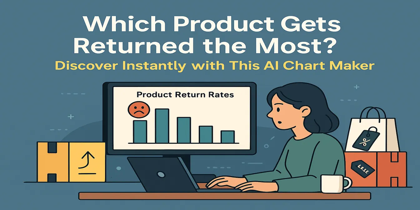
Which Product Gets Returned the Most? Discover Instantly with This AI Chart Maker
Don’t ignore your refund rates. This AI-powered Bar Chart maker shows you which products get returned the most—and helps you take action before it hurts your bottom line.
- Data Visualization
What’s Your Best-Selling Product? Find Out Instantly with This AI Chart Maker
Tired of guessing which product is driving most of your sales? Let an AI chart maker generate a pie chart or bar graph that shows your top-selling items—instantly and clearly.
 Data Visualization
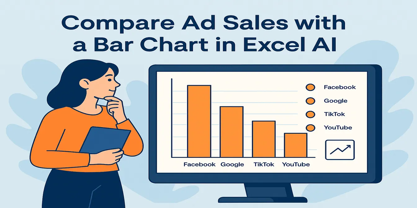
Compare Ad Channel Sales with a Bar Chart in Excel AI
Tired of guessing which ad channel works best? Let Excel AI generate Bar Charts comparing Facebook, Google, TikTok, and more—instantly and insightfully.
 Data Visualization
How to Instantly Create Bar Charts with Excel AI (No Manual Work Needed)
Stop wasting time building charts manually. Discover how Excel AI can generate clean, insightful Bar Charts from your data with just one simple prompt.
 Data Visualization
Create Bar Graphs in Excel The Classic Method vs. The Instant AI Approach
Tired of clicking through endless menus to create a simple bar graph in Excel? This guide shows you the traditional method and introduces a revolutionary AI-powered way to generate charts instantly with just a plain English command. Compare both and speed up your reporting.
 Data Visualization
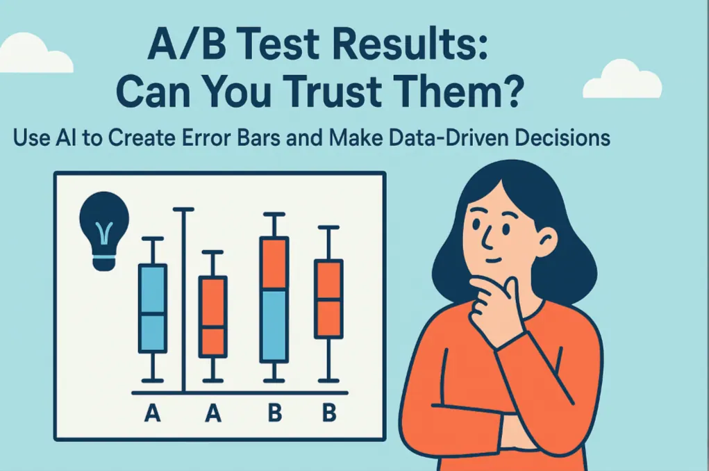
A/B Test Results: Can You Trust Them? Use AI to Create Error Bars and Make Data-Driven Decisions
Don't bet your budget on a slim margin in an A/B test. Discover how AI can create an error bar chart for you with a single sentence, turning statistical anxiety into clear, confident insights.
 Data Visualization
Stop Clicking Around: Add Error Bars to Excel Charts Instantly with AI
Tired of navigating endless menus just to add error bars to your Excel charts? See how RowSpeak, an Excel AI agent, lets you create charts with custom error bars using simple text commands, turning a tedious task into a quick conversation.
 Data Visualization
Ditch the Spreadsheet: 5 Free AI Bar Chart Makers That Create Visuals in Seconds
Looking for a free bar graph maker? 🚀 In this guide, we review 5 powerful AI tools—RowSpeak, Edraw.AI, LiveChatAI, Canva, and iWeaver—that let you instantly create bar charts online. Save time, visualize data beautifully, and pick the right tool for your workflow.
Showing Discrete Changes with a Column Chart
While similar to Bar Charts, column charts are often used to show changes in data over a discrete period. If you want to compare quarterly sales figures for the last fiscal year, a column chart is an excellent choice. You can ask:
Make a column chart of our quarterly sales for last year.
RowSpeak will create a vertical column chart, with each column representing a quarter, providing a clear view of performance fluctuations throughout the year.
The following blogs will help you understand how to create column charts and other data visualizations using RowSpeak:
Visualizing a Workflow with a Flowchart
RowSpeak's AI goes beyond numerical data. You can also create diagrams to visualize processes and workflows. This is incredibly useful for project planning, training materials, or process documentation. To map out a simple business process, you could instruct the AI as follows:
Build a flowchart for our customer support process, starting with 'Customer Submits Ticket', leading to 'Assign to Agent', then 'Investigate Issue', and ending with 'Provide Solution & Close Ticket'.
The AI will interpret this sequence and generate a clean, logical flowchart, saving you the manual effort of drawing and connecting shapes.
The following blogs will help you understand how to create flowcharts and other data visualizations using RowSpeak:
 AI Dashboard
How to Create a Dashboard in Excel with AI
A practical step-by-step workflow for creating an Excel dashboard with AI, including source data checks, prompt examples, review criteria, and where RowSpeak fits.
 AI Dashboard
Online Dashboard Builder from Excel File: A Practical AI Workflow
A practical workflow for turning Excel or CSV files into online dashboards with AI, including dashboard examples, prompt patterns, review checks, and where RowSpeak fits between Excel and heavy BI.
- AI Dashboard
Build a Dashboard from Excel, CSV, and PDF Files with AI
Dashboards often start from messy files, not perfect databases. This RowSpeak workflow shows how to turn Excel, CSV, and PDF data into dashboard-ready analysis.
 Excel Template
The Intelligence Hub: Architecting Multi-Sheet KPI Dashboards with AI
Tired of fragmented data? Discover how to build a unified KPI dashboard that connects multiple sheets into a high-end visual reporting engine instantly.
 Excel AI
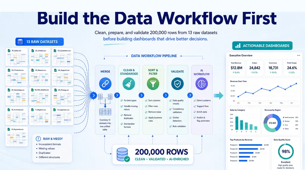
How to Clean Data Before Building a Dashboard in Excel
When a boss asks for dashboards from 13 raw datasets, the first job is not charting. It is building the data workflow that makes the charts meaningful.
 AI Dashboard
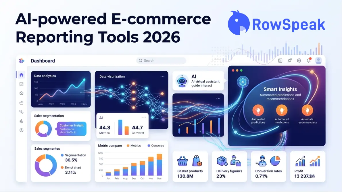
Best AI-Powered E-commerce Dashboard Reporting Tools for 2026: A Complete Buyer's Guide
Not all AI reporting tools are built for e-commerce sellers. We break down every major category — BI platforms, native analytics, AI assistants, and Excel-to-dashboard converters — so you can choose the right one without wasting a sprint.
 Excel Template
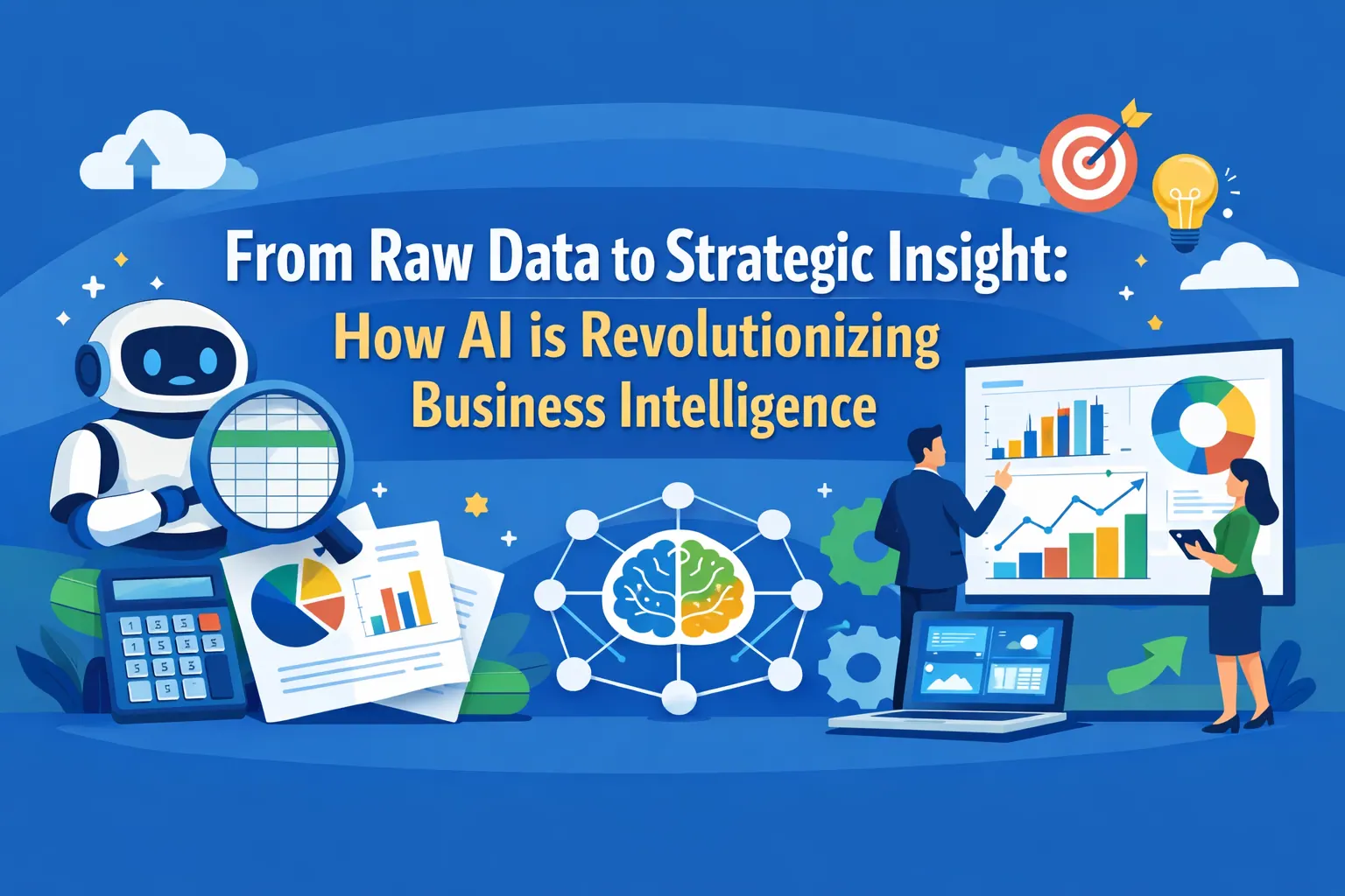
From Raw Data to Strategic Insight: How AI is Revolutionizing Business Intelligence
Stop drowning in rows of data. Discover how to use AI to architect professional BI dashboards, automate data cleaning, and make faster, data-driven decisions.
 Excel Template
Excel Dashboard Templates: Why Free Downloads Aren't Enough & How AI Generates the Perfect Fit
Transform your messy data into executive-ready insights. Discover how RowSpeak’s AI builds custom Excel dashboards tailored to your specific business KPIs from a single sentence.
 Data Analysis
Stop Writing Formulas: Chat with Excel to Analyze Data via RowSpeak AI
No formulas. No VBA. Just upload your file and chat. Discover how RowSpeak is transforming raw data into executive insights in seconds.
 Excel Template
The Death of Manual Reporting: Generate Professional KPI Dashboards in Seconds with AI
Stop wrestling with complex Pivot Tables and manual chart updates. Discover how RowSpeak's AI generates dynamic KPI dashboards from a single prompt or one-click professional showcases.
 Excel Template
The Ultimate Shortcut to Professional KPI Dashboards: RowSpeak Template Generation
Stop hunting for broken Excel templates. Discover how RowSpeak's Template Generation builds professional KPI Dashboards in seconds—whether you pick a proven layout or describe your own.
 Data Visualization
Beyond Charts: How AI Turns Data into Compelling Business Stories That Drive Decisions
Move beyond basic charts. Discover how RowSpeak's AI understands business context to create visual narratives that highlight trends, pinpoint issues, and suggest opportunities.
 Data Visualization
From Data to Insight: How AI Reduces Chart Creation Time from 3 Hours to 30 Seconds
The days of manual chart adjustments are over. With RowSpeak, a simple instruction is all you need to generate professional charts for reports, presentations, and dashboards—from data to visualization in just 30 seconds.
 AI Dashboard
Hands-On Review of AI Dashboard Generators: What Actually Works
A practical, hands-on evaluation of AI dashboard generators, focusing on how they interpret natural language, infer data structure, and perform in real workflows.
 AI Dashboard
15+ Business Dashboard Examples for Every Industry in 2026 (AI & How to Build)
Explore 15+ business dashboard examples and learn how to build your own with AI-powered tools like RowSpeak.
 Data Visualization
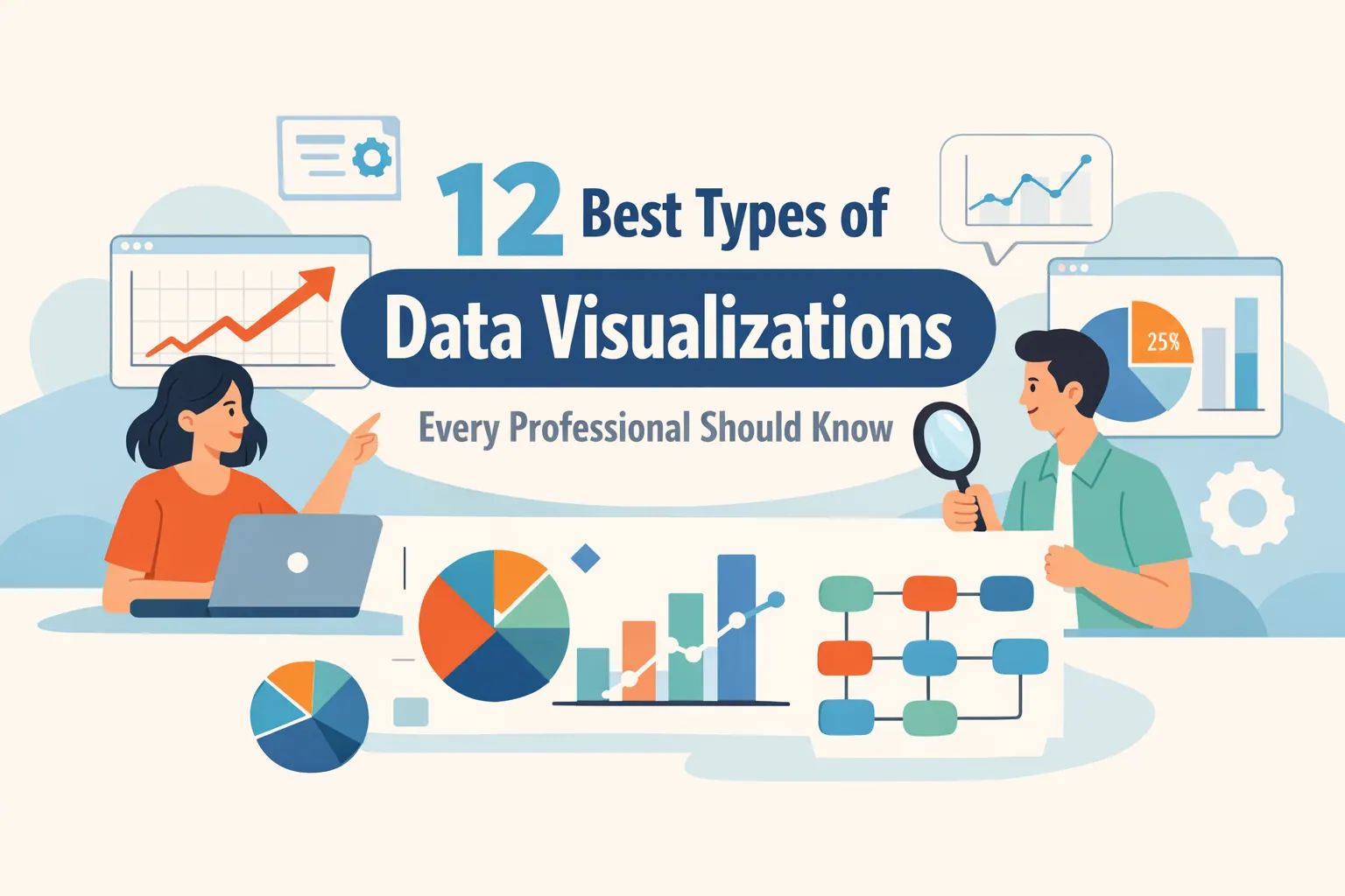
12 Best Types of Data Visualizations Every Professional Should Know
Explore 12 essential data visualization types and see how RowSpeak makes creating charts and dashboards fast and effortless.
 AI Dashboard
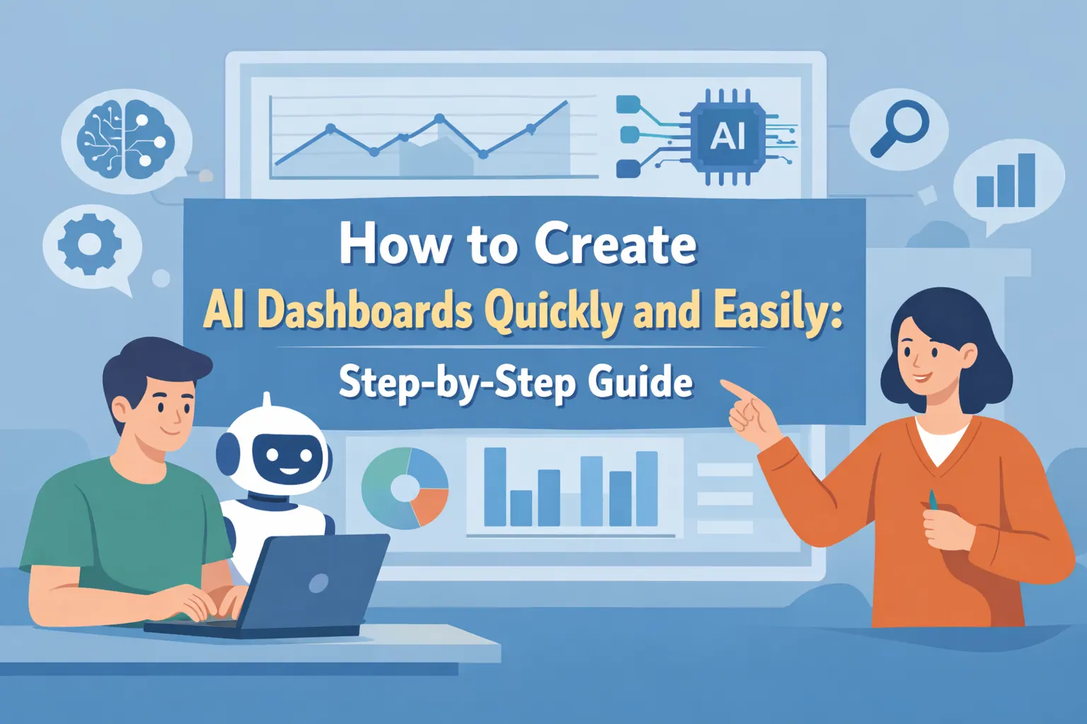
How to Create AI Dashboards Quickly and Easily: Step-by-Step Guide
Learn how AI automates data analysis and dashboard creation. Step-by-step guide to transform raw data into actionable insights.
 AI Dashboard
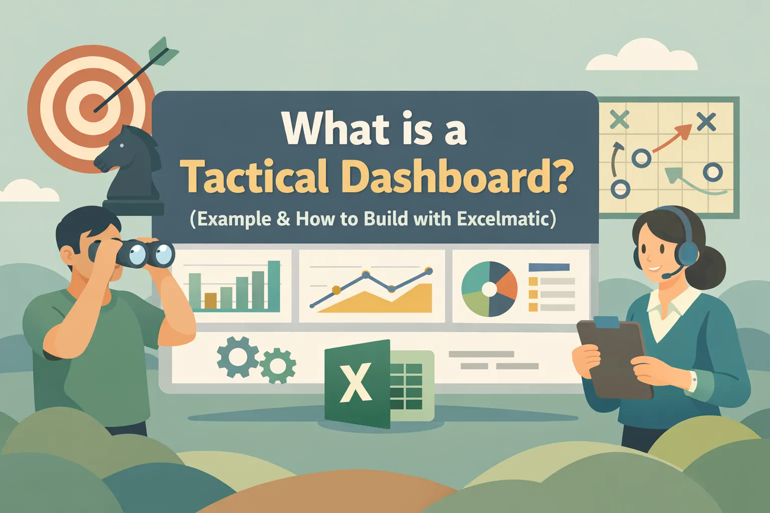
What is a Tactical Dashboard? (Example & How to Build with RowSpeak)
A tactical dashboard supports daily execution through short-term, actionable metrics, built faster with RowSpeak AI.
 AI Dashboard
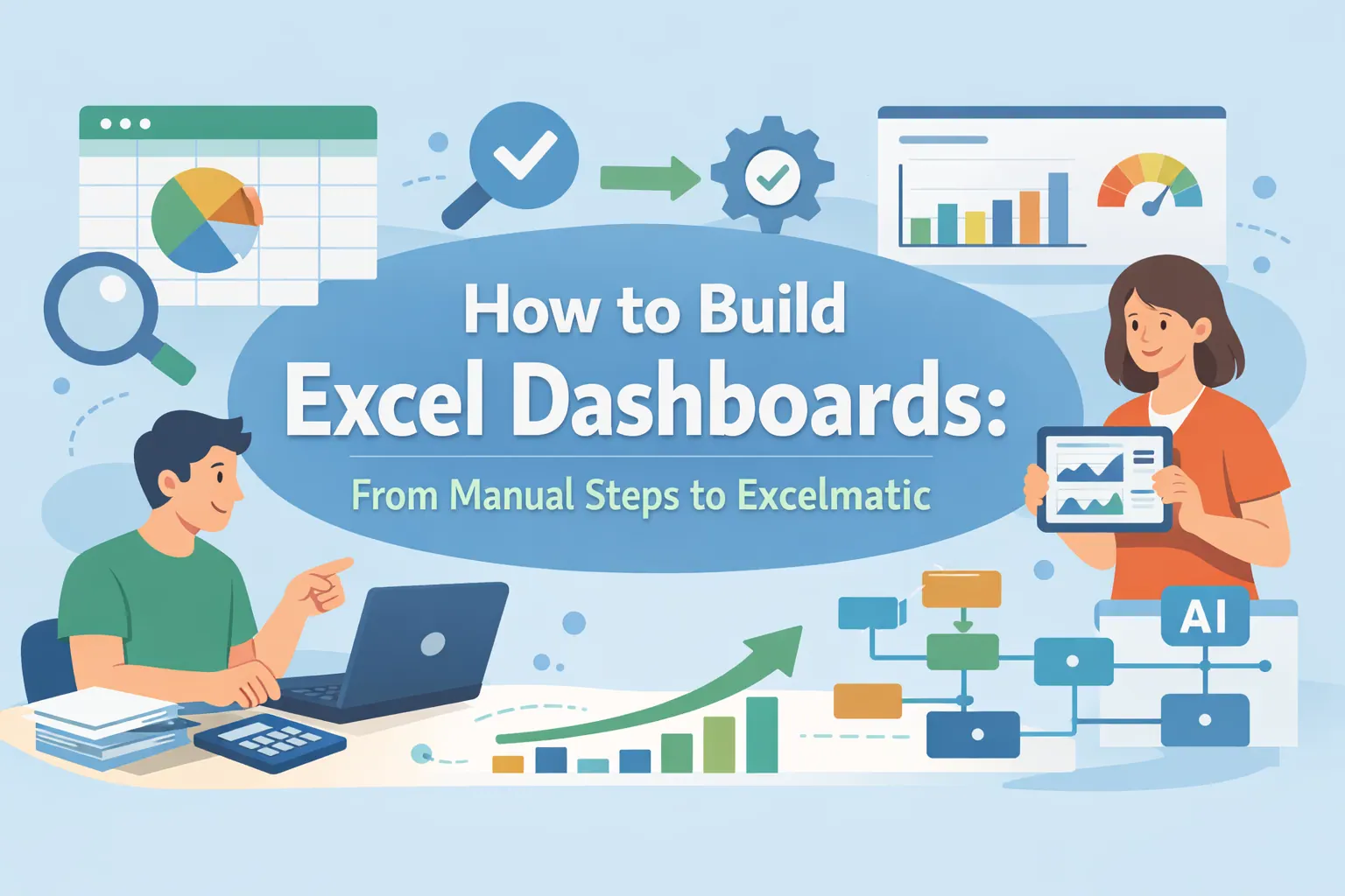
How to Build Excel Dashboards: From Manual Steps to RowSpeak
Master Excel dashboards from manual setup to automated insights with RowSpeak. Save time and visualize your data clearly.
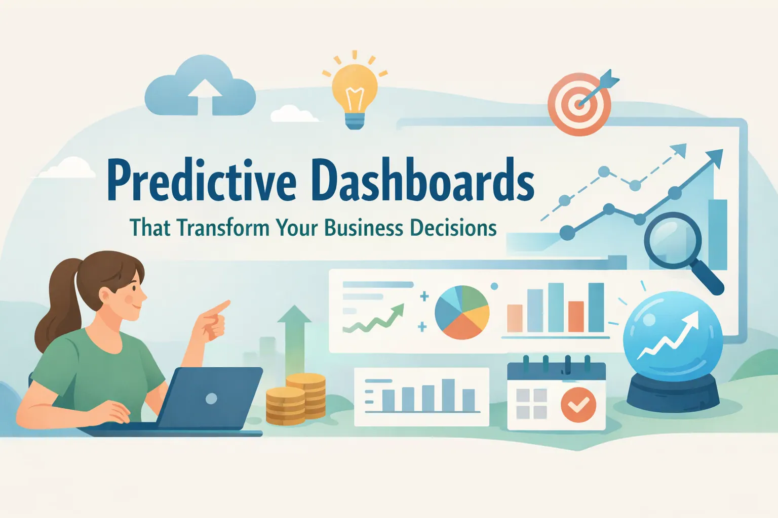 AI Dashboard
Predictive Dashboards That Transform Your Business Decisions
Predictive dashboards in RowSpeak help teams forecast trends, anticipate outcomes, and turn data into actionable business insights quickly and easily.
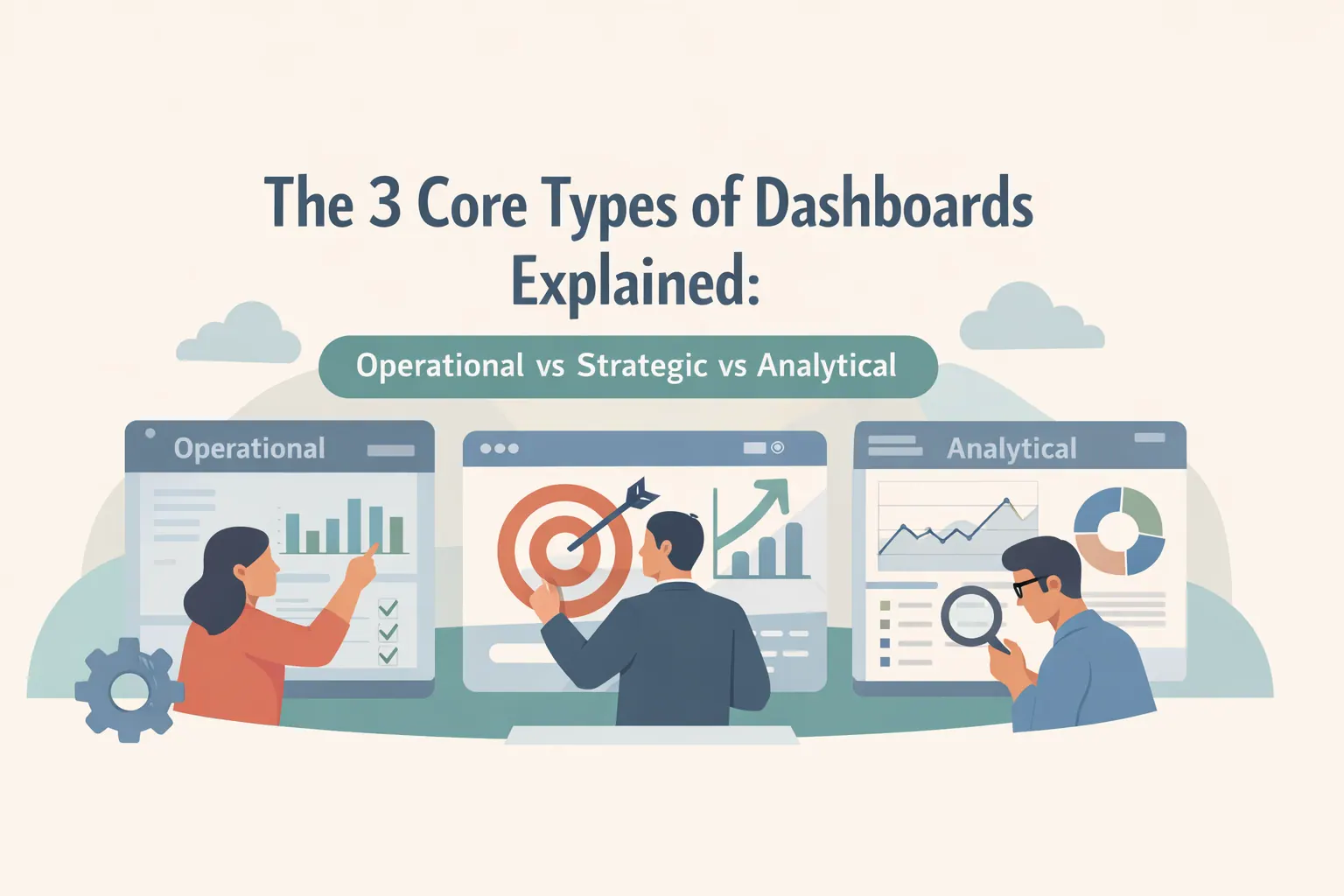 AI Dashboard
The 3 Core Types of Dashboards Explained: Operational vs Strategic vs Analytical
This guide explains the three core dashboard types and how AI tools help teams choose — and build — the right one faster.
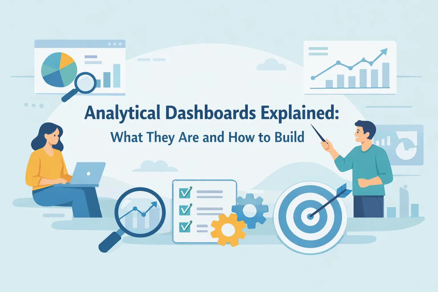 AI Dashboard
Analytical Dashboards Explained: What They Are and How to Build
Discover how to create analytical dashboards with RowSpeak, turning spreadsheets into AI-powered insights in minutes.
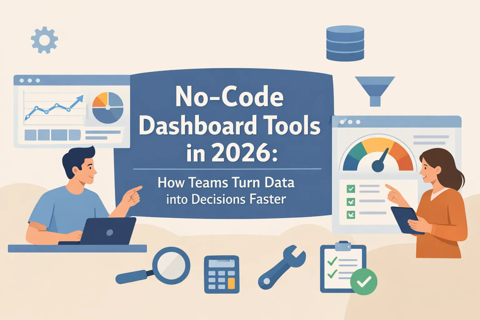 AI Dashboard
No-Code Dashboard Tools in 2026: How Teams Turn Data into Decisions Faster
A practical guide to no-code dashboard tools and how teams use AI to turn everyday data into faster decisions.
 AI Dashboard
How to Build a Project Tracking Dashboard with RowSpeak AI
Build a real-time AI-powered RowSpeak dashboard to track projects, visualize KPIs, and make informed management decisions.
 AI Dashboard
Customer Retention Dashboard Example for SaaS Teams (Metrics & Structure)
Use a Customer Retention Dashboard to track SaaS users, reduce churn, and grow revenue.
 AI Dashboard
Business Forecast Dashboard: 5 Examples for SMBs
Explore business forecast dashboard examples that help SMBs gain clarity, improve budgeting, and plan with confidence.
 AI Dashboard
AI Marketing Attribution Dashboards: How to Stop Guessing Which Ads Actually Convert
How AI marketing attribution dashboards help Shopify brands identify which ads actually convert and where ad spend is wasted.
 AI Dashboard
5 Analytical Dashboard Types Operations Teams Rely On
The analytical dashboard types operations teams use most, and how RowSpeak fits into real Excel-based decision workflows.
 AI Dashboard
Operations Dashboard Examples for Businesses That Need Faster Decisions
A practical guide to operations dashboard examples for businesses, covering use cases, best practices, and execution-focused design.
 AI Dashboard
Strategic Dashboard: A Practical Guide with 5 Real-World Examples
This guide explains strategic dashboards, core layers, real use cases, and how leaders turn data into strategy.
 AI Dashboard
The 5 Pillars of a Strategic Dashboard for Better Decisions
This article explains the five pillars that turn dashboards into decision systems.
- AI Dashboard
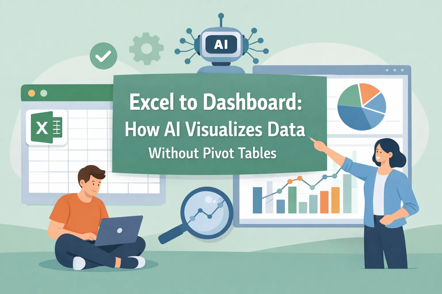
Excel to Dashboard: How AI Visualizes Data Without Pivot Tables
Learn how AI transforms Excel files into dashboards without formulas, pivots, or manual formatting.
 AI Dashboard
Performance Dashboard: What It Is, Types, and Best Practices
A performance dashboard connects fragmented business metrics into a clear view that supports faster, better decision-making.
 AI Dashboard
5 Retail Dashboard Examples Every Team Should Use (How They Are Built)
Five practical retail dashboard examples that help teams connect performance data with better decisions.
 AI Dashboard
What Is a Logistics Dashboard? Types, Metrics, and AI Insights
An expert overview of logistics dashboards, their types, key metrics, and the role of AI in logistics decisions.
 AI Dashboard
What Is a Supply Chain Dashboard? Types, Metrics, and AI-Driven Insights
An expert overview of supply chain dashboards, their types, key metrics, and how AI supports better decisions.
With RowSpeak, data visualization is no longer a barrier but a gateway to discovery. By removing technical complexity, we empower every user to transform numbers into narratives and data into decisions, all with the simplicity of a conversation.
You can also check this Unlocking Data Insights with AI: A Beginner's Guide to Data Analytics to learn how AI tools like RowSpeak can help you analyze data and extract valuable insights.