Sports Statistics Dashboard with Graphs Template
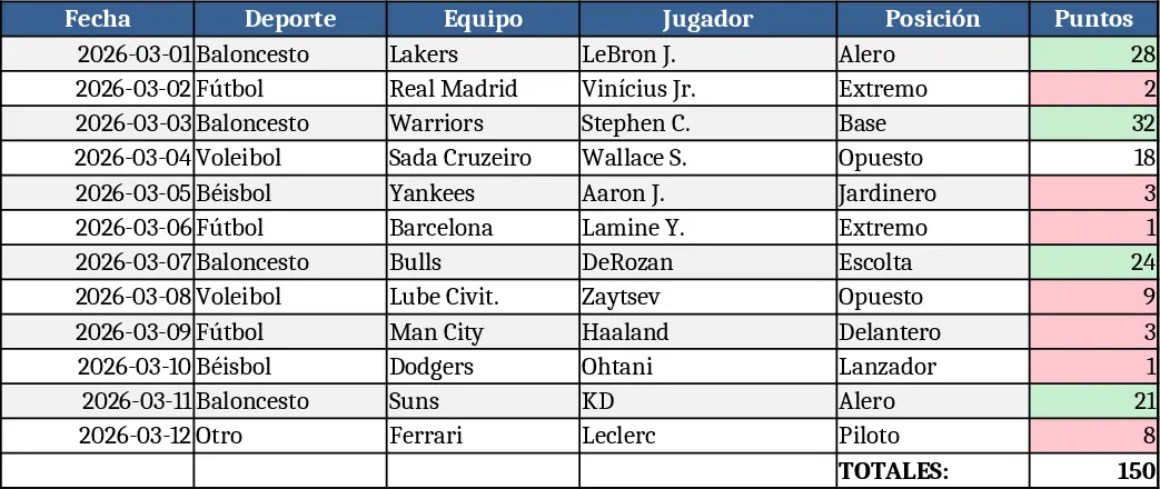
This Excel template is organized into three clear sheets: Data Input, Chart Dashboard, and Summary. In the Data Input sheet you record each event with columns for Date, Sport, League, Team, Player, Metric (e.g., points, rebounds, goals), and Value. Dropdown lists let you pick the sport, team, and metric so the data stays consistent. The Summary sheet automatically aggregates totals, averages, and rankings by team or player, while the Chart Dashboard pulls those aggregates into dynamic line, bar, and pie charts that update as you add new rows.
The template solves the common headache of manually copying numbers into separate charts and recalculating totals after every game. By centralizing raw data entry and automating visual output, you get instant insight into trends such as a player’s scoring progression, team performance over a season, or comparative league statistics. This speeds up reporting, improves accuracy, and frees you to focus on interpreting the numbers rather than wrestling with formulas. Whether you are preparing a weekly briefing for a coach, publishing a quick infographic for a fan site, or tracking personal fantasy‑league stats, the template delivers a professional‑looking dashboard with a single click.
Designed for coaches, sports analysts, team managers, journalists, and even enthusiastic fans who need reliable, repeatable reporting, the workbook works for any sport—football, basketball, baseball, soccer, or niche disciplines. It helps you monitor individual and collective performance, spot emerging patterns, and communicate results clearly to stakeholders. By keeping all calculations hidden in the background, you maintain a clean, printable view for presentations while still having the full data set for deeper analysis.
How to use
- Open the Data Input sheet and start entering your game results; select the sport, team, and metric from the dropdowns to ensure consistency.
- Switch to the Summary sheet to see automatically calculated totals, averages, and leaderboards that reflect the data you just entered.
- Go to the Chart Dashboard sheet; the pre‑built charts will refresh instantly, showing trends and comparisons without any extra steps.
- If you need additional metrics, simply add a new column in the Data Input sheet and update the named ranges—charts will adapt automatically.
Expected benefits: you’ll spend far less time building charts from scratch and make fewer manual errors, giving you more bandwidth to analyze performance and share insights quickly.
Similar Templates Recommendation
Blue Bar Chart Template
Visualize your data trends and comparisons using a professional blue-themed bar chart designed for clear reporting and analysis.
Graphic Design Asset Tracker Template
Create dynamic visual charts to track key metrics, compare data trends, and present insights in a clear, customizable format.
Interactive Data Dashboard with KPI Cards Template
Track metrics, visualize data trends, and gain actionable insights with this customizable multi-purpose dashboard template.