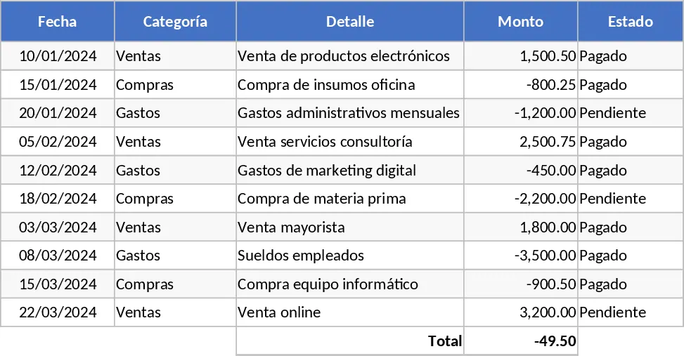
Graphic Design Asset Tracker Template
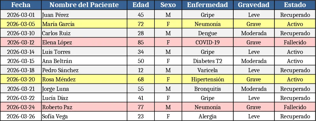
The Charts template is organized into three main sheets: Data Input, Chart Settings, and Dashboard. In the Data Input sheet you list your raw numbers – dates, categories, sales figures, expenses, or any metric you need to visualise. The Chart Settings sheet lets you choose the chart type (column, line, pie, bar, area) from a dropdown, assign the X‑axis and Y‑axis fields, and set optional filters such as date ranges or product groups. The Dashboard sheet automatically generates the selected chart(s) and includes a small summary table that highlights totals, averages, and growth percentages. All charts are linked to the data, so any update in the Data Input sheet instantly refreshes the visuals.
This template solves the common problem of manually rebuilding charts every time new data arrives. Instead of recreating graphs from scratch, you simply paste or import fresh data, adjust a few settings, and the template does the rest. It saves time, reduces errors, and ensures consistency across reports, making it ideal for weekly sales reviews, monthly financial performance decks, or operational KPI tracking. By centralising data and visualisation logic, teams can focus on interpreting results rather than fiddling with chart options.
The primary users are business analysts, team leads, and managers who need to turn raw numbers into actionable insights quickly. Whether you’re preparing a quarterly sales performance board, monitoring production output, or presenting budget variances to executives, the template provides a ready‑made canvas that adapts to any dataset. It also works well for cross‑functional meetings where stakeholders expect clear, visual summaries without digging into raw spreadsheets.
How to use:
- Open the Data Input sheet and paste your dataset, ensuring columns match the template’s headings (e.g., Date, Category, Value).
- Switch to Chart Settings, select the desired chart type from the dropdown, then pick the columns for the X‑axis and Y‑axis. Apply any filters if needed.
- Go to the Dashboard sheet – the chart updates automatically. Adjust the size or format directly on the sheet if you need a different look.
- Export the dashboard as a PDF or copy the chart into PowerPoint for presentations.
Expected benefits include a noticeable reduction in the time spent building and updating charts each reporting cycle, more consistent visual standards across the organization, and quicker access to insights that drive decision‑making.
Similar Templates Recommendation
All-Purpose Excel Template
A versatile Excel template that lets you organize data, run calculations, and generate clear, visual reports in one workbook.
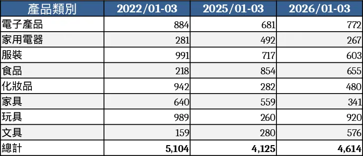
Interactive Data Dashboard with KPI Cards Template
Track metrics, visualize data trends, and gain actionable insights with this customizable multi-purpose dashboard template.
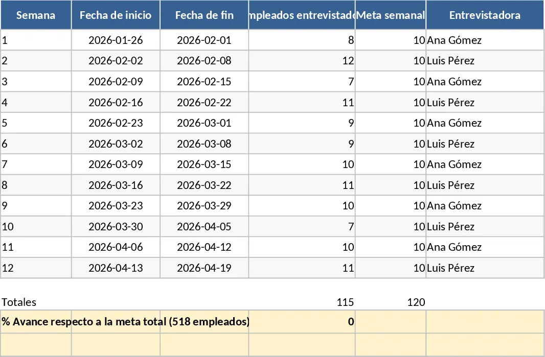
General Purpose Excel with Category Breakdown Template
A versatile Excel template that lets you organize data, track key metrics, and generate clear reports for any business need.