

Multi-Range Percentage Pie Chart Template
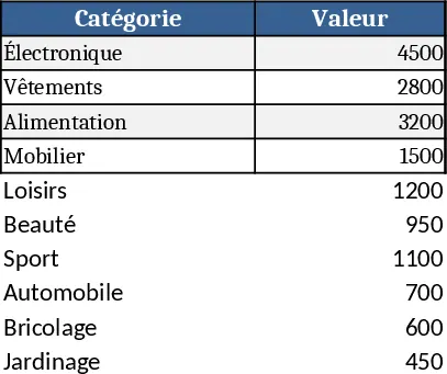
The Percentage Distribution Chart template is a ready‑to‑use Excel workbook that turns a simple list of categories and their associated percentages into a polished visual chart in seconds. Whether you need a pie, donut, or stacked bar, the file adapts instantly, letting you focus on the story behind the numbers instead of fiddling with chart settings.
The workbook is organized into two main sheets. The Data sheet contains a table with three columns: Category, Percentage, and Color (optional). Users type each label (e.g., “Marketing”, “R&D”) and the corresponding value such as 45‑60%, 10‑20%, 10‑15%, etc. A built‑in data‑validation rule forces the percentage to be entered as a number between 0 and 100 and checks that the total of all rows equals 100 %. If the sum deviates, a friendly warning appears. Above the table you’ll find a dropdown that lets you pick the chart type – Pie, Donut, or Stacked Bar – and another dropdown for the chart’s title. The second sheet, Chart, holds the dynamic chart that reads directly from the Data table and updates automatically whenever you change a value or switch the chart type. A small summary box on this sheet shows the total, the highest‑percentage segment, and a quick text label for each slice.
This template solves the common headache of manually building percentage charts for reports, presentations, or dashboards. It eliminates the risk of mis‑calculations, guarantees that the visual always reflects a 100 % total, and provides a consistent look across all your documents. It is especially handy for project managers allocating budgets, sales leaders showing market share, HR teams visualizing headcount distribution, or anyone who needs to illustrate how a whole is divided into parts.
How to use
- Open the workbook and go to the Data sheet.
- Enter each category name in column A and its percentage in column B; optionally pick a fill color in column C.
- Verify that the total displayed at the top reads 100 %; adjust any values if a warning appears.
- Choose your preferred chart type and title from the dropdowns; the chart on the Chart sheet refreshes instantly.
The template also includes a few handy extras. A Settings hidden sheet lets you define default font sizes, label positions, and whether percentages appear inside or outside the slices. With a single click you can copy the chart as a picture for insertion into PowerPoint or Word, or you can link the chart to other workbooks for live updates. Because all calculations are driven by simple formulas, the file remains lightweight and works on any version of Excel that supports basic charting.
Typical users are budget officers preparing quarterly allocation reports, product managers illustrating feature adoption rates, sales directors showing channel share, and educators creating classroom statistics. In any situation where a quick visual breakdown of a whole into parts is needed, this template provides a reliable, repeatable solution.
Expected benefits: you’ll create accurate, eye‑catching percentage charts in minutes, cutting the time spent on manual formatting and reducing the chance of errors.
Similar Templates Recommendation
Simple Pie Chart Template
Visualize data proportions and part-to-whole relationships with this customizable pie chart template for clear reporting and data analysis.
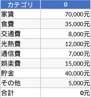
10 Matrix Chart Gallery Template
Create ten custom data matrices with accompanying charts (pie, bar, line, etc.) to visualize any information you choose.
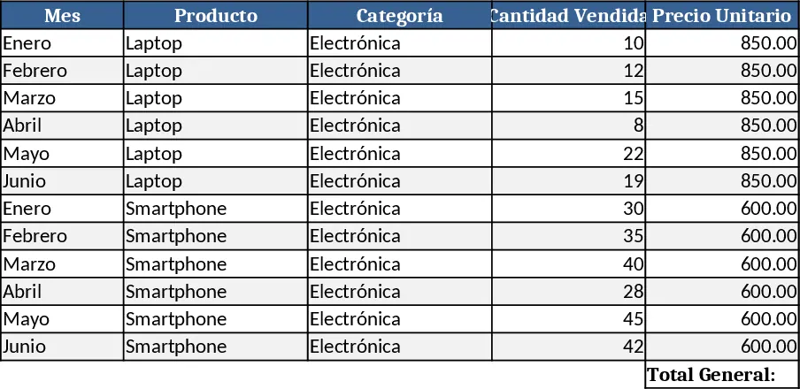
Basic Diagram Template
Create a visual chart that highlights your most important topics, letting you quickly see priorities and trends at a glance.
