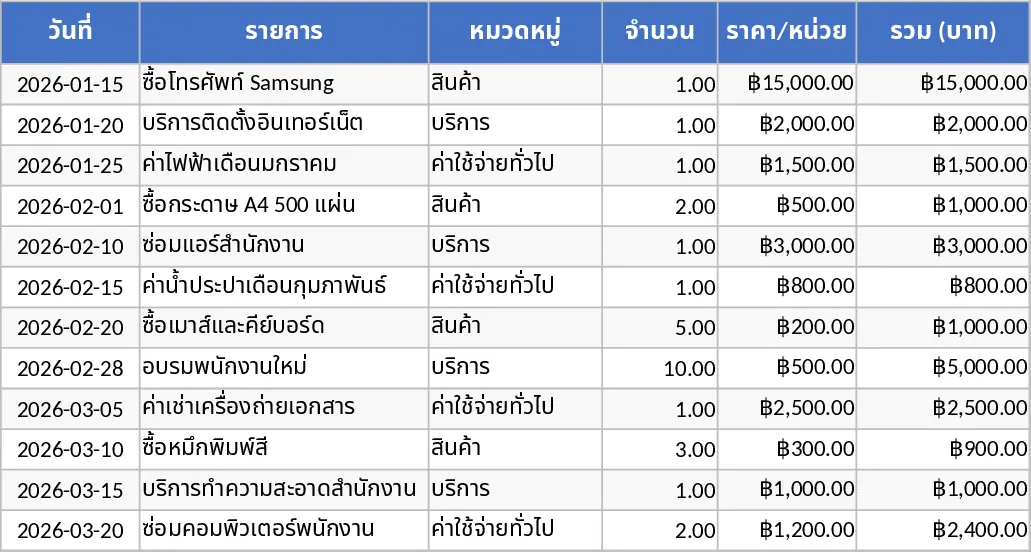
Basic Diagram Template

This template is built around three simple sheets: Data Input, Settings, and Dashboard. In the Data Input sheet you list each topic, assign a numeric value (such as frequency, impact score, or budget), and optionally tag it with a category or date. The Settings sheet contains dropdown menus for selecting the chart type (bar, pie, line, or radar) and for choosing which metric to display on the axis. The Dashboard sheet automatically generates a clean, ready‑to‑present diagram that visualizes the top‑ranked topics based on the criteria you set, and it also includes a small table that shows the top five items and any trend over time if dates are provided.
The template solves the common problem of turning raw lists of ideas, issues, or metrics into an instantly understandable visual summary. Instead of manually building a chart in PowerPoint or copying data into a separate graphing tool, you get an up‑to‑date diagram with a single click. This speeds up weekly status meetings, strategic planning sessions, and any situation where you need to communicate what matters most without digging through spreadsheets. It also ensures consistency across reports, because the same layout and formatting are reused every time.
Anyone who needs to highlight key topics can benefit: project managers summarizing risk items, marketers tracking campaign themes, educators outlining curriculum focus areas, or HR professionals reviewing employee feedback categories. The template works equally well for one‑off presentations or for ongoing dashboards that are refreshed monthly or quarterly.
How to use
- Open the Data Input sheet and enter each topic in column A, its associated value in column B, and optional tags or dates in the next columns.
- Switch to the Settings sheet and pick your preferred chart type from the dropdown, then select which column should drive the axis (e.g., value, date, or category).
- Return to the Dashboard sheet – the chart updates automatically to reflect your entries and settings.
- Export the chart as an image or copy it directly into your presentation or report.
Expected benefits: you’ll spend far less time formatting charts manually, and you’ll have a reliable visual that instantly communicates the most important topics to your audience.
Similar Templates Recommendation
Data Extraction Chart Template
Create dynamic extraction charts in Excel to visualize data pulls, track trends, and generate instant visual reports.
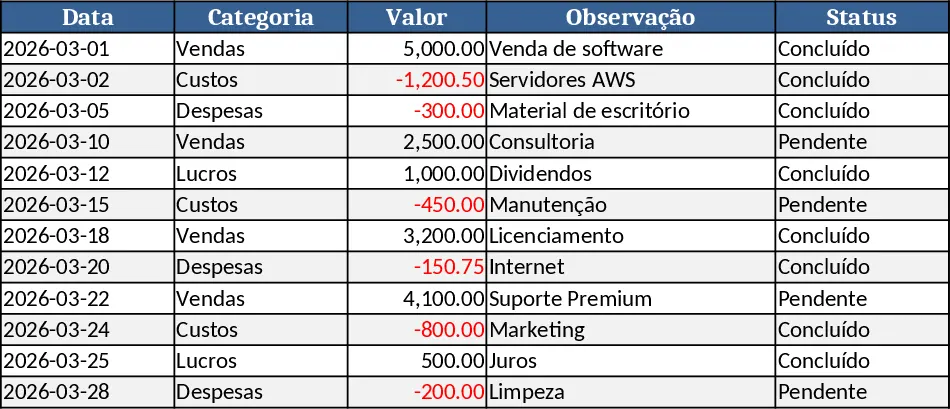
Institution Application & Monthly Income Dashboard Template
Create an interactive dashboard that visualizes key performance indicators by institution and monthly income, summarizing trends and comparisons.
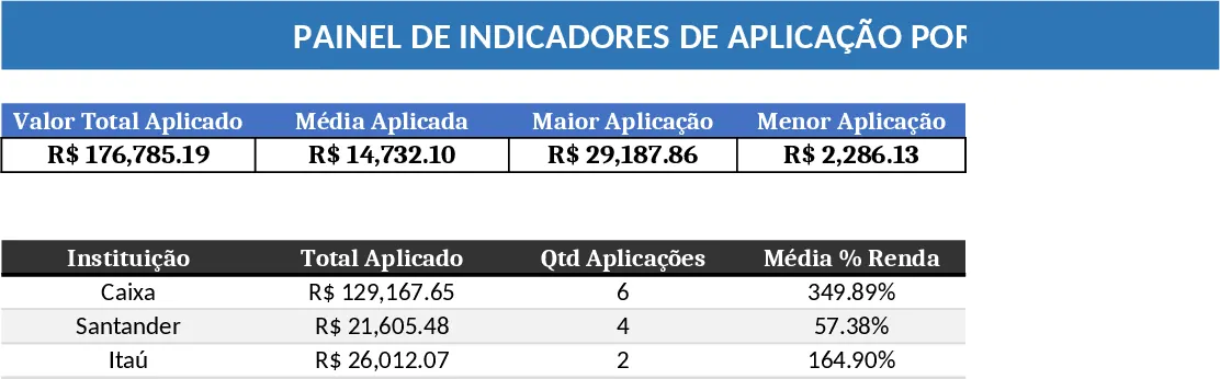
Calculation and Summary Report Template
A versatile Excel template that lets you input raw data, run calculations, and instantly generate clear summary tables and charts.