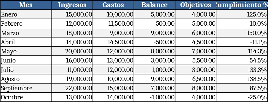
Institution Application & Monthly Income Dashboard Template
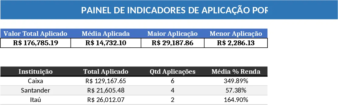
This template provides a ready‑to‑use Excel dashboard that brings together data on institutions and their monthly income streams into a clear, visual summary. The workbook is organized into three sheets: Data Input, Calculations, and Dashboard. In the Data Input sheet you paste or import the raw data – columns for Institution Name, Month, Income Amount, and any optional tags such as region or product line. The Calculations sheet automatically aggregates the data, creating totals, growth rates, and average income per institution, plus month‑over‑month comparisons. The Dashboard sheet contains a set of linked charts, slicers, and summary tables that let you filter by institution, time period, or custom categories, instantly updating line graphs, bar charts, and KPI cards.
The dashboard solves the common problem of manually consolidating financial data from multiple sources and then building ad‑hoc reports. By automating aggregation and providing visual cues, it saves hours of copy‑pasting and formula tweaking. Users can quickly spot which institutions are driving revenue, identify seasonal income patterns, and compare performance across different periods. This insight supports strategic decisions such as resource allocation, budgeting, and targeted outreach.
Ideal for financial analysts, business development managers, and nonprofit program officers who need to monitor funding or revenue by partner organization. Whether you are preparing a monthly board report, evaluating grant performance, or simply tracking internal sales channels, the template gives you a single source of truth and a polished visual output that can be shared with stakeholders.
How to use:
- Open the workbook and go to the Data Input sheet; paste your raw data following the column headings.
- Verify that dates are formatted as months and that income values are numeric; the sheet will flag any errors.
- Switch to the Dashboard sheet, use the slicers at the top to select one or more institutions and the desired month range.
- Watch the charts and KPI cards update automatically, then export the dashboard as a PDF or copy it into a presentation.
Expected benefits: faster turnaround on monthly reports, reduced manual calculations, and clearer visual communication of income trends across institutions.
Similar Templates Recommendation
Basic Diagram Template
Create a visual chart that highlights your most important topics, letting you quickly see priorities and trends at a glance.

Data Extraction Chart Template
Create dynamic extraction charts in Excel to visualize data pulls, track trends, and generate instant visual reports.
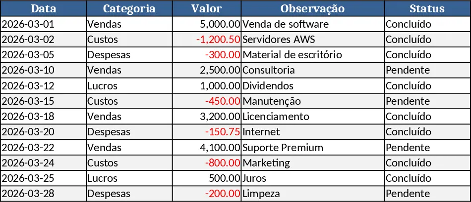
Business Dashboard Template
A customizable analytics dashboard template that lets you consolidate key metrics, visualize trends, and monitor performance at a glance.