Tenda Atacado Executive Dashboard 2024‑2025 Comparison Template
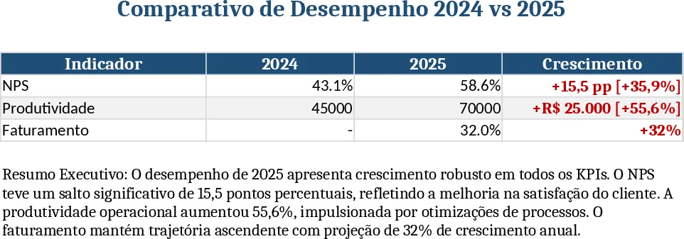
The Executive Performance Dashboard template is built on a single worksheet that mimics a polished one‑page report. At the top you’ll find a placeholder for your company logo, followed by a bold title area styled in dark blue. The core of the sheet is a table titled Indicadores Principais with four columns – Indicator, 2024 value, 2025 value, and Growth – where you enter the raw numbers for each KPI (NPS, Productivity, Revenue, etc.). Below the table a free‑text box holds the Resumo Executivo, automatically populated with concise narrative sentences that pull the growth figures from the table, so you get a ready‑to‑share executive summary without typing. All visual elements follow a clean white background, dark‑blue headings, red highlights for key changes, and light borders with generous spacing, matching the style guide you provided. The template also includes a hidden macro button that instantly formats the page for PDF export, preserving the layout on a single sheet.
This dashboard solves the common problem of gathering disparate performance data and turning it into a single, visually consistent snapshot for senior leadership. Instead of juggling multiple spreadsheets, charts, and word documents, you input the raw numbers once and the template calculates growth percentages, formats the table, and generates a ready‑to‑present summary. The result is a professional‑looking report that can be shared in meetings, attached to emails, or printed as a PDF, helping you communicate progress, highlight improvements, and make data‑driven decisions faster.
The template is ideal for C‑level executives, business analysts, and finance or operations managers who need to present year‑over‑year performance to boards, investors, or internal stakeholders. It works best in quarterly or annual review cycles, strategic planning sessions, and any scenario where a concise, high‑impact visual of key metrics is required. By centralising the data entry and automating the narrative, the dashboard reduces the risk of manual errors and ensures consistency across reporting periods.
How to use
- Open the workbook and replace the placeholder at the top with your company logo.
- Fill in the 2024 and 2025 columns for each indicator in the Indicadores Principais table; the Growth column updates automatically.
- Review the auto‑generated executive summary – edit the surrounding text only if you need additional context.
- Click the Export to PDF button (or use File → Export) to produce a single‑page PDF that matches the visual style guidelines.
Expected benefits: a streamlined reporting process that saves hours of manual formatting, delivers a consistent executive view, and speeds up decision‑making.
Similar Templates Recommendation
Secondary School Results and Ranking Template
Track up to 200 secondary students' marks, auto‑calculate grades, averages, divisions and rankings in a clear, formatted sheet.

Couple Budget and Cash Flow Tracker Template
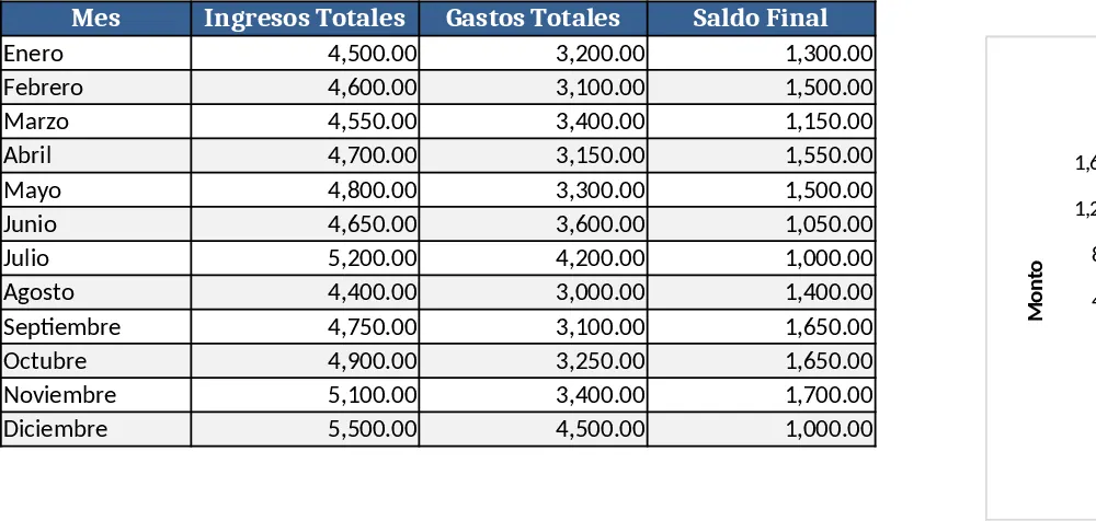
Track monthly income, expenses, and cash flow for a working couple, visualize budgets and savings goals in one spreadsheet.
Date Range and Internal Log Template
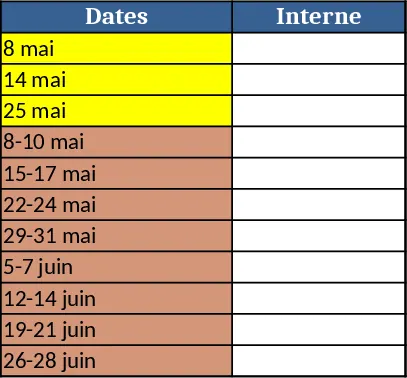
Create an Excel file with two columns for dates and internal notes, with colored rows for different date ranges.