Cervical Cancer Mortality by Age and Skin Color in Pará (North) – DATASUS & INCA Chart Template
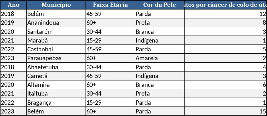
This Excel template is built to turn raw DATASUS and INCA datasets into a ready‑to‑publish chart that shows cervical cancer mortality in the northern part of Pará. The workbook is organized into three sheets: Data Import, where you paste the original CSV files; Parameters, where dropdowns let you pick the year, age bracket, and skin‑color categories you want to analyse; and Dashboard, which automatically generates a pivot table and a dynamic chart based on your selections. Key columns in the Data sheet include Year, Age_Group, Skin_Color, Deaths, Population, and a calculated Mortality_Rate field. The Parameters sheet contains slicers for Region (pre‑filled with "North Pará"), Age_Group, and Skin_Color, so you can instantly switch views without editing formulas. The Dashboard sheet displays a clean line or bar chart, a summary table of rates, and conditional formatting that highlights the highest‑risk groups.
The template solves the common bottleneck of manually cleaning and visualising health statistics. Public‑health officers, epidemiologists, NGOs, and policy makers often spend hours re‑formatting DATASUS tables, calculating rates, and building charts from scratch. With this workbook, all of those steps are automated: you simply load the latest data, choose your filters, and the template does the math and visualisation for you. This not only speeds up reporting cycles but also reduces the risk of calculation errors, ensuring that decision‑makers base their actions on accurate, up‑to‑date information.
Anyone who needs to monitor cervical cancer trends in Pará—whether a municipal health department preparing a quarterly briefing, a researcher comparing mortality across age and ethnicity, or a grant‑writing team showing impact—will find the template intuitive. It tracks the number of deaths, the underlying population, and the resulting mortality rate per 100,000 women, broken down by age groups (e.g., 20‑29, 30‑39, etc.) and skin‑color categories (e.g., White, Black, Mixed). By visualising these dimensions side‑by‑side, you can quickly spot disparities, assess the effectiveness of screening programs, and prioritize interventions where they are most needed.
How to use
- Download the latest cervical‑cancer mortality files from DATASUS and INCA and paste them into the Data Import sheet, preserving the column headers.
- In the Parameters sheet, select the desired Year, Age_Group, and Skin_Color from the dropdown menus.
- Click the Refresh button (or press Alt+F5) to update the pivot table; the chart on the Dashboard sheet will redraw automatically.
- Export the chart as an image or copy it into a report; the accompanying summary table can be printed or shared directly.
Expected benefits include a noticeable reduction in manual data‑wrangling time, more consistent reporting across teams, and clearer visual communication of mortality patterns, all without needing advanced Excel skills.
Similar Templates Recommendation
Secondary School Results and Ranking Template
Track up to 200 secondary students' marks, auto‑calculate grades, averages, divisions and rankings in a clear, formatted sheet.

Couple Budget and Cash Flow Tracker Template
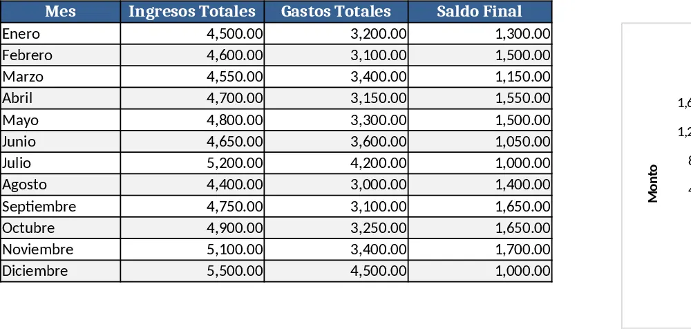
Track monthly income, expenses, and cash flow for a working couple, visualize budgets and savings goals in one spreadsheet.
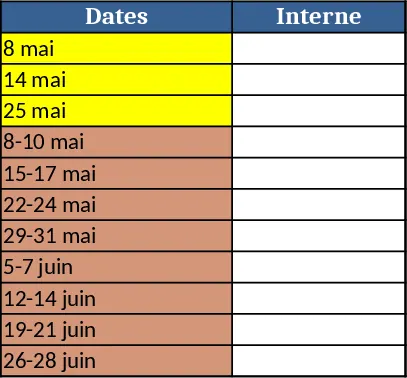
Date Range and Internal Log Template
Create an Excel file with two columns for dates and internal notes, with colored rows for different date ranges.