Mémoire Data Collection and Graphing Template
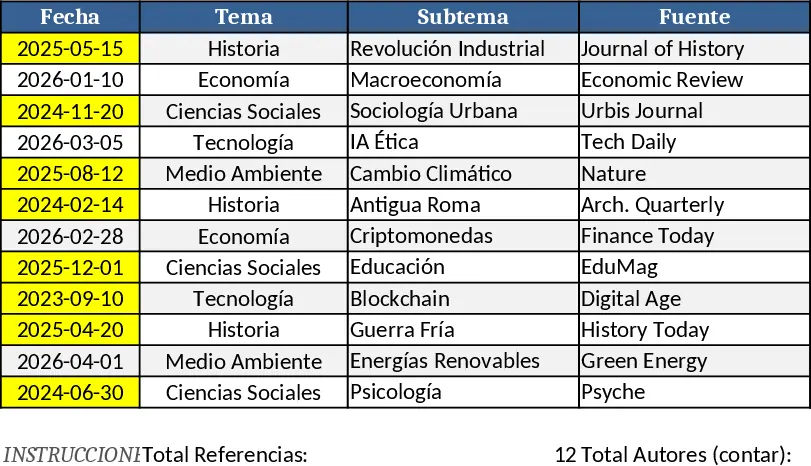
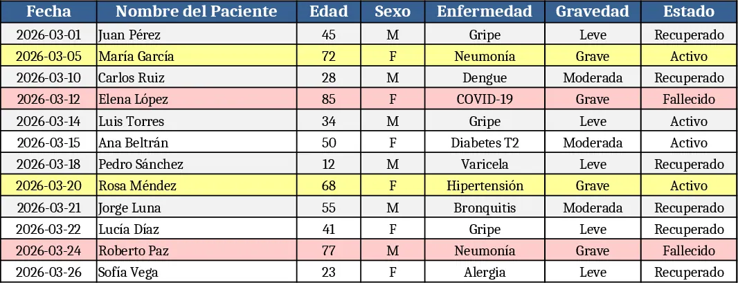
This Excel template is built around three simple sheets – Data Input, Settings, and Chart Dashboard. In the Data Input sheet you list each observation, measurement or survey response in rows, with columns for Variable Name, Value, Category (chosen from a dropdown), Date and any notes. The Settings sheet lets you pick which variables appear in which chart type, set axis titles, and choose colors, all through easy dropdown menus. Once the data is entered, the Chart Dashboard sheet instantly creates bar, line, pie or scatter charts that update whenever you add or edit rows, giving you a live visual summary of your research findings.
The template solves the common headache of manually copying data into chart tools, re‑formatting numbers, and keeping figures consistent across a mémoire. By centralising raw data and visual output in one workbook, you spend less time on repetitive formatting and more time interpreting results. It also ensures that every chart follows the same style, which makes your final document look professional and cohesive.
Designed for university students, master’s candidates and any researcher preparing a mémoire, dissertation or final project, the workbook fits both quantitative experiments and qualitative coding counts. Whether you are tracking lab measurements, survey responses, literature review counts, or field observations, the template adapts to any discipline that requires clear, reproducible charts.
How to use:
- Open the Data Input sheet and fill each row with your collected values, selecting the appropriate Category from the dropdown.
- Switch to the Settings sheet to assign variables to specific chart types and adjust titles or colors.
- Go to the Chart Dashboard – the charts refresh automatically, showing the latest trends.
- Copy the finished charts into your mémoire or export them as images.
Expected benefits include a noticeable reduction in time spent on data entry and chart creation, plus a more reliable, audit‑ready record of your research data.
Similar Templates Recommendation
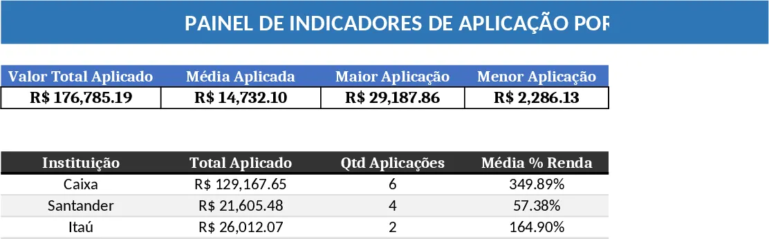
Institution Application & Monthly Income Dashboard Template
Create an interactive dashboard that visualizes key performance indicators by institution and monthly income, summarizing trends and comparisons.
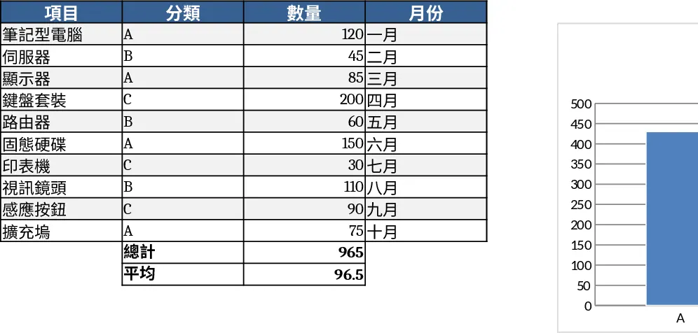
Bar Chart Dashboard Template
Create customizable bar charts in Excel to visualize your data and compare metrics at a glance.
Graphic Design Asset Tracker Template
Create dynamic visual charts to track key metrics, compare data trends, and present insights in a clear, customizable format.