Turnover Analysis Dashboard by Month, Reason, and Role Template
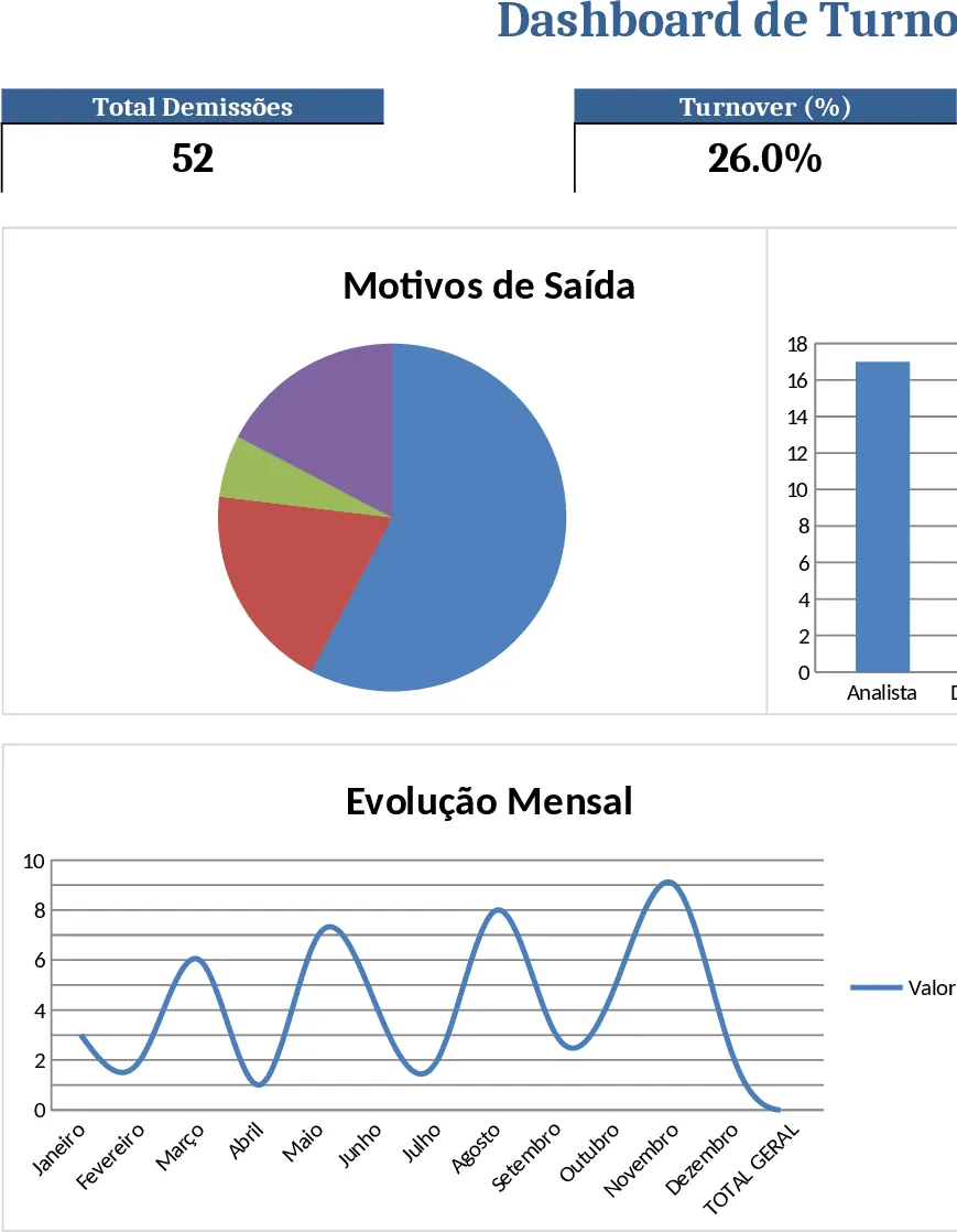
The template is built around three simple sheets: Data Input, Dashboard, and Settings. In the Data Input sheet you paste or type each employee exit record, one row per departure. Required columns are Date (or Month), Employee ID, Department, Function, and Reason for Leaving. Dropdown lists are pre‑populated for Reason (e.g., Resignation, Retirement, Termination, Layoff) and Function (e.g., Sales, Operations, Finance, IT) to keep data consistent. The Settings sheet lets you add or edit those list items without touching formulas. All the heavy lifting happens on the Dashboard sheet, where pivot tables automatically aggregate the raw data and feed a set of charts: a line chart showing monthly turnover rate, a stacked column chart breaking down exits by reason, and a bar chart highlighting the functions with the highest attrition. A summary table at the top displays key metrics such as total exits, average monthly turnover, and the top three reasons for leaving.
This workbook solves the common HR pain point of manually compiling attrition reports each month. By linking raw Excel records to live charts, you instantly see whether turnover spikes in a particular month, which reasons are most frequent, and which job functions are most vulnerable. The visual insights help you diagnose retention issues, justify staffing decisions, and communicate trends to senior leadership without spending hours on ad‑hoc analysis. It also standardises data entry, reducing errors that often creep into manual spreadsheets.
The template is ideal for HR analysts, talent‑acquisition specialists, and department managers who need a quick, reliable view of employee turnover. Whether you are preparing a monthly HR KPI report, investigating a sudden rise in resignations, or planning a retention initiative, the dashboard gives you the numbers and visual context you need to act confidently.
How to use
- Open the Data Input sheet and enter each turnover event, selecting Reason and Function from the dropdowns. Ensure the Date column reflects the month of the exit.
- If you need to add new reasons or functions, go to the Settings sheet and type them into the appropriate list; the dropdowns will update automatically.
- After all records are entered, go to the Dashboard sheet and click the Refresh All button (or press Ctrl+Alt+F5) to update the pivot tables and charts.
- Review the charts and summary table; you can filter the view by month or reason using the slicers on the Dashboard sheet.
Expected benefits: you’ll spend far less time consolidating turnover data, gain instant visual insight into attrition patterns, and be able to act faster on retention challenges.
Similar Templates Recommendation
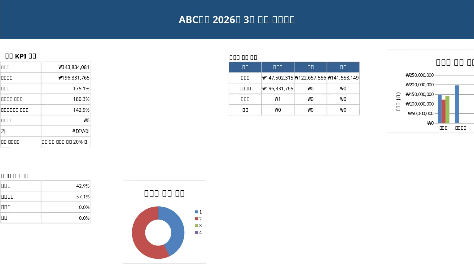
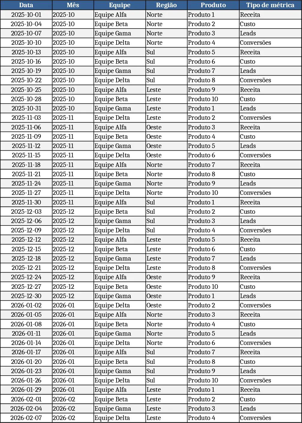
Monthly Business KPI Dashboard Excel with Charts Template
Track monthly business performance with an interactive KPI dashboard that visualizes revenue, costs, leads, conversions and top products.
Monthly Sales Report Template
A ready‑to‑use Excel template that lets you quickly compile, analyze, and visualize monthly sales data in a professional report.
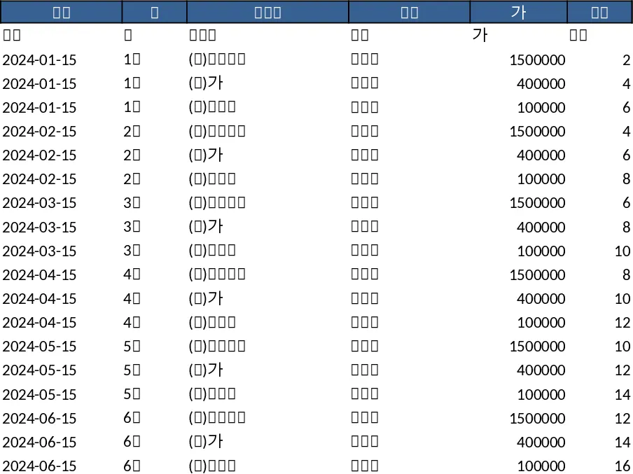
Professional Sales Closing Dashboard Template
A ready‑to‑use Excel dashboard that lets you input monthly sales data and instantly see KPI summaries, trend charts and detailed tables for executive reporting.