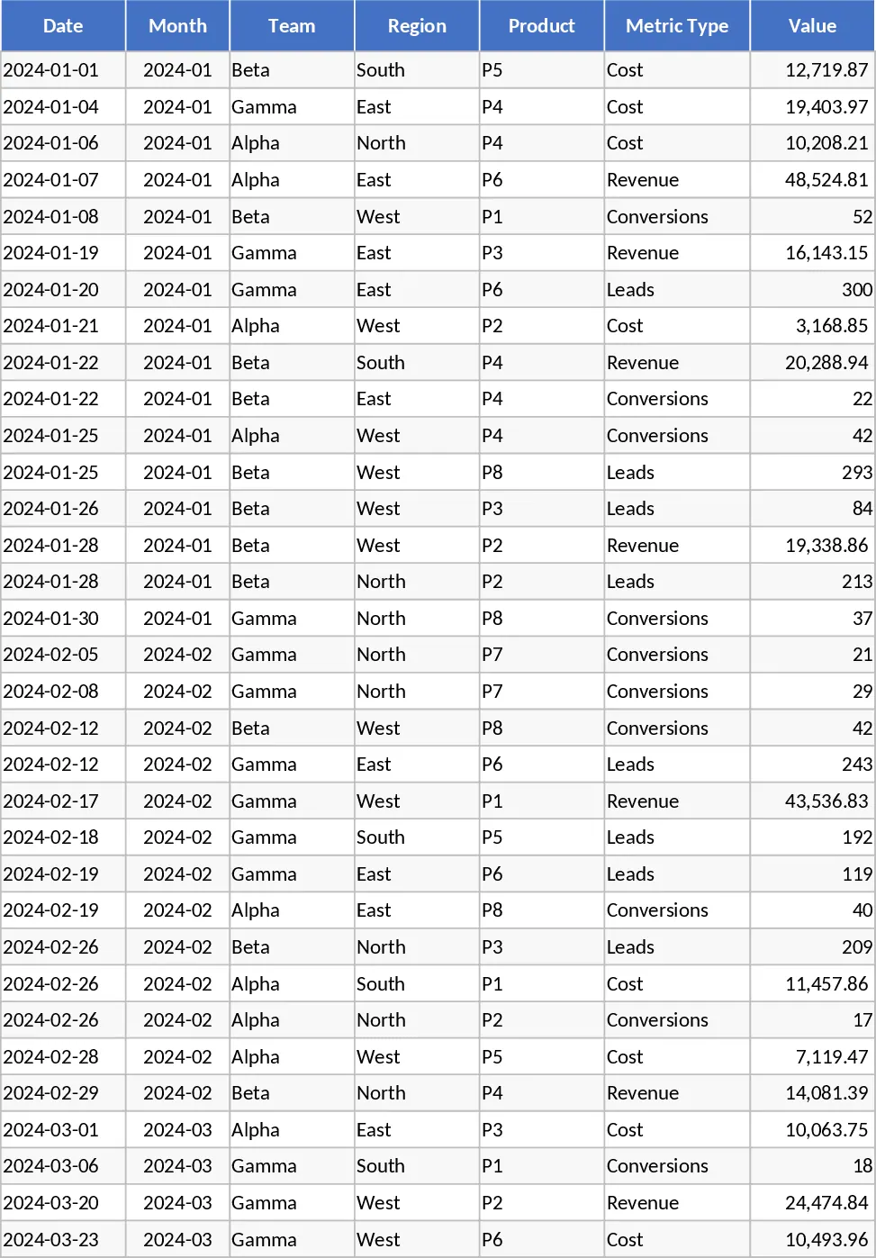
Monthly KPI Dashboard with Pivot Summary Template
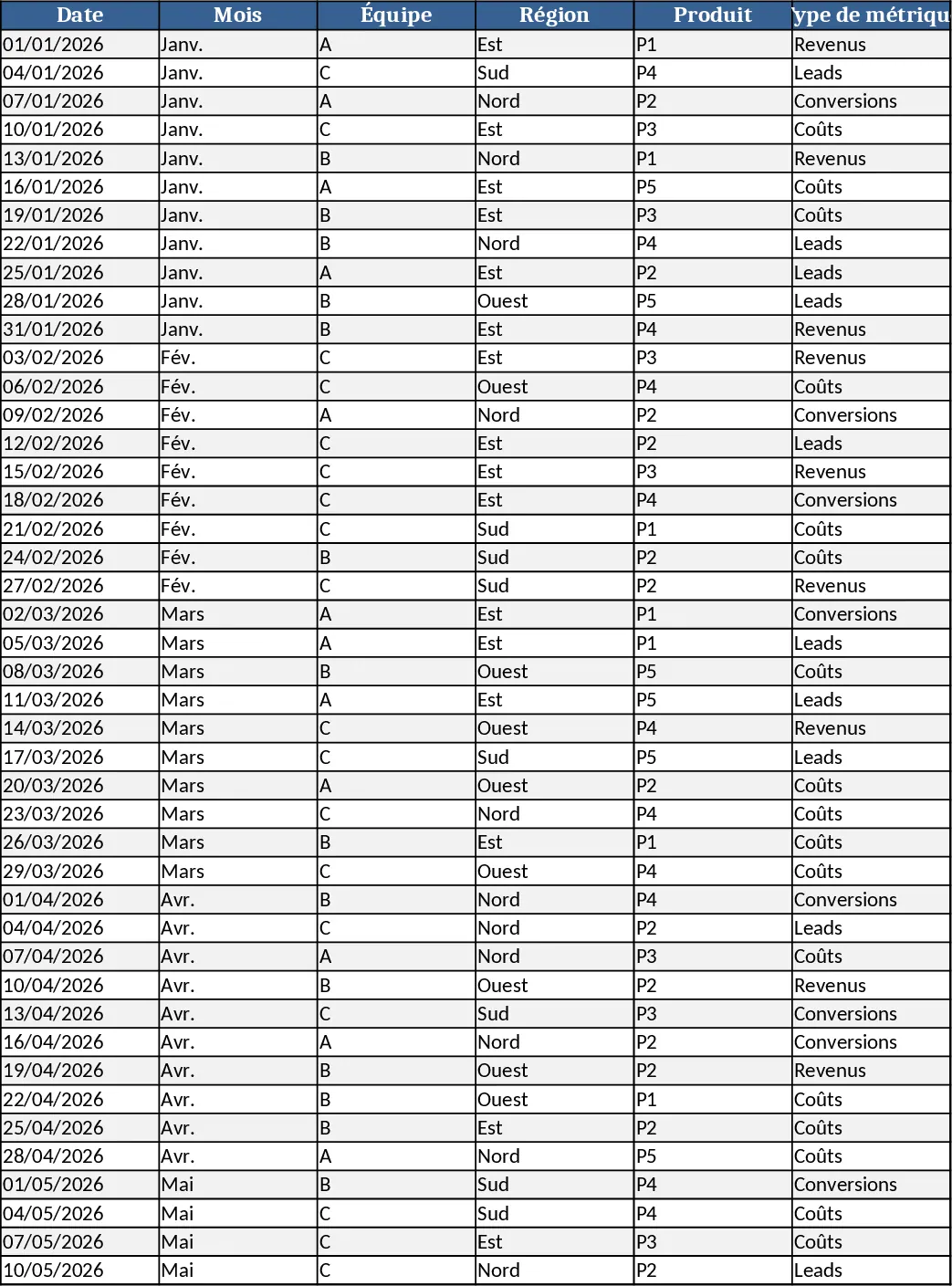
This Excel workbook is organized into four interconnected sheets that together create a live monthly KPI dashboard. The Raw_Data sheet holds the source records with columns for Date, Month, Team, Region, Product, Metric Type (Revenue, Cost, Leads, Conversions) and Value. You can paste or import your own data here, and the sample includes 60 rows spanning six months to illustrate the layout. The KPI_Definitions sheet lists each key performance indicator, such as Conversion Rate = Conversions / Leads, together with the exact formula or logic used, so anyone can understand how the numbers are derived. The Pivot_Summary sheet contains pre‑built PivotTable structures that automatically aggregate the raw data by Month, Region, Product and Team, and it includes slicers for those dimensions, making it easy to slice and dice the information. Finally, the Dashboard sheet pulls the pivot results into a set of charts: a line chart for revenue trend, a bar chart for revenue by region, a combo chart comparing costs versus revenue, a dual‑axis chart for leads and conversion rate, and a top‑10 product bar chart. All visuals refresh instantly when the Raw_Data sheet is updated.
The template solves the common pain of building monthly performance reports from scratch. Instead of manually copying data, calculating ratios, and redesigning charts each month, users get a ready‑to‑use framework that standardizes metric definitions and visualizes results with a single click. It saves time, reduces errors, and ensures consistency across reporting periods, allowing teams to focus on analysis rather than data wrangling. By centralizing raw inputs and automating calculations, the workbook also makes it simple to compare performance across regions, products, or teams, highlighting trends and outliers that would otherwise be hidden in spreadsheets.
This solution is ideal for business analysts, finance professionals, marketing managers, sales operations staff, and any decision‑maker who needs a clear, up‑to‑date view of key business metrics on a monthly basis. Whether you are tracking revenue growth, cost efficiency, lead generation, or conversion performance, the dashboard gives you a single pane of glass to monitor progress, set targets, and communicate results to stakeholders. The built‑in KPI definitions also serve as a training aid for new team members, ensuring everyone uses the same calculations.
How to use
- Open the workbook and replace the sample rows in the Raw_Data sheet with your own data, keeping the same column order. Add as many rows as needed; the formulas and pivots will expand automatically.
- Review or edit the KPI_Definitions sheet if you need to add custom metrics or adjust formulas to match your business logic.
- Go to the Pivot_Summary sheet and use the slicers to filter by month, region, product or team; the underlying tables will update instantly.
- Switch to the Dashboard sheet to see the refreshed charts and key figures. The visualizations reflect the latest data and slicer selections, giving you an up‑to‑date performance snapshot.
Expected benefits include a noticeable reduction in the time spent preparing monthly reports and fewer manual calculation errors, allowing you to allocate more effort to strategic analysis and decision‑making.
Similar Templates Recommendation
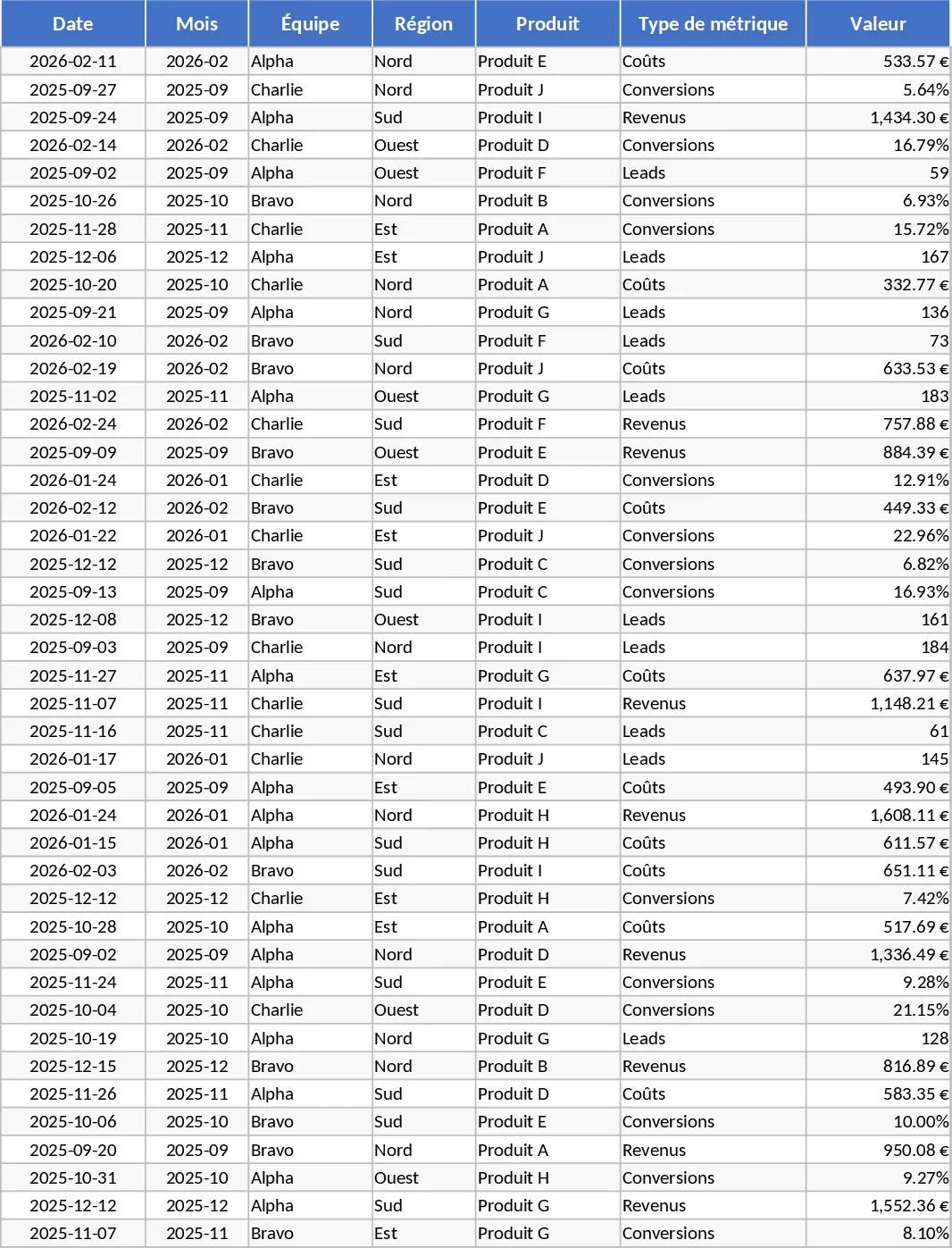
Advanced Monthly KPI Dashboard and Performance Tracking Template
Track monthly performance across revenue, costs, and conversions with an automated dashboard featuring regional and product-level insights.
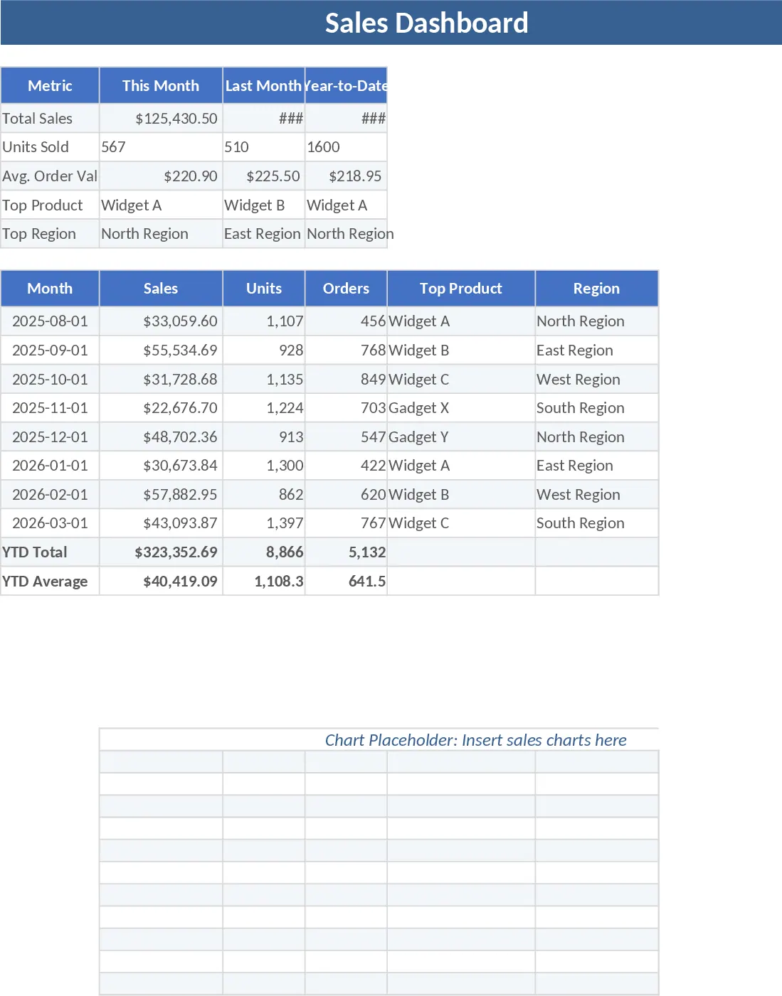
Sales Dashboard Template
Track your sales performance, monitor key metrics like revenue and conversion rates, and visualize trends through an interactive dashboard.
Advanced Monthly Business KPI Dashboard with Professional Layout Template
Monitor monthly business performance across regions and products with automated charts, financial trends, and conversion metrics in one dashboard.