Monthly Business KPI Dashboard with Charts and KPI Cards Template
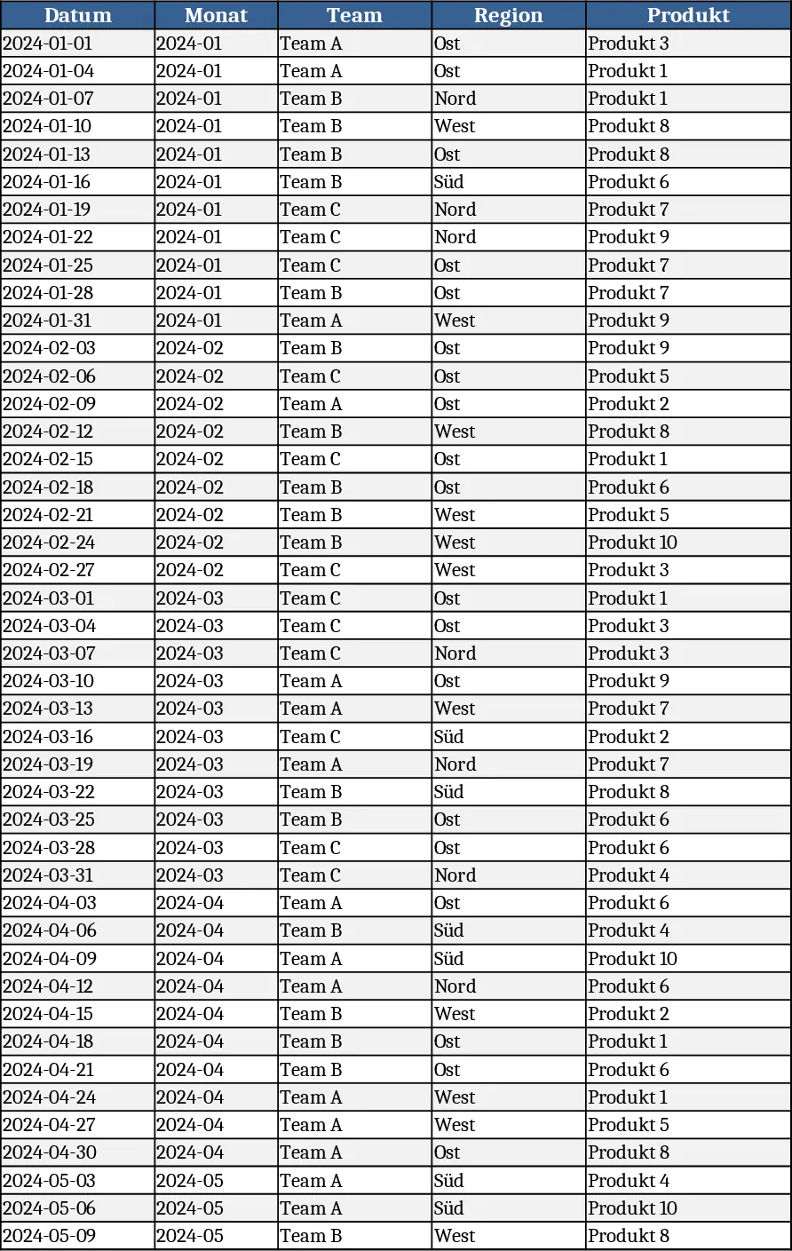
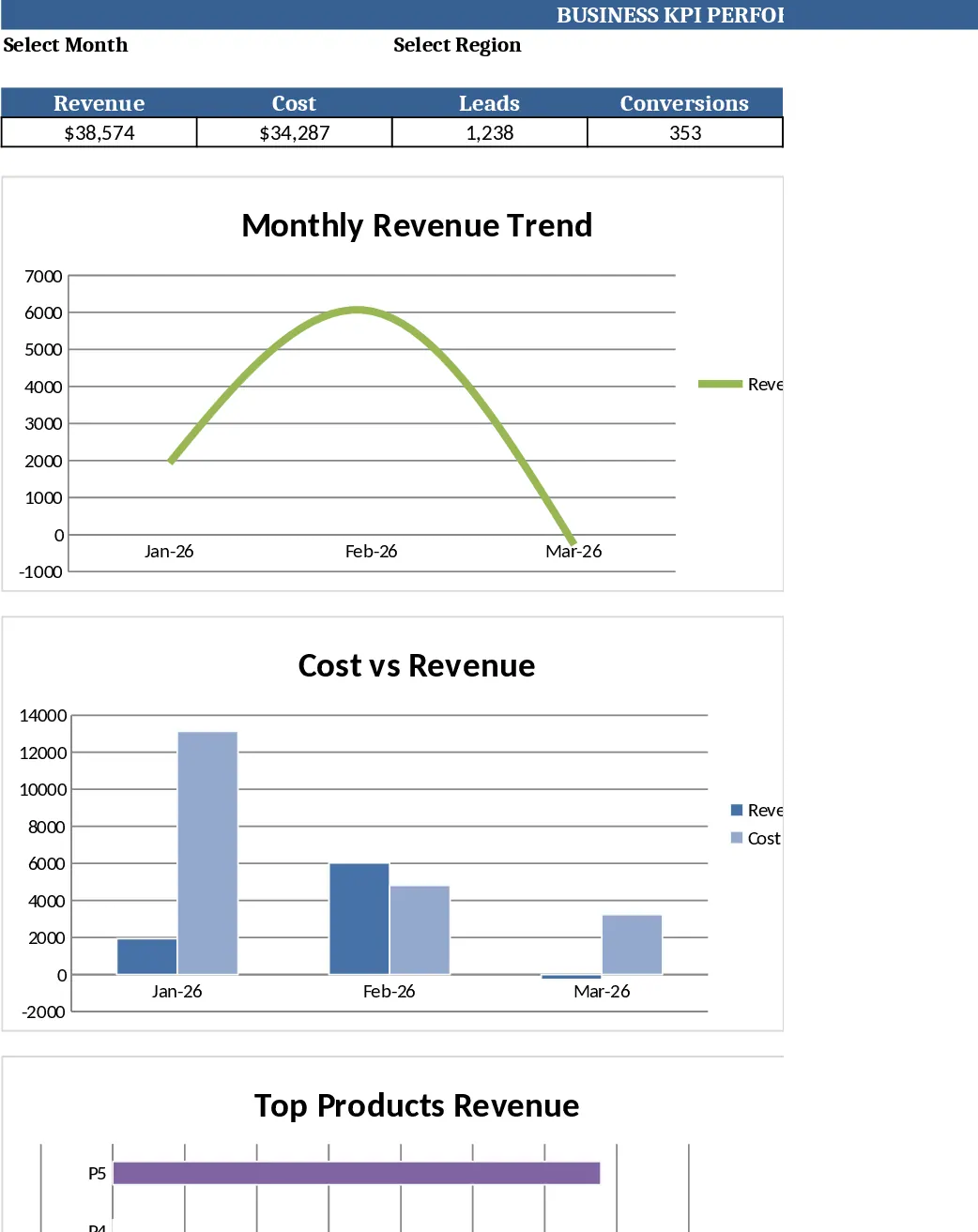
This Excel template delivers a complete monthly Business KPI Dashboard across four interconnected sheets. Raw_Data holds the transactional feed with columns for Date, Month, Team, Region, Product, KPI Type (Revenue, Cost, Leads, Conversions) and Value. KPI_Definitions lists each key performance indicator, the formula that derives it (e.g., Conversion Rate = Conversions ÷ Leads) and any logic notes, so users can extend or modify calculations without touching the core formulas. Pivot_Summary contains pre‑built pivot tables that aggregate the raw numbers by Month, Region, Product and Team, and includes slicer‑ready fields for quick filtering. Finally, the Dashboard sheet presents dynamic charts – a line chart for revenue trend, a bar chart for revenue by region, a combo chart comparing cost versus revenue, a dual‑axis trend for leads and conversion rate, and a top‑10 product bar chart – all driven by the slicers on the summary sheet.
The template solves the common pain of manually consolidating sales, cost and lead data each month, calculating derived metrics, and rebuilding charts from scratch. By feeding the raw data once, every chart and KPI updates automatically, giving managers a single source of truth for performance monitoring. The built‑in KPI definitions ensure consistency across the team, while the slicers let users explore the data by region, product line or team without altering the underlying tables. This reduces the risk of errors, speeds up reporting cycles, and provides a clear visual narrative for executive reviews.
Ideal for business analysts, finance managers, sales ops specialists and any stakeholder who needs to track revenue, expense, lead generation and conversion health on a monthly basis. Whether you are preparing a board deck, conducting a regional performance review, or simply keeping an eye on product profitability, the dashboard offers instant insight into trends and outliers. The top‑10 product view highlights revenue leaders, while the cost‑vs‑revenue combo chart flags margin pressure points.
How to use
- Open the workbook and go to the Raw_Data sheet. Replace the 60 sample rows with your own data, keeping the same column order and data types (dates as dates, numeric values as numbers). Add as many rows as needed; the table will expand automatically.
- Review the KPI_Definitions sheet to ensure the formulas match your business logic. If you need a new KPI, add a row with the name, formula (using Excel syntax) and a brief note; the dashboard will pick it up after you refresh the pivots.
- Switch to Pivot_Summary and click any slicer to filter the view. The pivot tables will recalculate based on the filtered raw data, and the linked charts on the Dashboard sheet will reflect those changes instantly.
- On the Dashboard sheet, observe the updated charts and KPI cards. Use the slicers to drill down by month, region or product, and export the visual as needed for presentations.
Expected benefits include a noticeable reduction in manual data wrangling time, fewer formula errors, and faster access to actionable insights, allowing teams to focus on strategy rather than spreadsheet maintenance.
Similar Templates Recommendation
Monthly Business KPI Dashboard with Automation Template
Track monthly revenue, cost, leads and conversion rates with a dynamic KPI dashboard that updates automatically from raw data.
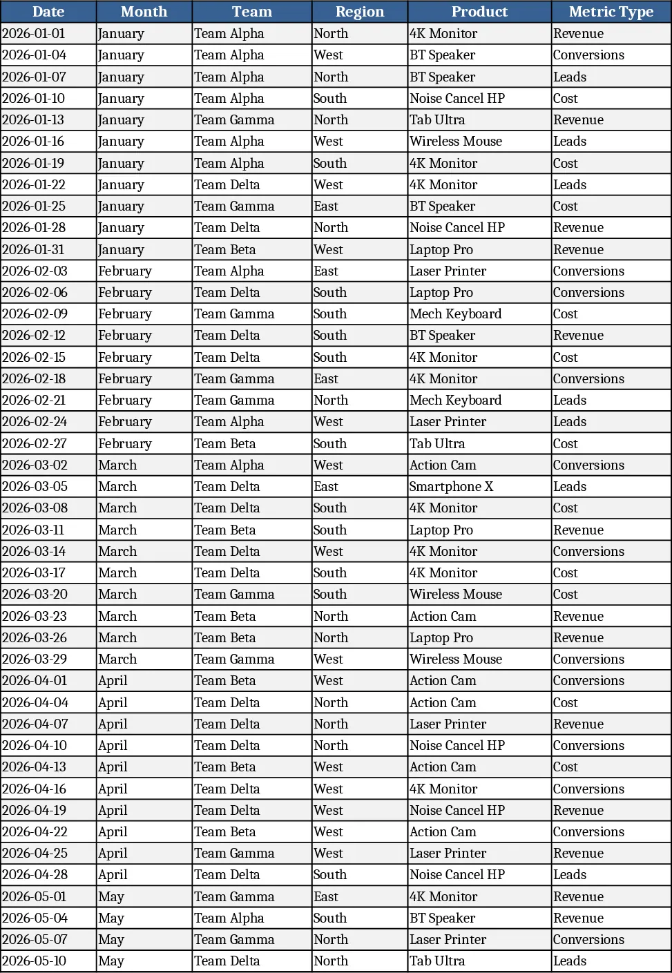
Monthly Business KPI Dashboard with Trend Analysis Template
Track monthly revenue, cost, leads and conversion rates with a dynamic KPI dashboard that updates automatically from raw data.
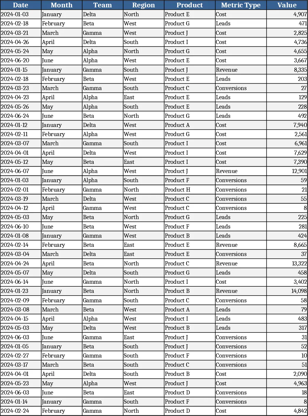
Advanced Monthly Business KPI Dashboard with Weekly Trends Template
Track monthly revenue, costs, leads and conversion rates across teams, regions and products with dynamic charts and pivot summaries.