An AI chart is useful only when it helps someone make the right decision. A polished line chart with a wrong date range, a mixed currency, or an unclear metric is still a reporting error.
This guide shows how to turn an Excel file into a chart with AI while keeping the data, chart choice, and final message reviewable. It is designed for analysts and managers who need charts for a monthly report, sales review, budget meeting, or operating dashboard. The article includes a recorded chart output and a downloadable workbook with exact control totals so you can test the workflow yourself.
Key takeaways:
- Define the row grain, metric formula, exclusions, reporting period, and comparison before choosing a chart. If those five items are unclear, a polished chart can still be numerically wrong.
- Use lines for ordered time, sorted bars for category comparisons, and variance bars for actual-versus-plan. Use a pie or donut only for a small, mutually exclusive composition that adds to a meaningful whole.
- Reject a chart that hides partial periods, mixes currencies, averages percentages incorrectly, truncates an axis to exaggerate change, or cannot be reconciled to a source total.
- Ask AI for the aggregation and source fields behind the visual, then save the chart definition with the report. That makes next month’s output reproducible instead of a one-off image.
- In the downloadable test workbook, the correct revenue total is
57,700; category totals are37,500,10,500,5,000, and4,700. Any chart that does not reconcile to those values fails before visual design is scored.
Start with the question, not the chart type
“Make a chart from this Excel file” is too broad. Start with a decision question instead.
| Decision question | Usually useful chart |
|---|---|
| Is revenue improving over time? | Line chart |
| Which region is behind plan? | Sorted bar chart or variance chart |
| What share comes from each channel? | Stacked bar or composition chart |
| Where does a conversion funnel drop? | Funnel chart |
| Which categories changed most from budget? | Variance bar chart |
This makes an AI suggestion easier to evaluate. A chart is not “right” because it is attractive; it is right when it answers the question without hiding the important comparison.
Step 1: Prepare the Excel file
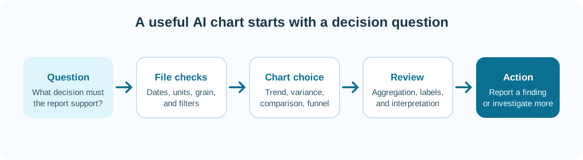
Before generating a chart, check five things:
- One row, one record. Avoid merged cells, presentation rows, and subtotals inside the data range.
- Clear field names. Use
Order Date,Region, andNet Revenue, not unnamed columns. - Consistent types. Dates should be dates, numeric values should not include mixed text labels, and currencies should use a stated unit.
- A defined grain. Know whether each row is an order, customer, product, or monthly total.
- Known filters. State whether cancelled orders, refunds, inactive accounts, or test records are included.
If the file fails these checks, ask AI to identify the problems first. Do not ask for a dashboard before the table is usable.
Download a chart test workbook with known totals
Download Quick_Chart_Test.xlsx. The single sheet contains ten data rows with Date, Category, Region, Revenue, and New_Customers fields.
Calculate these controls before asking any tool to draw a chart:
| Control | Expected value |
|---|---|
| Data rows | 10 |
| Revenue total | 57,700 |
| New customers total | 196 |
| Electronics revenue | 37,500 |
| Software revenue | 10,500 |
| Office revenue | 5,000 |
| Furniture revenue | 4,700 |
The four category totals must add back to 57,700. This catches a chart that silently drops a row, treats a number as text, applies an unintended filter, or displays an attractive aggregation that does not match the source.
Step 2: Use a chart request with context
Give the tool the metric, grouping, time range, and intended reader. For example:
Create a monthly line chart of net revenue from January to June 2026.
Exclude cancelled orders and show one line for each region. Use the reporting
currency in the file, label the y-axis clearly, and call out any month where a
region changes by more than 15% from the previous month. Add a short note on
what must be checked before interpreting the change.
The final sentence is important. AI can identify a movement, but it should not invent a cause from a chart alone.
A real chart output—and what still needs review
The screenshot below was extracted from a recorded product demonstration. It shows a RowSpeak-generated bar chart of total sales by product category.
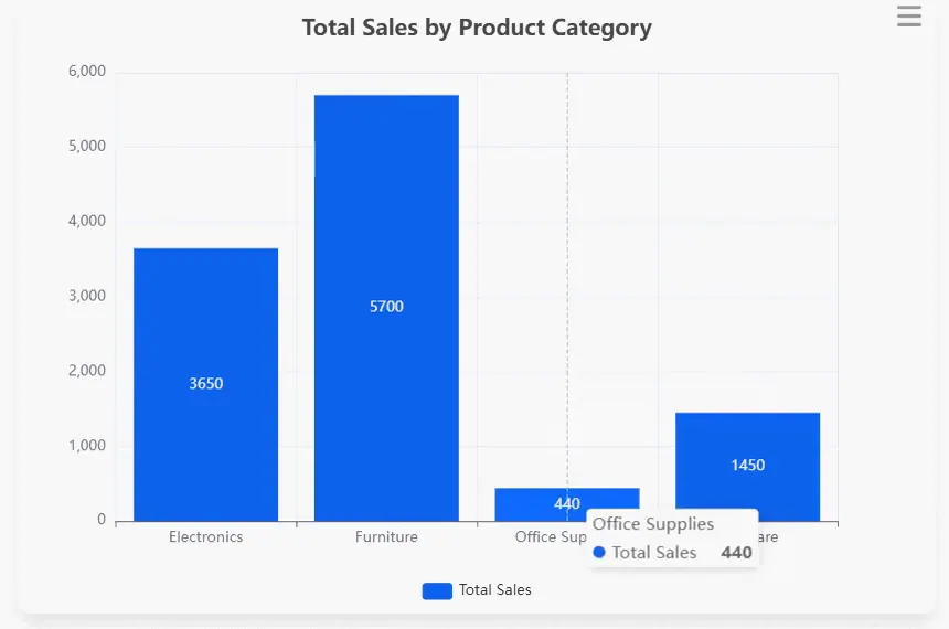
The chart gets several basics right: categories are compared with a common zero baseline, bars are sorted by neither size nor alphabet but remain easy to read, values are labeled, and the tooltip exposes the selected value. It also reveals review questions that a generic “chart created successfully” message would miss:
- The title says “Total Sales,” but it does not state currency, period, or whether sales are gross or net of returns.
Office Suppliesappears visually close to the plot boundary and should be checked for label clipping at smaller screen sizes.- The category order does not communicate a stated business priority; sorting descending may make comparison faster.
- The chart alone cannot prove that the four bars reconcile to the source table.
This is the right way to use a screenshot as evidence: show the output, then document both its strengths and the checks still required.
The four displayed values are 3,650, 5,700, 440, and 1,450, which sum to 11,240. That verifies the arithmetic visible in the chart, but not the source aggregation. This recorded chart uses a different source file from Quick_Chart_Test.xlsx; do not use its 11,240 total as the fixture answer.
The 4.4-second clip below shows the recorded English chart output and tooltip interaction. It is visual workflow evidence, not a chart-generation timing benchmark.
Step 3: Choose the right type of tool
Different tools solve different parts of the Excel-to-chart workflow.
Excel-native assistants are useful when the chart must remain in the existing workbook and the analyst wants cell-level control.
Chart-first tools are useful when the data is checked and the priority is visual polish, publication, or a specific chart type.
General AI analysis tools are useful when you need to explore the data, ask follow-up questions, and try alternative cuts before choosing a visual.
File-to-report workflows are useful when the chart is only one part of a larger output: a summary, dashboard, or monthly management report. An Excel-to-dashboard workflow fits this use case better than a one-off chart generator.
Compare chart tools by the job they complete
Rather than choosing from a generic “top 10” list, use the chart job as the first filter.
| Chart job | Tool category to test | What to verify |
|---|---|---|
| Keep a chart inside an audited workbook | Excel-native assistant | Formula references, filters, and chart range |
| Publish a polished external visual | Chart-first editor | Export format, branding, accessibility, and source note |
| Explore several possible cuts of a file | General AI analysis | Calculations, grouping, and consistency across follow-ups |
| Turn exports into a recurring management view | File-to-dashboard workflow | Input mapping, KPI definitions, reviewability, and repeatability |
| Build a governed dashboard from live systems | BI platform | Metric governance, refresh, sharing, and permissions |
This approach avoids a misleading comparison between a tool that creates a beautiful SVG and a tool that prepares a weekly KPI report. Both may be useful, but they solve different parts of the process.
Ask for alternatives before choosing a visual
For a high-stakes report, ask AI for two or three chart candidates and the reason for each. For example:
For the regional revenue and budget table, recommend up to three chart options.
For each option, state the decision it supports, the aggregation used, the
main risk of misinterpretation, and why another common chart type would be
less suitable. Do not create a chart until the reporting owner confirms the
metric and period.
This makes AI a visual analyst rather than a silent chart factory. It also gives a reviewer a clear reason to reject a pie chart, a truncated axis, or a chart that hides the variance the meeting needs to discuss.
Step 4: Review the chart before sharing it
Use this checklist every time:
- Metric: Does the chart show revenue, gross revenue, or net revenue after refunds?
- Aggregation: Is it a monthly total, average, median, or count?
- Time: Are there partial months, missing dates, or an uneven comparison period?
- Filters: Are cancelled orders, internal transactions, or test records excluded consistently?
- Scale: Does the axis start and end at values that make the comparison fair?
- Labels: Can a reader identify the unit, period, source, and series without an explanation?
- Color: Does color communicate a meaningful category or threshold?
- Interpretation: Is the written conclusion supported by the data in the chart?
For example, a 20% decline in one region could result from a missing export, a changed territory definition, or a real demand change. The chart tells you where to inspect. It does not settle the question alone.
Seven chart corner cases to put in the test file
| Test case | What can go wrong | Acceptance rule |
|---|---|---|
| Current month has only 12 days | Line appears to collapse | Partial period is labeled or excluded from full-month comparison |
| Revenue contains USD and EUR | Values are summed as one currency | Chart splits currency or uses a documented conversion table |
| One region has a negative refund-adjusted value | Bar disappears or scale becomes misleading | Negative value is visible and explained in the legend/note |
| Conversion rates are averaged across rows | Small segments receive too much weight | Rate is recomputed from numerator and denominator totals |
| Category name changes mid-period | One category becomes two bars | Mapping is reviewed and original labels remain traceable |
| Zero and missing are mixed | Missing data looks like true zero performance | Missingness is shown separately or flagged |
| A single outlier sets the axis scale | Other differences become unreadable | Outlier is retained but paired with a table, inset, or explicit scale choice |
Keep these rows in a reusable regression fixture. When the prompt, tool, or chart definition changes, rerun the fixture before publishing the next report.
A budget-versus-actual example
Suppose an FP&A team has actuals.xlsx and budget.xlsx. The reporting goal is to explain the five largest monthly operating variances.
First, map account names and periods across both files. Then calculate Actual - Budget and Variance % using agreed rules. After that, ask for a sorted variance bar chart, not a pie chart. The sorted bars make the largest drivers immediately visible.
Then request a short annotation for each material variance:
For the five largest absolute operating expense variances, create a sorted bar
chart and a table with actual, budget, dollar variance, and variance percentage.
Do not explain a variance unless the source data contains a driver. List the
accounts that require the finance owner to review before the report is sent.
This produces a chart plus a review queue, which is more useful than a visual alone.
From one chart to a useful dashboard
Most reporting teams do not need ten charts. They need a small set that answers recurring questions: what changed, why it changed, where to act, and who owns the follow-up.
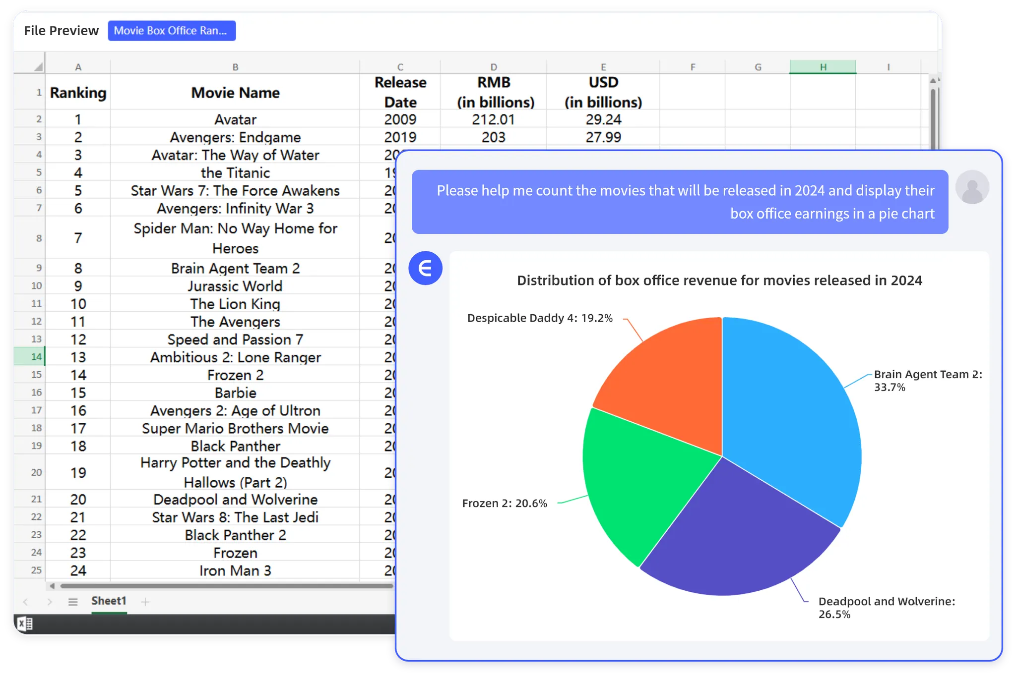
RowSpeak can help teams move from Excel, CSV, PDF, or image-based tables to charts and graphics, written findings, and a dashboard-ready output. This is most useful when data preparation, analysis, and reporting need to stay connected.
Keep the dashboard focused. A good starting set is one trend chart, one variance chart, one exception table, and a short action list. Add more only when a recurring decision genuinely needs it.
A real artifact failure after “successful” generation
The recorded workbook below contains four requested sheets and opens as an .xlsx, yet several dashboard chart areas appear empty or incomplete in the preview.
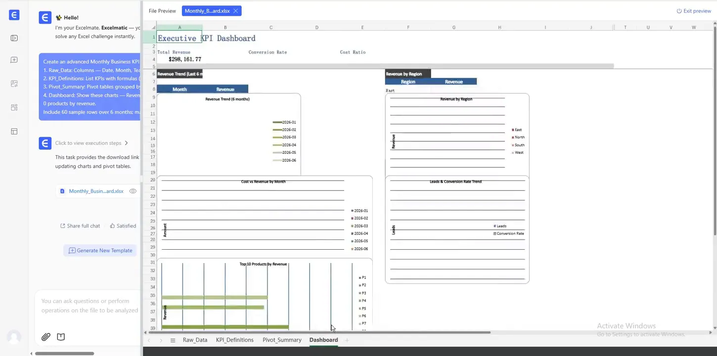
This is an important charting boundary: file creation, numerical reconciliation, and visual acceptance are three separate gates. Reopen the workbook, recalculate formulas, inspect every chart source range, test filters, and render each output sheet before sending it to a manager.
Tool boundaries that matter after the first chart
| Option | Strongest when | What a reviewer can inspect | Limitation to test |
|---|---|---|---|
| Excel-native assistant | The chart must stay in the controlled workbook | Source range, formulas, filters, chart object | Hidden ranges, table structure, and workbook-specific feature availability |
| General AI analysis | The analyst wants several exploratory cuts quickly | Conversation, generated calculation/code, and artifacts | Repeating the same chart definition next month |
| Chart-first tool | Data is already validated and publication quality matters | Visual styling, annotations, export, source note | Data cleaning and metric logic happen elsewhere |
| RowSpeak file-to-report workflow | Charts must sit beside findings, tables, and a report/dashboard from exported files | Prompt, analysis output, chart, dashboard, and downloadable artifact | Ambiguous mappings and business definitions still need approval |
| BI platform | The chart belongs to a governed, refreshable dashboard | Semantic model, measure definition, filters, refresh, access | Setup effort for a small export-driven workflow |
Design for a reader who did not build the chart
Before exporting or sharing, test the chart with a colleague who did not make it. They should be able to answer four questions within a few seconds:
- What metric is shown?
- What period and filters are included?
- What comparison should I notice?
- What decision or review action follows from the change?
If the chart needs a long verbal explanation, simplify the title, labels, or chart type. A management chart should reduce interpretation work, not create a new decoding task.
The next reporting cycle
Save the data checks, chart definitions, and review questions with the report. When the next export arrives, your team can repeat the workflow instead of rebuilding visuals from scratch. That repeatability is where AI charting becomes a reporting improvement rather than a faster way to make isolated graphics.
To test the complete path, run Quick_Chart_Test.xlsx through the RowSpeak charts and graphics workflow, reconcile every displayed value to the controls above, and keep the rejected chart versions with the final report.