If your monthly report already lives in Excel, the fastest useful workflow is simple: upload the workbook, describe the decision you need in one sentence, review the numbers, and share the checked browser-based AI dashboard by link or as an HTML file.
You do not need to rebuild the report with PivotTables, chart menus, or a business intelligence (BI) data model just to get the first working view. RowSpeak's AI Dashboard Generator can turn the file into key performance indicator (KPI) cards, charts, filters, a detail table, and written insights that your team can review.
The Excel workbook is the source, not where the dashboard runs. RowSpeak creates a standalone interactive web dashboard; it does not add a dashboard sheet or charts to the original workbook.
Key takeaways:
- One clear sentence can generate a standalone, browser-based AI dashboard draft. After you check the numbers, you can refine and share it. A copyable prompt is included below.
- The useful result is more than a set of charts: you get headline KPIs, filters, trends, exceptions, and the detail needed to check the numbers.
- You can send a share link or download the dashboard as browser-ready HTML. RowSpeak also provides four live dashboard examples you can use as a starting point.
- You can try RowSpeak free with up to 3 dashboard generations per month. Paid plans start at $9.90 per month or $99 per year.
See the monthly Excel report workflow in under 3 minutes
The 2-minute, 39-second video below shows the complete process with a cash flow workbook. You will see the file upload, the one-sentence request, the generated dashboard, interactive filters, and the Share and Download controls.
What does an AI dashboard add to a monthly report?
A monthly Excel report usually contains the right data but makes the reader do too much work. They must find the totals, compare periods, scan rows for exceptions, and work out which change deserves attention.
An AI dashboard reorganizes that same file around the monthly decision.
| Monthly Excel report | Interactive AI dashboard |
|---|---|
| Rows, tabs, and static totals | KPI cards for the numbers that matter first |
| Charts that show one fixed view | Filters for month, region, category, or other fields |
| Manual searching for changes | Trends, rankings, and exceptions in one view |
| A workbook attachment | A share link or downloadable HTML dashboard |
| Numbers without an explanation | A short summary with details available for review |
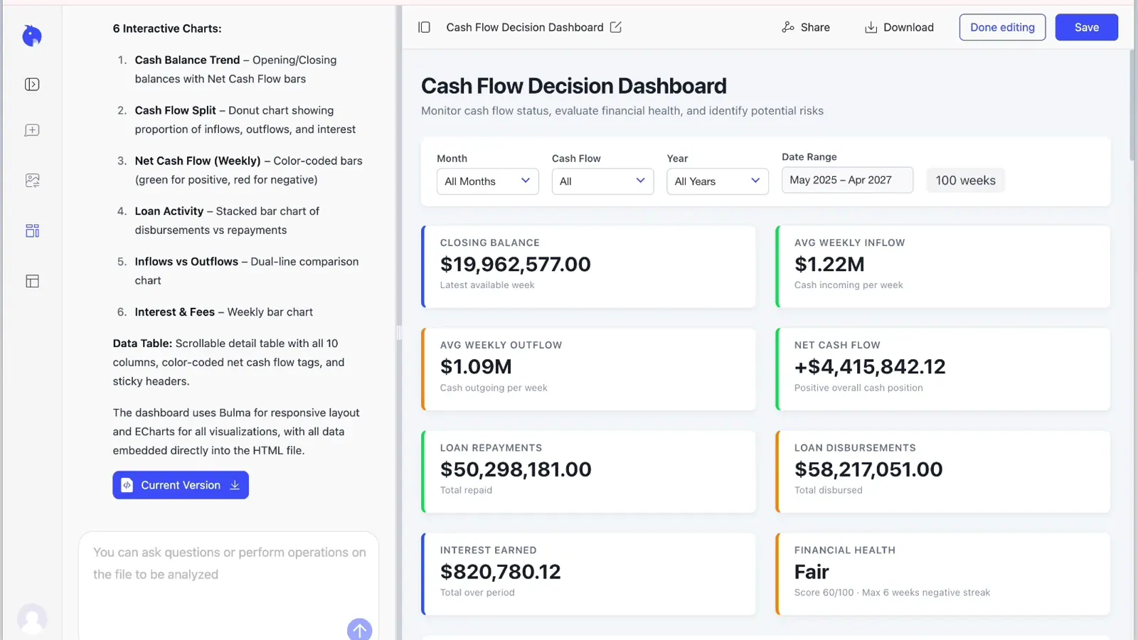
The dashboard in the video, for example, includes filters for month, cash flow type, year, and date range. It also creates KPI cards for closing balance, average inflow, average outflow, net cash flow, loan activity, interest earned, and financial health.
The image below shows the generated dashboard as a standalone browser view. It puts the filters and headline cash flow numbers first, followed by charts that help you investigate the result.
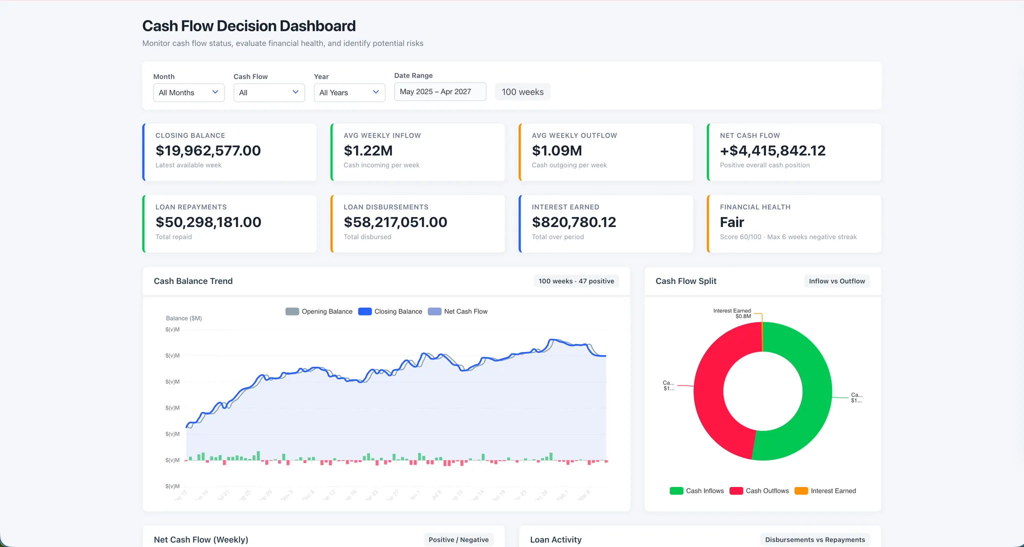
The goal is not to add as many charts as possible. A good monthly dashboard lets a manager answer three questions quickly: What happened? Why did it happen? What needs attention next?
Which monthly reporting scenarios work well?
This workflow works best when the source is an Excel or CSV export and the dashboard question changes faster than a formal BI project can.
- Finance and budgeting: Track cash flow, budget versus actual, margin, expenses, working capital, and unusual variances.
- Sales and sales operations: Review revenue, pipeline, win rate, average deal size, region performance, and deals at risk.
- Marketing: Compare spend, leads, conversion rate, cost per acquisition, return on ad spend, and campaign performance.
- Inventory and operations: Monitor stock levels, aging inventory, reorder risk, supplier delays, fulfillment, and exceptions by product or item code (SKU).
- Project and support teams: Summarize status, backlog, owners, overdue work, ticket volume, response time, and service risks.
You can use the same process for a weekly report, a quarterly review, or a client update. If the source starts as a recurring system export rather than a workbook, the monthly CSV reporting workflow explains the extra checks to make before dashboarding.
The best workflow: monthly Excel report to AI dashboard
Step 1: Start with the decision, not the chart
Before uploading the file, write down what the dashboard should help someone decide.
For a cash flow report, the decision might be whether the business has enough cash for the next payment cycle. For a sales report, it might be which regions are behind target. For an inventory report, it might be which products need to be reordered this week.
Then identify five parts of the dashboard request:
- Audience: Who will use the dashboard?
- KPIs: Which numbers should appear first?
- Comparisons: Should this month be compared with last month, budget, or target?
- Breakdowns and filters: Which fields should the reader explore?
- Exceptions: What should the dashboard flag for action?
Step 2: Give the workbook a quick check
You do not need to redesign the workbook. You do need to make sure the data has a clear meaning.
Check for one header row, one business record per row, consistent dates, numeric amount fields, and stable category names. Identify subtotal rows, merged headings, blank rows, duplicates, or notes that should not be counted as transactions.
There is one important limit to remember: AI cannot calculate a reliable month-over-month change if the workbook only contains one month. Include the prior month, a budget, or a target when you want a comparison.
If the file is unclear, inspect it first with this request:
Review this workbook before creating a dashboard. Identify the date range,
what one row represents, useful KPI fields, duplicate or subtotal rows,
missing values, and any columns that need clarification.
Step 3: Upload the workbook and write one sentence
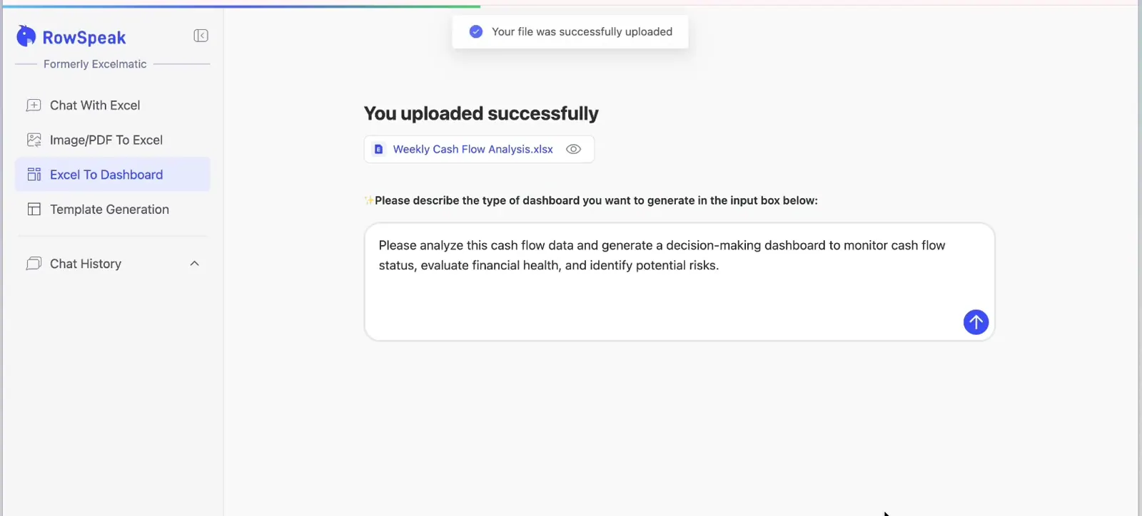
Open RowSpeak's Excel To Dashboard tool and upload the monthly report. In the video, the workbook is uploaded and this single sentence is used:
Please analyze this cash flow data and generate a decision-making dashboard to monitor cash flow status, evaluate financial health, and identify potential risks.
That short prompt works because it names the data, the dashboard's job, and the decisions it should support.
For more control while keeping the request to one sentence, use this template:
Use AI to create a polished, interactive [sales, finance, or inventory] dashboard
from this monthly Excel report for [audience], showing [KPIs], comparing [period
or target], breaking results down by [fields, such as region or product], adding
filters for [fields], highlighting [exceptions], and summarizing what needs attention.
Here is a complete monthly sales example you can paste and adapt:
Use AI to create a polished, interactive sales dashboard from this monthly Excel report
for the leadership review, showing revenue, gross margin, orders, average order
value, and month-over-month change, breaking results down by week, region, and
product category, adding filters for month, region, and category, highlighting
unusual changes, using a clean executive layout with KPI cards first and detail
last, and summarizing the three issues that need attention.
You do not need to name every chart type. Describe the business view first, then change any chart that does not make the comparison clear.
Step 4: Review the first dashboard draft
RowSpeak uses the workbook and prompt to plan the dashboard structure. In the video example, it creates eight KPI cards, six interactive charts, multiple filters, and a detailed cash flow table.
Treat this as a first draft, not an approved report. Before sharing it, check:
- Date scope: Does the dashboard cover the full month and the correct fiscal period?
- Headline totals: Do at least three important KPIs match the workbook?
- Calculation rules: Are revenue, margin, variance, cash flow, and rates defined the way your team defines them?
- Source rows: Were subtotals, duplicates, blanks, and excluded categories handled correctly?
- Filters: Does every KPI and chart update consistently when a filter changes?
- Summary: Does each written conclusion match a visible number or chart?
If something is wrong, correct it in plain English. For example:
Use only July 2025, recalculate net cash flow as total inflow minus total
outflow, exclude subtotal rows, and show which values changed from the
previous dashboard version.
Step 5: Test the interaction
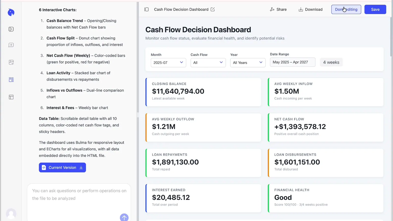
Use the filters the way a manager will use them. Select one month, region, product category, or cash flow type and confirm that the cards, charts, and detail table all move together.
In the video, selecting July changes the view from 100 weeks to 4 weeks. Closing balance, inflow, outflow, net cash flow, loan activity, interest, and the financial health score all update for that period.
Step 6: Reuse the workflow next month
Save the final prompt, the required source columns, and the review checklist. When the next report arrives, upload the new workbook and use the same request.
Keep column names and KPI definitions stable where possible. If the source system changes a field, adds subtotal rows, or uses a new category name, run the file inspection again before generating the dashboard.
For recurring leadership reports that also need a written narrative, pair the dashboard with an AI reporting workflow so the charts and management summary are checked together.
Is the AI dashboard easy to share?
Yes. You have two practical options after reviewing the dashboard.
Send a share link. RowSpeak creates a link that you can send in email, chat, or a meeting invite. Anyone with the link can access the shared content, so use the same care you would use with any business report that contains sensitive data.
Download the dashboard as HTML. The generated dashboard can be downloaded as a browser-ready HTML file with its data embedded. The recipient can open it in a browser and use the dashboard view without digging through the source workbook.
The link is usually better when everyone should see the same current version. The HTML file is useful when you need a portable deliverable or want to keep a dated copy with the monthly reporting package.
How much does an AI dashboard cost?
You can try the workflow free. The free access includes up to 3 dashboard generations per month. Paid plans increase that monthly limit and support larger files.
| Plan | Monthly billing | Annual billing | Dashboard generations per month |
|---|---|---|---|
| Free access | Try free | Not applicable | 3 |
| Essential | $9.90 per month | $99 per year | 10 |
| Professional | $29.90 per month | $299 per year | 30 |
| Premium | $59.90 per month | $599 per year | 100 |
Prices and limits were checked on August 14, 2026. Review the current RowSpeak pricing before choosing a plan, because plans can change.
The free plan lets you test up to three dashboard generations on real reports. Paid plans are better suited to multiple teams, clients, or recurring reports.
Can you start from an existing dashboard example?
Yes. The Excel-to-dashboard page includes four live examples. Select any title or view link below to open the interactive HTML dashboard.
Sales Cases: Sales Management Dashboard
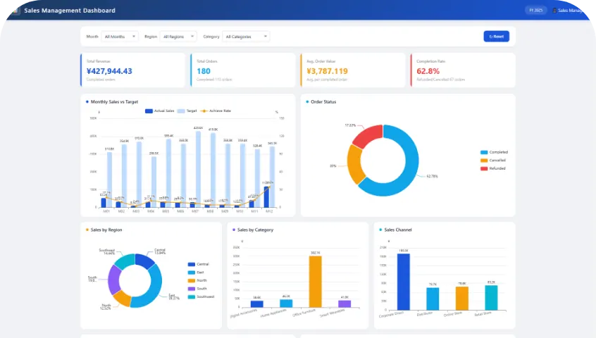
See total revenue, completed orders, monthly sales against target, and performance by region, category, and channel. View the live sales dashboard.
Finance Cases: Financial Budget Dashboard
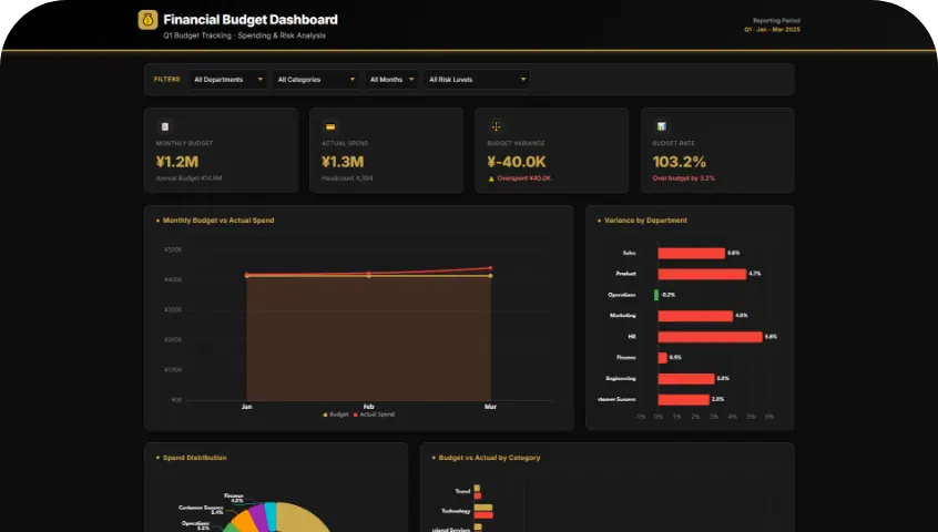
Compare budget with actual spending, identify department variances, and inspect cost distribution and risk levels. View the live finance dashboard.
Campaign Marketing Cases: Ad Decision Center
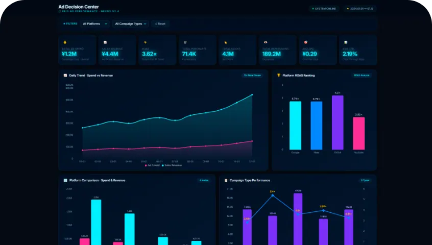
Compare ad spend, sales revenue, return on ad spend, cost per acquisition, and performance by platform and campaign. View the live marketing dashboard.
Inventory Management Cases: Inventory & Sales Dashboard
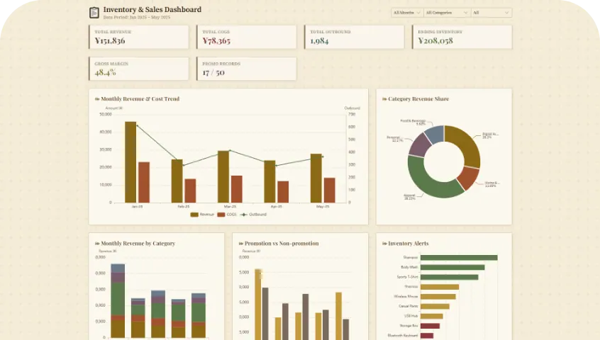
Track revenue, cost of goods sold, outbound inventory, gross margin, product categories, and inventory alerts. View the live inventory dashboard.
Open the example closest to your work and inspect its KPI order, filters, charts, and detail sections. Then describe that structure in your own prompt. This is often easier than starting from a blank idea, especially when you are not sure what a good dashboard should contain.
When is RowSpeak enough, and when is BI better?
RowSpeak is a good fit when the work starts with a spreadsheet, the reporting question can change, and a person will review the result before it is shared. It sits between manual Excel work and a heavier BI implementation.
A BI platform is the better choice when you need an always-on dashboard connected to many systems, centrally controlled definitions for every metric, organization-wide permissions, scheduled refreshes, and long-term maintenance across many users.
Start with the real Excel file, learn which KPIs and views people use, and move to BI later if the workflow becomes stable enough to justify it.
Common mistakes to avoid
- Asking only, "Make me a dashboard," without naming the audience or decision.
- Requesting a month-over-month comparison when the prior month is not in the file.
- Treating the first AI-generated dashboard as final without reconciling the totals.
- Changing source column names every month and expecting the same prompt to behave identically.
- Adding every possible chart instead of prioritizing KPIs, trends, exceptions, and detail.
- Sharing a link to sensitive financial or customer data without checking who should receive it.
Create your first monthly AI dashboard
Start with a real report you already prepare. Upload it to the RowSpeak Excel-to-dashboard workflow, paste the one-sentence prompt from this guide, and review three headline totals before you share anything.
That gives you a practical first dashboard, a repeatable monthly process, and a clear way to decide whether you need more Excel work, an AI reporting workflow, or a full BI system.