Key takeaways:
- You will stop rebuilding reports by hand: this article shows how to move from a PDF or CSV export to a clean table, a simple dashboard, and a clear list of actions.
- You will know what to check before trusting the numbers: we explain how to spot missing pages, shifted columns, duplicate rows, broken dates, and totals that do not match the original report.
- You will get prompts you can copy: the examples tell RowSpeak what to extract, what to compare, what to flag, and how to explain the result in plain language.
- You will know when the workflow is enough: we compare manual Excel work, file-based reporting automation, and heavier BI tools so you can choose without overbuilding.
- You will see where RowSpeak fits: upload PDF, Excel, CSV, or image-based tables, review the extracted data, and turn the approved numbers into a shareable report or dashboard.
Copying a table from a PDF into Excel feels like it should take 30 seconds. Then the columns collapse, page headers appear in the middle of the data, negative numbers lose their signs, and totals no longer reconcile.
The real problem is not PDF conversion alone. Your team does not need another spreadsheet full of extracted cells. It needs a reliable path from a static exported report to metrics, explanations, and an actionable dashboard.
This guide shows a practical PDF to Excel automated workflow. You will learn how to extract tables, validate the result, combine PDF and CSV exports, define dashboard metrics, and review the final output before it reaches leadership—even if you do not work with databases or technical tools.
Why PDF-to-Excel work is still painfully manual
PDF is designed to keep a page looking the same when you open or print it. It is not designed to keep the rows and columns ready for Excel. The file may not remember which number belongs to which column, which rows continue on the next page, or whether a total should be included with the detail.
That is why a table that looks perfectly structured to a person can become disorderly when pasted into Excel.
The pain is persistent enough to produce a 716-point Hacker News discussion about the struggle to convert election PDFs into spreadsheets. The example was unusually public, but the workflow is familiar to finance and operations teams: important data is published in a readable report, while the analyst still has to reconstruct it into rows and columns before any useful analysis can begin.
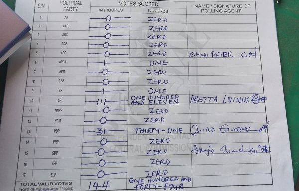
This handwritten polling sheet shows why the job is so frustrating. A person can see the party names and vote totals, but copying every row into Excel takes time. Handwriting, pen marks, signatures, and the photographed page angle also make ordinary copy-and-paste useless.
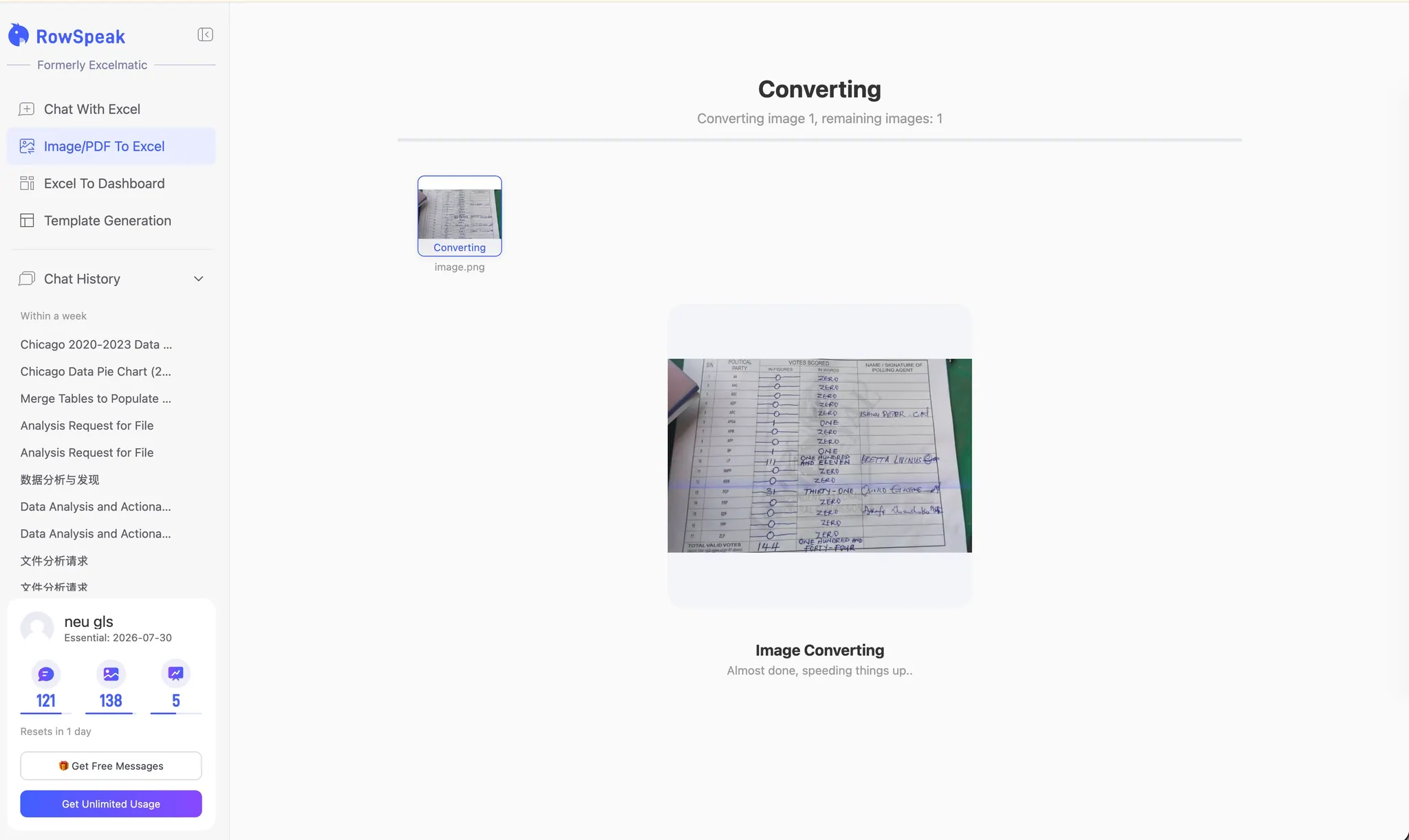
Below is the same image being converted with RowSpeak's Image/PDF to Excel tool. The reader only needs to upload the image; RowSpeak reads the visible table and starts organizing it into rows and columns.
After conversion, RowSpeak displays the extracted information as a table you can review and edit. Instead of typing every party name and vote total by hand, you can check the important values against the original image, correct anything that was misread, and then download the table or continue analyzing it.
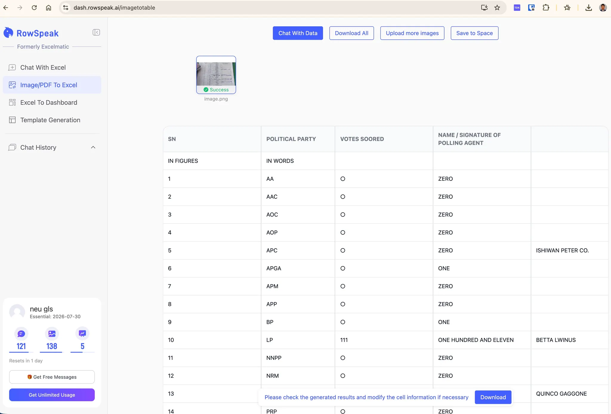
The important benefit is not that you never need to check the data. Handwritten and photographed records can still be unclear. The benefit is that you start with a structured table and review the uncertain cells, instead of rebuilding the entire report one row at a time.
The same problem appears in:
- Bank, payment processor, and marketplace statements
- Vendor performance and logistics reports
- Government filings and public datasets
- Insurance, audit, and compliance reports
- Monthly management packs
- Invoices, purchase orders, and price lists
- Survey, election, and research reports
The PDF is often an output of another system. Your team receives the final page layout but not the clean source table behind it.
Copy-pasting creates errors before analysis starts
Manual copy-paste is risky because it produces a table that looks editable before it is trustworthy.
Common problems include:
- Merged columns: Two or more PDF columns land in one Excel cell.
- Shifted rows: A wrapped description pushes values into the wrong field.
- Repeated page elements: Headers, footers, and page numbers become data rows.
- Missing symbols: Currency signs, percentages, parentheses, and negative signs disappear.
- Broken types: Dates and numbers arrive as text.
- Missing labels: Region, department, or category names become separated from the rows they describe.
- Silent omissions: A page or continuation table is skipped without an obvious error.
Formatting fixes can hide these problems without solving them. A clean-looking workbook may still contain incomplete or misaligned data.
This is why a reporting automation tool should do more than change a PDF into an Excel file. It should help you check the table, explain which numbers were used, and correct the result when the first version is wrong.
The better workflow: PDF report to actionable dashboard
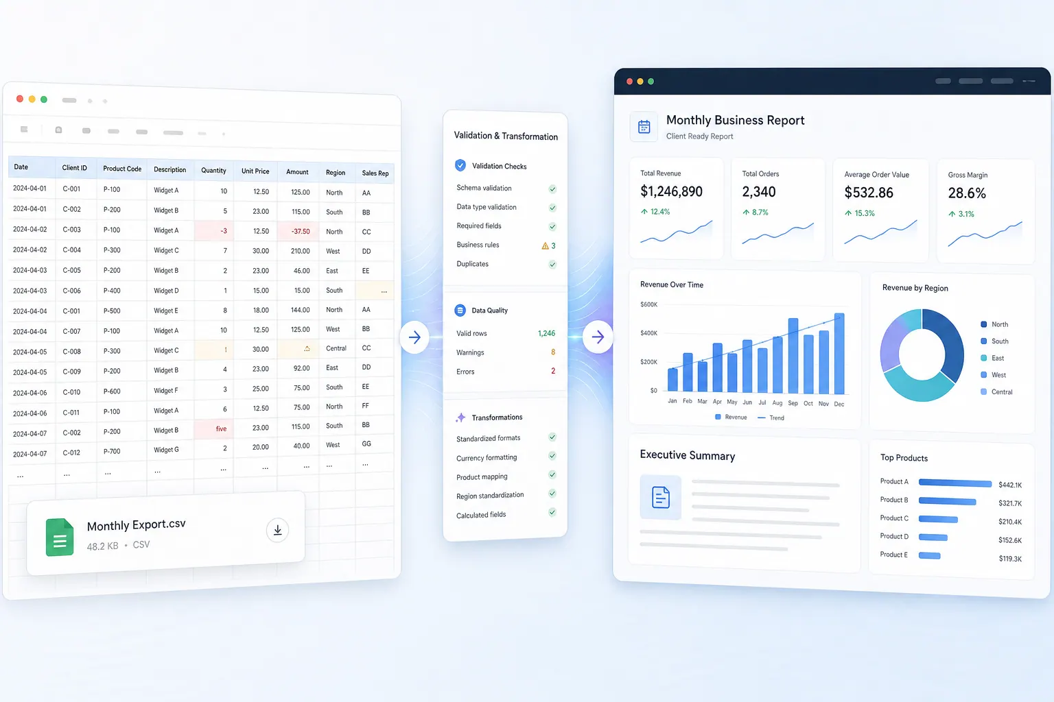
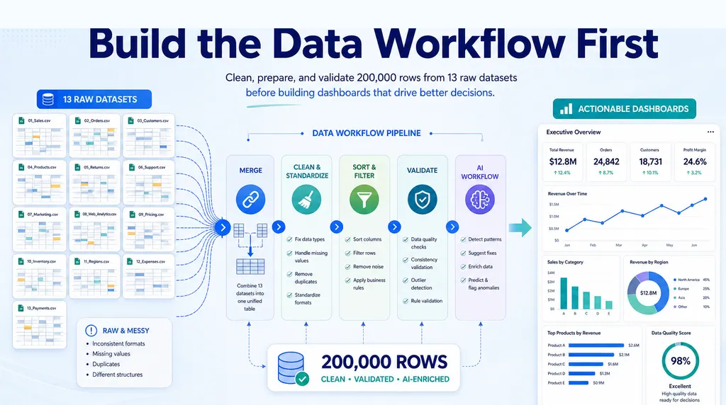
A reliable file-to-dashboard process has five stages:
- Define the business question.
- Extract the PDF into a structured table.
- Validate and clean the extracted data.
- Combine it with related Excel or CSV exports.
- Build and review the dashboard.
Keeping these stages separate makes errors easier to find. It also prevents a polished chart from creating false confidence in weak source data.
Step 1: Start with the decision, not the PDF
Before extracting anything, decide what the dashboard should help someone do.
For example, an operations manager may receive a 40-page monthly carrier report as a PDF and a shipment export as CSV. The dashboard needs to answer:
- Which carriers missed their service targets?
- Which regions caused the most late deliveries?
- Did cost per shipment rise?
- Are surcharges concentrated in a few routes?
- Which exceptions need action this week?
This decision-first approach tells you which tables matter. You may not need every paragraph, appendix, or legal note in the PDF.
Step 2: Extract the table with explicit instructions
Upload the PDF and describe the table you need. If the report contains several tables, name the pages, the section title, the columns you want, and what each finished row should represent—for example, one row per carrier and region.
A practical extraction prompt looks like this:
Extract the carrier performance table from pages 8-21.
Create one row per carrier and region for the reporting month.
Keep these columns: month, carrier, region, shipments, on-time shipments,
late shipments, freight cost, fuel surcharge, and total cost.
Remove repeated page headers and footers, but keep subtotal rows in a separate
table. Flag any row where the column alignment is uncertain.
Specific instructions reduce ambiguity. “Convert this PDF to Excel” may be enough for a simple one-page table, but a multi-page operational report needs rules.
RowSpeak's PDF-to-Excel workflow is designed for this extraction step. If you only need a reusable spreadsheet, the standalone guide to converting PDF files to Excel covers the basic methods and tradeoffs.

Step 3: Validate before calculating metrics
Do not build charts immediately after extraction. First check whether the table represents the PDF correctly.
Use this validation checklist:
- Row count: Are all expected pages and records included?
- Column alignment: Do values remain under the correct headers?
- Totals: Do extracted totals match the totals printed in the PDF?
- Signs and units: Are negatives, percentages, currencies, and thousands preserved?
- Dates: Is the full reporting period included, with no unexpected dates?
- Duplicates: Were continuation rows or repeated headers added twice?
- Categories: Were group labels carried into the detail rows correctly?
- Exceptions: Are unclear or low-confidence rows isolated for review?
For financial or operational reports, reconcile at least one printed subtotal and the grand total. If the PDF shows 18,420 shipments and the extracted table sums to 18,240, stop there. A dashboard cannot repair missing source rows.
You can ask RowSpeak to perform the first review:
Check the extracted table against the PDF totals. List mismatches by page,
identify possible duplicate or missing rows, verify that percentages and negative
values were preserved, and create an exception table for manual review.
The result still needs human review. Automation reduces the search area; it does not remove accountability for the numbers.
Step 4: Combine the PDF table with Excel or CSV exports
The PDF may summarize performance, while the CSV lists every shipment, sale, invoice, or other individual record. Combining them gives you both the official summary and the details behind it.
In the carrier example:
- The PDF contains official monthly service-level results.
- The CSV contains shipment dates, routes, customers, weights, and individual charges.
- An Excel target file contains carrier service goals and budget rates.
Before combining the files, find the columns they have in common, such as carrier + region + month. Make names and dates consistent. If one file says “North East” and another says “Northeast,” record that they mean the same region instead of letting the dashboard count them separately.
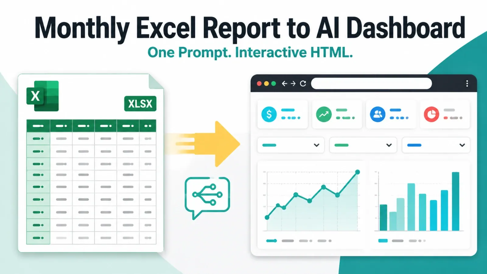
This is the core of a CSV to dashboard workflow: the CSV supplies the detailed rows, while the PDF or workbook supplies targets, explanations, or official totals. RowSpeak's Excel AI workflow can work across these common business files without asking you to set up a database first.
Step 5: Define the metrics before choosing charts
Write down each dashboard metric, its source, and its calculation.
| Metric | Source | Calculation | Review check |
|---|---|---|---|
| On-time delivery rate | On-time shipments / total shipments | Reconcile with printed rate | |
| Cost per shipment | CSV | Total shipment cost / shipment count | Exclude cancelled shipments |
| Surcharge rate | CSV | Fuel surcharge / freight cost | Check currency and negatives |
| Target gap | PDF + Excel | Actual on-time rate - target rate | Match carrier and region keys |
| Late shipment concentration | CSV | Late shipments by route / all late shipments | Confirm reporting month |
Only after these definitions are clear should you choose charts. A KPI card can show overall on-time delivery. A bar chart can rank carriers by target gap. A trend line can show cost per shipment over time. An exception table can identify routes with both high cost and poor service.
For more guidance on this stage, see the Excel-to-dashboard workflow and the broader guide to building dashboards from Excel, CSV, and PDF files.
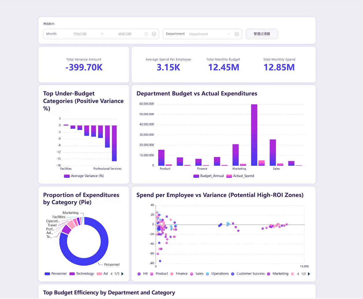
Step 6: Ask for an actionable dashboard, not every possible chart
An actionable dashboard should make the next decision clearer. It does not need to visualize every column.
Use a prompt like:
Create a monthly carrier performance dashboard from the reviewed PDF, CSV, and
Excel tables. Show KPI cards for on-time delivery, total freight cost, cost per
shipment, and target gap. Rank carriers and regions by missed target. Highlight
routes with rising costs and worsening delivery performance. Add a short summary
of the top three issues, likely drivers supported by the files, and recommended
follow-up actions. Keep all caveats and excluded rows visible.
The words “supported by the files” matter. They tell the system to separate evidence from speculation. The request also asks for caveats and exclusions, which helps make the dashboard reviewable.
Step 7: Review the dashboard before sharing
Run a final review after the dashboard is created:
- Do KPI totals reconcile with the approved extracted table?
- Can each metric be traced to source fields and calculation rules?
- Are filters, exclusions, and reporting dates visible?
- Does each chart answer a business question?
- Are recommendations supported by the data?
- Are PDF extraction exceptions still visible?
- Can another analyst repeat the workflow next month?
If the dashboard is for leadership, add a brief executive summary: what changed, why it changed, what remains uncertain, and what action is recommended.
RowSpeak's AI reporting workflow can help turn the checked numbers into a structured report with charts and written findings. If the same dashboard must update automatically for many people over a long period, a business intelligence (BI) platform may be the better final system. RowSpeak fits well when your files keep changing and you need a useful, reviewable report before taking on a larger BI project.
Manual Excel vs a reporting automation tool vs BI
| Approach | Best fit | Main limitation |
|---|---|---|
| Manual copy-paste into Excel | One small, simple table | Fragile, hard to repeat, easy to misalign |
| Basic PDF converter | Clean extraction from a predictable PDF | Stops at a spreadsheet; limited analysis and review |
| RowSpeak file-based workflow | PDF, Excel, CSV, and image inputs that need analysis, reporting, and dashboards | Still requires review of extraction and business rules |
| BI platform | Stable models, governed refreshes, many recurring users | More setup than many file-based reporting tasks need |
The choice depends on the maturity of the workflow. If the report changes every month and the business question is still evolving, start with a flexible file-based process. If the definitions and sources are stable, move the proven model into BI.
Common mistakes to avoid
Treating conversion as completion
An Excel file is not an analysis. Confirm that the data is complete, define the metrics, and connect the output to a decision.
Fixing extraction errors without documenting them
Keep a correction log for renamed categories, removed duplicate rows, inferred headers, and excluded values. Those rules make next month's workflow repeatable.
Combining files without checking what each row means
A PDF may contain one row per carrier, while a CSV contains one row per shipment. Combining them directly can accidentally multiply the totals. First bring both files to the same level—for example, total the shipments by carrier and month before matching them to the PDF.
Generating charts before reconciling totals
Visual polish makes errors harder to notice. Reconcile the table before creating the dashboard.
Hiding uncertain data
Flag ambiguous rows and incomplete pages. A visible caveat is more useful than a confident but unsupported number.
From static report to repeatable reporting workflow
The goal is not to become faster at copy-pasting. It is to remove copy-paste from the reporting process.
A useful workflow preserves five things: the original file, the extracted table, the validation checks, the metric definitions, and the final dashboard. When the next PDF or CSV export arrives, your team can repeat the same steps and focus its attention on exceptions rather than rebuilding the report.
If your reporting process begins with PDFs, Excel workbooks, CSV exports, or screenshots, try RowSpeak on the next real report. Start with the PDF-to-Excel workflow, validate the extracted table, then use the Excel-to-dashboard workflow to turn the reviewed data into decisions instead of another spreadsheet attachment.
FAQ
Can PDF to Excel be fully automated?
Simple, consistent PDF tables can often be extracted with little correction. Complex multi-page reports still need validation for missing rows, shifted columns, repeated headers, signs, units, and totals. The safer goal is automated extraction with a clear human review step.
How do I turn a CSV into a dashboard?
First confirm what each row represents, clean key fields, define metrics and filters, and reconcile totals. Then choose a small set of KPI cards, trends, rankings, and exception views tied to a business decision. RowSpeak can help analyze the CSV and generate a reviewable dashboard/report view.
What should I look for in a reporting automation tool?
Look for a tool that accepts the files you already receive, lets you correct extracted tables, combines several files, shows how totals were calculated, flags possible problems, and creates dashboards or written reports your team can review.
When should I use BI instead of a file-based dashboard workflow?
Use BI when the same data and calculations repeat, the dashboard must update automatically, and many people need ongoing access. Use a file-based workflow when the inputs change, you are still deciding what the report should show, or you need a useful result quickly from PDF, Excel, or CSV exports.
Your next report can start here
Turn one messy file into a report you can actually review
Upload a PDF, photo, Excel workbook, or CSV export to RowSpeak. Check the extracted table, ask what changed, and create a clear report or dashboard without rebuilding every row by hand.
Try RowSpeak with your next fileStart with the file that is currently waiting in your inbox.